| Image |
Comment |
| 01/18/2006 07:12:11 PM |
|
| 01/18/2006 01:23:45 PM |
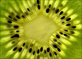
Color from Down Underby MeeraComment: Greetings from the Critique Club
First off, I must tell you I loved your "Food" entry. Right, don't need rocket science, just need good ideas and execution.
Okay, back to the subject at hand. Your kiwi abstract. I like the composition very much. The star shape in the center and the black seeds around it make a lovely pattern. And of course the gradiations of green are lovely.
Unfortunately, even though it is an abstract, usually people like something to be sharp. And it's likely that the overall soft-focus of this image worked against you in this Challenge.
You are doing well after only four Challenges, and I wish you well in future competitions. Welcome aboard. |
 Photographer found comment helpful. Photographer found comment helpful. |
| 01/18/2006 09:58:13 AM |
|
| Photographer found comment helpful. |
| 01/17/2006 10:41:25 PM |
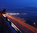
Santa Monica Trafficby mikewill73Comment: Greetings from the Critique Club
Congratulations on your very fine entry in your first Challenge.
The composition of this image is excellent with the nice leading lines of the traffic and bridge taking the viewer into the bright lights of the city. You smudged out the potential distraction of the near wall that is blue in the image. The Santa Monica pier jutting out is a perfect foil to the bridge. Good color, good detail. Good score.
Keep up this way and you'll be on the front page before you know it. |
| 01/17/2006 06:58:32 PM |
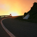
Supernova - our Sun's final shapeby PascalComment: Greetings from the Critique Club
Pascal! This is the second time I've been lucky enough to draw one of your images to critique.
Frankly, I love this image. As an avid Science Fiction reader, I can relate easily to this depiction of the civilization's last moments. There we are, driving off the cliff to infinity.
I guess you were the victim of "Did Not Meet the Challenge" voters who couldn't see the very defined shapes in this image well enough to give you a good score.
The fact that you have a 'blown out' portion of the sky is perfect for this interpretation. The color of the center pavement stripe is gorgeous. The sky is gorgeous.
I cannot offer any critical comment. I can only sympathise.
Good luck in your next Challenge.
Alice |
| Photographer found comment helpful. |
| 01/16/2006 11:23:57 PM |
|
| Photographer found comment helpful. |
| 01/16/2006 11:21:42 PM |
|
| Photographer found comment helpful. |
| 01/16/2006 11:21:08 PM |
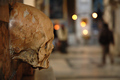
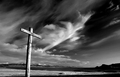
Crossby BrinComment: It would have been nice to see the base of the cross as well... |
| Photographer found comment helpful. |
| 01/16/2006 11:19:54 PM |
|
| Photographer found comment helpful. |
| 01/16/2006 10:54:23 PM |
|
| Photographer found comment helpful. |
Home -
Challenges -
Community -
League -
Photos -
Cameras -
Lenses -
Learn -
Help -
Terms of Use -
Privacy -
Top ^
DPChallenge, and website content and design, Copyright © 2001-2026 Challenging Technologies, LLC.
All digital photo copyrights belong to the photographers and may not be used without permission.
Current Server Time: 06/22/2026 09:16:58 PM EDT.