|
|
|
Showing 7011 - 7020 of ~8912 |
| Image |
Comment |
| 01/19/2006 07:56:01 PM | |
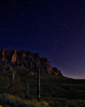
| 01/19/2006 07:54:01 PM | Moonlight Sonataby kirbicComment: I'll be fascinated to see the technical information on this image eventually. Lovely lighting, and no apparent movement in the stars. |  Photographer found comment helpful. Photographer found comment helpful. |
| 01/19/2006 07:51:29 PM | Goldenby riotComment: What an exceptional close-up image of this bird. Just beautiful. | | Photographer found comment helpful. |
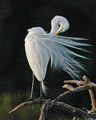
| 01/19/2006 07:49:38 PM | Preening Prettyby nidiciComment: Sometimes I just like to come back to a picture to enjoy it again. This image fits that category. I can't score it any higher. | | Photographer found comment helpful. |
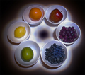
| 01/19/2006 05:14:44 PM | Color Wheelby bowhennComment: Greetings from the Critique Club
What an original idea. And an excellent choice of fruit to exemplify the primaries and secondary colors. Focus of the fruit and dishes is spot on. The light painting works well mostly. It's a bit dark (and that's where your score suffered, I think) and there are a few hot spots as well. It is fun, though to see the design in the middle.
Someone more experienced in lighting techniques than I, would have to tell you how to get the effect you want without the hot spots and the overly dark shadows. I can only commend you for a gallant attempt and a really great idea.
I hope you continue to enjoy DPChallange. I will look forward to seeing more of your work.
ALice
|
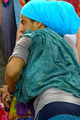
| 01/19/2006 04:30:13 PM | Rapper!by permapierComment: Greetings from the Critique Club
What a good time to visit Costa Rica, in their nice warm weather.
You found a colorful image indeed, while you were there. And you met the Challenge nicely with the colorful turban and other items. I would suggest that you may have given the viewer a bit too much information though. While there is lots of color, I think the color burst you are looking for is in the turban, and much of the lower half of the image (say from the elbow down), is extraneous. Then, and it is unfortunate, you did crop into the turban. Frequently, when cropping, it's good to either crop before a major element, or deeply into one. Just a little bit into the element usually appears to be a 'mistake.' (Whether it is intentional or not).
Other than that, the colors look good as does the exposure.
So keep on trying and having fun doing it. Good luck in future Challenges. | | Photographer found comment helpful. |
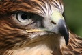
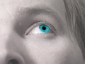
| 01/19/2006 04:15:02 PM | Window to the soulby nlghttrainComment: Greetings from the Critique Club
YOu must have had fun desaturating this image. And you were certainly on the right track to emphasize the pupil of the eye in this fashion.
If this was hanging in the Museum of Modern Art, the patrons would be ooh-ing and aaah-ing over it. (Me too.) But, no, it's in DPChallenge where the voters frequently want more realism, and symmetry. So you scored in the lower numbers.
I suppose, for DPC, if you had made the color of the eyes more 'normal' and used a more conventional composition, you'd have scored a bit higher. But would you have been happier? Doubt it.
So, what the heck. I certainly think you know what you're doing. As long as the numbers don't bother you, keep on doing your photography that way and let those of us who appreciate your work continue to do so.
Good luck. | | Photographer found comment helpful. |
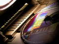
| 01/18/2006 07:37:48 PM | Legendary Rock Colorsby PascalComment: Greetings from the Critique Club
Pascal! What do you know. I've drawn another of your images for a critique.
Well, this time you're not running off the edge of the earth into a blazing sun, you're looking for a Rainbow. It's a great idea, but execution may have been a problem for you.
It seems to me that there is quite a bit of information in this image and you might want to remove some of it to make the center of attraction more obvious and important. For example, that white space in the top left, is the brightest thing in the image and it draws the attention of the viewer - not what you want to have happen. And it adds little to the 'Burst of Color' theme.
I'd suggest cropping down quite a bit, still leaving some of the horizontal bars in the frame (to avoid the dreaded copying another person's art work rule) and perhaps cropping into the colored arc just a bit as well.
Finally, Pascal, I'd suggest using a tripod for this type of image. It is just a tiny bit soft, and you might think about how it would look tack-sharp.
Okay, that'll give you something to go on, and I'm delighted to see that you are enjoying DPC. Keep up the good work. | | Photographer found comment helpful. |
| 01/18/2006 07:15:07 PM | |
| 01/18/2006 07:13:32 PM | |
|
Showing 7011 - 7020 of ~8912 |
Home -
Challenges -
Community -
League -
Photos -
Cameras -
Lenses -
Learn -
Help -
Terms of Use -
Privacy -
Top ^
DPChallenge, and website content and design, Copyright © 2001-2026 Challenging Technologies, LLC.
All digital photo copyrights belong to the photographers and may not be used without permission.
Current Server Time: 06/23/2026 01:35:01 AM EDT.
|