|
|
|
Showing 6881 - 6890 of ~8912 |
| Image |
Comment |
| 02/26/2006 10:50:34 AM | Inhabitantsby shabbychicComment: Greetings from the Critique Club
Hmmm, cattle pictures seemed to average in the 5.6 range in this Challenge.
;>)
You've got a good one and I very much enjoy the coloration you gave the image. The nice dull browns emphasize the 'cattle drive' aspect well. I wonder if a slightly less tight crop on that lead animal's horns would have been helpful to the composition. You blurred out the background well, so that the potentially distracting change from the slanted line of bright white to the darker horizon works.
Unfortunately, without any information on your settings and no comments in your "Photographer's Comments" areas, it's difficult to go much further with a critique than the above.
When you request a Critique, it sure does help the Critique Club if you provide this information.
Good luck in future DPC Challenges.
Alice
|  Photographer found comment helpful. Photographer found comment helpful. |
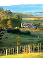
| 02/25/2006 02:38:56 PM | Constable Countryby KiwiShotzComment: Greetings from the Critique Club
Hello,KiwiPix. We meet again. It's always fun to critique one of your images; you show me new things.
I very much like the foreground fence. Any higher and it would have blocked the viewer from the remainder of the picture, as it is, it acts as a leading line and introduction to the rest. Good shadow control. (much darker would have been disaster)and lovely soft colors.
I do see your dilemma on the water and background mountains. Actually, the biggest problem I see in this very nice image is the bald, bright sky. YOu've been through all this already, I"m sure, but my suggestion would be to crop out the mountains & sky and just leave that heavenly blue water as the final backdrop to this gentle, peaceful photograph.
again, very nice. And good luck in your future DPC Challenges.
Alice | | Photographer found comment helpful. |
| 02/25/2006 02:21:38 PM | February Dawn and Fogby bacchusComment: Greetings from the Critique Club
From one fog connoisseur to another - you have a fine photo here. The diffused light one can sometimes find in dense fog makes it all worthwhile. You saw this and made the most of it. Composition works well with the nice horizontal from left to right and good interest in the sky and filigreed branches.
You received a good, if not great, score for this exceptional image. (What no cow?) So, perhaps it was that some people considered it a loose tie-in with the Challenge, or perhaps some folks thought you used a filter that caused your score to be (imo) lower than it might have been.
Ma Nature does make the best filters of all, and you found one.
Continued good shooting and capture some more snake shots.
Alice |
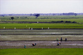
| 02/24/2006 03:54:06 PM | Planting Riceby davidus428Comment: Greetings from the Critique Club
What an interesting country you live in. This rice field picture gives great clues to the agricultural area where you shot it. Unfortunately, for the viewer, they are just clues.
I'd suggest moving in very close to some of the action. In moving your image around on my screen, I find an interesting composition in the lower right corner: the three clustered people and the three people standing behind them. I wonder if, with that nice 200mm lens of yours, it would have been possible to isolate them and their activity. Of course, you could have been too far away, and certainly you can't go back to try again. I'm just bringing out the idea of trying to present the most important and easiest to understand part of the story.
But, after checking over your portfolio and looking at some of your amazing close-up work, I realize you know all this, and certainly your competency with a camera is right up there.
So about all I can say, is continue to enjoy your DPC experience and I'll look forward to seeing more of your very nice images. |
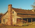
| 02/22/2006 07:20:00 PM | Rustic Cabinby swallaceComment: Greetings from the Critique Club
This is a nice, competent, image that certainly meets the Challenge, showing as it does, country life a century or so ago. I very much like the effort you took to capture this image at a good time of day. The soft, sunset colors, work well to bring out the textures in the wood. "The problem" as I see it, is that this is just a nice image. Now, if you had granny on the bench and a dawg on the ground, this would be country living as it is stereotypically perceived in the urban world. Of course the last sentence was a joke, but what I'm saying is a little life, or color, would make this image sparkle.
I wish you continued success in your DPC Challenge entries. You have a good eye!
Alice | | Photographer found comment helpful. |
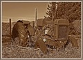
| 02/22/2006 06:54:59 PM | "Oliver"by blancericComment: Greetings from the Critique Club
From looking at your portfolio, I see you like to look at the same bridges I do. You have some nice interpretations there.
But now, to the image at hand. I can see this nice, almost generically Bolinian tractor very easily in my imagination. YOu've had a bunch of comments on oversharpening, and I won't add to them, although that was the first thing that caught my eye. What did bring me up short was the absence of strong values in this very nice image. I'd love to have seen more darks and real lights in this photo to contrast against the dull, rusty (broken) tractor. I have not personally used the sepia effect (although it's on my list) so I don't know what one would adjust to get more value change. (Or even if you want to. After all, it's your image and you might not agree!)
But I'm trying to figure out why this nice image didn't score much higher. And that may well have something to do with it. In any event, it was a nice find and the compostion works well for this Challenge.
Continued good luck in your DPC entries.
Alice |
| 02/22/2006 12:24:55 AM | | | Photographer found comment helpful. |
| 02/18/2006 05:24:30 PM | Blue Heronby DelRioPhotoComment: Now THIS is unique! I've seen one or two GGB shots, and this just about takes the Blue for creativity.
Yes, next time feel better and join the crowd.
Alice | | Photographer found comment helpful. |
| 02/16/2006 08:10:59 PM | the end...by reeveyComment: Greetings from the Critique Club
Love your lighting in your Shadow entry. It's always good to leave a little mystery in the picture and you certainly did that with your lighting and your subject matter. Technicals are good, I think, and the composition works well. I can only think that the subject matter brought your score down a bit. The implication of 'cutting' or 'self-inflicted wounds" is a frightening one to many people.
Still you did get a fairly good score, probably because no one could argue with the fact that you certainly met the Challenge, head on. Perhaps a less dark (no pun intended) subject next time will bring a better score your way. You have the technical skill.
I'll look forward to seeing more of your work on DPC.
Alice | | Photographer found comment helpful. |
| 02/15/2006 05:28:38 PM | | | Photographer found comment helpful. |
|
Showing 6881 - 6890 of ~8912 |
Home -
Challenges -
Community -
League -
Photos -
Cameras -
Lenses -
Learn -
Help -
Terms of Use -
Privacy -
Top ^
DPChallenge, and website content and design, Copyright © 2001-2026 Challenging Technologies, LLC.
All digital photo copyrights belong to the photographers and may not be used without permission.
Current Server Time: 06/23/2026 08:49:48 AM EDT.
|