| Image |
Comment |
| 07/10/2006 12:20:16 AM |
|
 Photographer found comment helpful. Photographer found comment helpful. |
| 07/04/2006 11:03:24 PM |
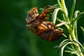
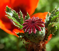
Carapaceby shamrockComment: Greetings from the Critique Club
Shamrock, very nice image you have here. And it scored comparatively well in this competitive crowd. Keep up the good work.
I've studied your very good specimen carefully and really like what you have done to 'imortalize' the creature. I'm glad you found a way to secure the critter so you could get a good image. Since it was just the shell, you could have taken the easy way and just picked the rosemary and brought him to a sheltered area. You did it the hard way and that earns extra points in my book.
Since this was a bokeh challenge, I'm going to be a little unorthodox here and suggest (after looking at this on my screen in many different cropping angles) that you might look at this again and crop say 1/8th to 1/4 of the image on the right left, ooops, I meant to say left! side. It still leaves plenty of bokeh/background, but it does concentrate on that very well defined carapace. Do you like it better? Maybe so? Maybe not?
About the only other idea for changing (not necessarily improving) your image would be to play around with lighting so the underside of the carapace has a bit more light play.
All this is beside the point. YOu have a good image and it scored well. Message edited by author 2006-07-12 00:28:44. |
| Photographer found comment helpful. |
| 07/03/2006 11:47:39 PM |
|
| 07/03/2006 11:47:22 PM |
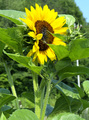
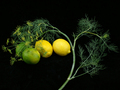
Sunflowerby asu_rowerComment: YOu found a great specimen of sunflower. Unfortunately, the background is a bit busy for the blossom. Maybe a little less depth of field. Then, that white stick, well, needs to be someplace else...
;>)
Still, a nice effort. |
| Photographer found comment helpful. |
| 07/03/2006 11:45:02 PM |
|
| Photographer found comment helpful. |
| 07/03/2006 11:44:22 PM |
|
| Photographer found comment helpful. |
| 07/03/2006 11:37:04 PM |
|
| Photographer found comment helpful. |
| 07/03/2006 11:33:42 PM |
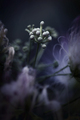
After rainby elislaComment: Love the colors in this. Wish it was cropped so that it wasn't quite so centered. But the blues in this are just wonderful. Good. |
| 07/03/2006 11:31:23 PM |
|
| Photographer found comment helpful. |
| 07/03/2006 11:30:04 PM |
|
| Photographer found comment helpful. |
Home -
Challenges -
Community -
League -
Photos -
Cameras -
Lenses -
Learn -
Help -
Terms of Use -
Privacy -
Top ^
DPChallenge, and website content and design, Copyright © 2001-2026 Challenging Technologies, LLC.
All digital photo copyrights belong to the photographers and may not be used without permission.
Current Server Time: 06/23/2026 09:53:11 PM EDT.