| Image |
Comment |
| 10/18/2006 11:49:02 AM |
|
 Photographer found comment helpful. Photographer found comment helpful. |
| 10/18/2006 11:48:18 AM |
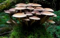
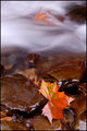
Small Crowdby jrdawsonComment: Good seeing and nice composition. Excellent color. wish those elegant fungi were in slightly better focus... |
| 10/18/2006 12:51:11 AM |
|
| Photographer found comment helpful. |
| 10/18/2006 12:23:21 AM |
|
| Photographer found comment helpful. |
| 10/17/2006 11:00:38 PM |
How much Woodchuck do your Ducks chuck?by theSajComment: I suppose, The Saj, you are posting this to "prove a point" but as long as you have posted it, I'll give you my opinion of the image:
Just as I feel strongly that cigarette companies should not advertise their products along with "candy-flavored cigarettes" or stuffed animals like "Joe Camels", so do I also believe that adult beverages should not be surrounded by kids toys.
If I'm wrong, and the beverage is not hard cider containing alcohol, than I apologize for the post. |
| Photographer found comment helpful. |
| 10/17/2006 09:13:45 PM |
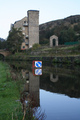
Rural Graffitiby bucketComment: Greetings from the Critique Club
Interesting image with lots to look at and composed so that it is a pleasure to linger. I like the way it is stopped at top and bottom with darkness (and I looked at it many different ways on my monitor).
You selected a good crop here, I think.
I also like the way you made your lens work in your favor in this image by having the towers lean in towards something strong in the middle. The bleakness indicated by the strong black & white, coupled with the graffiti make this a good, compelling image.
Considering the tough field of competition in this Challenge, I'll just say, "Good one" and let it go at that.
Keep up the good work, and a reminder: there's always room in the Critique Club for people of your caliber if you have a little time to spare.
SFAlice |
| Photographer found comment helpful. |
| 10/17/2006 07:31:33 PM |
|
| Photographer found comment helpful. |
| 10/17/2006 07:29:35 PM |
|
| Photographer found comment helpful. |
| 10/17/2006 05:20:10 PM |
Hopeby EyesupComment: Greetings from the Critique Club
Welcome to DPC. I see this is just your second Challenge entry and you already have a feel for the community as many photographers have commented on your entry and have given you valuable information if find it helpful.
Your entry was selected at random by the 'elves' that live in the DPC Critique Club program, and I was lucky enough to draw your image.
Since many of the points I might address have already been touched on by those who commented during and after the Challenge, I'll limit myself to just one compositional suggestion. And, obviously, this is just a suggestion:
Very frequently, when an image is divided in half (in this instance: cross in one half; statue in the other) a viewer doesn't know which is more important, and simply moves on to the next image in the queue. Since we want the viewer to linger and appreciate our own work, it is usually best to make one section of the image more important than the other. In this case, the statue is more in focus and could have taken up more of the space with ease, and also might have given a stronger reason for the background cross to be OOF.
In any event, I do hope you enjoy your participation in DPC. I'll look forward to seeing more of your work.
SFAlice |
| Photographer found comment helpful. |
| 10/17/2006 02:00:06 PM |
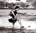
Rushby escapetoozComment: Greetings from the Critique Club
Very good stop-action shot of Tony here. And as a bonus, you get a comment from one of the best photographers at DPC:  e301 e301
If you have the time, you might want to wander through his portfolio and also read a few of his comments to other photographers on the site.
Anyhow, all this is a hard act to follow, but I'll try. My first impression of this image was that it is quite busy. I don't know Lake Havasu, but I wonder, since it's big enough for a speedboat to pull Tony, then maybe another angle would have given you more surfer and less intrusive background.
Still, you have an image you can be proud of and you scored quite well in this Challenge.
Keep up the good work.
SFAlice |
| Photographer found comment helpful. |
Home -
Challenges -
Community -
League -
Photos -
Cameras -
Lenses -
Learn -
Help -
Terms of Use -
Privacy -
Top ^
DPChallenge, and website content and design, Copyright © 2001-2026 Challenging Technologies, LLC.
All digital photo copyrights belong to the photographers and may not be used without permission.
Current Server Time: 06/24/2026 06:42:43 PM EDT.