| Author | Thread |
|
|
10/17/2006 05:20:10 PM |
Greetings from the Critique Club
Welcome to DPC. I see this is just your second Challenge entry and you already have a feel for the community as many photographers have commented on your entry and have given you valuable information if find it helpful.
Your entry was selected at random by the 'elves' that live in the DPC Critique Club program, and I was lucky enough to draw your image.
Since many of the points I might address have already been touched on by those who commented during and after the Challenge, I'll limit myself to just one compositional suggestion. And, obviously, this is just a suggestion:
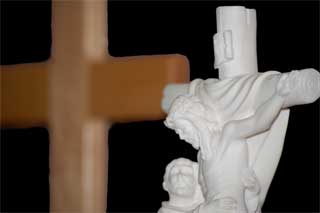
Very frequently, when an image is divided in half (in this instance: cross in one half; statue in the other) a viewer doesn't know which is more important, and simply moves on to the next image in the queue. Since we want the viewer to linger and appreciate our own work, it is usually best to make one section of the image more important than the other. In this case, the statue is more in focus and could have taken up more of the space with ease, and also might have given a stronger reason for the background cross to be OOF.
In any event, I do hope you enjoy your participation in DPC. I'll look forward to seeing more of your work.
SFAlice |
|
 Photographer found comment helpful. Photographer found comment helpful. |
|
|
10/12/2006 01:03:54 AM |
As far as the exposure it looks fine. It has a bit too tight of a crop...wish I could see more of the crosses. The size is probably the biggest stumbling block...always use the max of 640 on the longest side.
And Welcome to DPC...don't get to caught up on the score just enter what you like and keep improving...that's why we all joined.
Clint |
|
| Photographer found comment helpful. |
|
|
10/11/2006 06:43:22 PM |
Originally posted by Falc:
So my guess is you managed to hit just about every OFF button at DPC. The only other ones you missed were pets and kids ;-)
Sad but true I'm afraid. |
And the American Flag tends to get voted down pretty quickly as well |
|
|
|
10/11/2006 10:52:45 AM |
OK there are a number of areas for improvement here.
1. Size - already mentioned. Voters tend to deduct marks if the image is too small
2. Lighting - very flat. Photography is abouty capturing light and to make the best images you have to have exceptional light. Side light, window light, moon light, flash light, misty light but not flat light.
3. Topic - religion, bibles, crosses, beads all represent an opportunity for the non-religious voter to deduct marks, Stay away from these subjects if you want votes.
4. Statues - almost running into the 'literal artwork' argument here, but statues and toys again have trouble attracting votes.
So my guess is you managed to hit just about every OFF button at DPC. The only other ones you missed were pets and kids ;-)
Sad but true I'm afraid. |
|
| Photographer found comment helpful. |
|
|
10/11/2006 10:33:16 AM |
|
I think using a tripod would have helped. Slowing down the shutter speed would get you an f-stop that would have all of the subject (the white statue) in focus. I'd leave the wooden cross out. |
|
| Photographer found comment helpful. |
|
|
10/11/2006 09:42:12 AM |
from experience voters dont go for religious pictures, one.
statutes dont seem to do well either.
then it was too small.
but it is sharp, exposure is right.
better luck next time, dont give up. |
|
| Photographer found comment helpful. |
|
|
10/11/2006 09:21:11 AM |
I find that the two subjects are clashing with one another. How they overlay on top of the other. The wood cross is really out of focus but sharply outlined. Which gives it the feel of being cut and pasted, even though it wasn't.
I like the exposure on the white cross. But you've cut off the other person's head. You've also cut off the right edge of the cross.
Lastly, there is no border. Everything is cropped so tightly as to not allow the viewer's eyes to back up from the subject.
Hope that helps. Stick with it. You'll improve greatly on this site. |
|
| Photographer found comment helpful. |
|
|
10/11/2006 09:18:25 AM |
Did you find this shot interesting? If so, why?
It's called hope. What is hope? How is hope displayed in this image?
To me, it's a very unattractive image. There's nothing in it. Useless.
I can't tell you how to score higher, but, I think you should try to look more. Look at images that interest you and ask yourself what really is that grabs you. Why an image tells you something and how it's done.
If you have something to say like 'hope', then work on ways to get the message across. A statue and a cross in the image means nothing to me and there will be many others like me too. Of course, I know what the cross is and what's it about - but not because of your photograph.
If you don't understand how something is done, you can always find out by asking on DPC or from other sources.
.... my thoughts. |
|
| Photographer found comment helpful. |
|
|
10/11/2006 09:10:13 AM |
The edges of the cross in the background look as they were processed. Besides, the white cross is not entierly in focus. With a better positioning of lights, you could have more relief. The crop is too tight.
|
|
| Photographer found comment helpful. |
|
|
10/11/2006 02:21:34 AM |
Biggest reason why this didn't do good Mike, is that the size is so small. Gotta use the max 640.
Second, religous shots like this usually don't score well, not disagreeing or agreeing with that, just a fact. |
|
| Photographer found comment helpful. |
Comments Made During the Challenge  |
|
|
10/10/2006 05:22:16 PM |
|
Interesting idea. Needs to be larger |
|
| Photographer found comment helpful. |
|
|
10/07/2006 04:54:32 PM |
|
It would have been nice to see more detail |
|
|
|
10/04/2006 08:29:49 PM |
|
The cross in the background is somewhat distracting, would have worked just as well or better on a flat black background. Using a flash off to the side would improve contrast as well. |
|
| Photographer found comment helpful. |
|
|
10/04/2006 05:12:27 PM |
|
I like religious icons and it is a nice photo with the depth of field blurring the wood cross behind it. But, I almost thing leaving that space on the left void (empty space) would have provided more of the themed "contrast". |
|
| Photographer found comment helpful. |
|
|
10/04/2006 12:53:03 AM |
|
Home -
Challenges -
Community -
League -
Photos -
Cameras -
Lenses -
Learn -
Help -
Terms of Use -
Privacy -
Top ^
DPChallenge, and website content and design, Copyright © 2001-2026 Challenging Technologies, LLC.
All digital photo copyrights belong to the photographers and may not be used without permission.
Current Server Time: 06/28/2026 04:57:39 PM EDT.