|
|
|
Showing 6211 - 6220 of ~8911 |
| Image |
Comment |
| 05/07/2007 10:46:52 AM | Flowersby mian3010Comment: Greetings from the Critique Club
It's always nice to see floral subjects in a triptych. They lend themselves to some unusual combinations.
Your triptych has two warm toned images and one cool one. I wonder if it would have been more harmonious to have all the flowers the same tone, either warm or cool. Then, the image on the left and in the middle have green backgrounds, while the pansy has a rather busy floral with some sort of structure in the background. You might consider replacing that with a image with a simpler background for a more pleasing effect.
Finally, yes, if your camera will support it, a shallower depth of field would work wonders to make those blossoms 'pop' because it would blur the background and take away the distractions.
I see this is only your third Challenge. Welcome to DPC, and I shall look forward to seeing more of your work. |  Photographer found comment helpful. Photographer found comment helpful. |
| 05/05/2007 03:17:15 PM | His smile stands out from the othersby albc28Comment: Greetings from the Critique Club
What a happy bunch of guys you photographed. This is certainly a keeper for all your scrapbooks.
Technically, this image is a bit 'hot' and has a few distracting shadows (the left side, particularly, and the faces) that make this something of a candid shot.
Then, since this challenge was The Rule of Thirds, you will find that most people with uccessful images placed one strong subject in one of the sweet spots associated with the Rule and the rest of the composition was subordiate to that strong subject.
But all that aside, it's tough to fault a picture that shows three happy guys in fun shirts goofing off for the camera. I'm glad to have seen it and hope to see lots more images from you.
SFAlice | | Photographer found comment helpful. |
| 05/05/2007 02:00:14 PM | Two thirds of the way to summerby joekentComment: Greetings from the Critique Club
What a nice way to celebrate the coming of summer. A nice sunny day at the beach with your family.
This image has a few problems that our voters picked up on. Technically, I'd say it is a bit 'hot'. With RAW you can dial the exposure up or down, and it would be interesting to see how this would look with less light directed at the subject.
Then, since this challenge was The Rule of Thirds, you will find that most people placed one strong subject in one of the sweet spots associated with the Rule and the rest of the composition was subordiate to that strong subject. Here the flip flops are equally strong, and take away from the rule. If they were both placed in the lower right (for example) it would have exemplified the rule quite well.
Still, it is a pleasant image; one that you will have as a reminder of a happy day.
| | Photographer found comment helpful. |
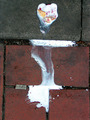
| 05/05/2007 01:47:26 PM | Flowing Delightby unknowndeathComment: Greetings from the Critique Club
Hello! I spent a long time looking at your interesting abstract wondering why it received such a low score. It's an abstract into which one can read many interpretations. Right now, I see a dancing figure.
Then, the light dawned: the Challenge asked us to illustrate the Rule of Thirds, and your composition has as its main attraction that nice design of white smack in the middle of the image.
Technically, I like the good definition in the bricks and the color is really good. It's a pleasing piece to look at and (imo)it surely would have received a higher score if it came closer to an interpretation of the Challenge.
I really like the way your imagination functions. Keep 'em coming!
SFAlice |
| 05/05/2007 12:58:32 PM | Self Portrait In Bubbleby JoshuaRaineyPhotographyComment: Greetings from the Critique Club
Welcome to DPC. I see this is your first entry, and what a fine entry it is.
Technically difficult, you pulled it off beautifully. It's interesting on many different levels, thus keeping the viewer involved for a long time.
Just a thought - Right now, the image is almost exactly half 'n half. I wonder how this very nice image would look with just a little of the black area at the bottom cropped out.
Other than that, I'll just say congratulations on a very nice image and I wish you continued success here at DPC.
SFAlice | | Photographer found comment helpful. |
| 05/05/2007 12:50:41 PM | Burbujas de amorby libitumComment: Greetings from the Critique Club
Lovely rose, delightful capture.
And at the outset, I'll say: "they look like bubbles to me. Probably soap bubbles, at that."
While I wish people would not get 'picky' about such things as 'drops' and 'bubbles' they do and that's just a fact of DPC life. When viewers/voters look at a rose, they expect 'drops' and see accordingly. From your score, it's nice to see that many voters did appreciate the fine image you made and its bubbles.
This flower lends itself to many interpretations. Your slightly soft-focus rendition is pleasing and the bubbles turned out nice and sharp, making a good contrast. Colors are excellent, placement in the frame is appealing.
I see you are fairly new to DPC. Keep those nice images coming. I for one look forward to seeing more of your work.
SFAlice | | Photographer found comment helpful. |
| 05/05/2007 12:41:24 PM | Slideby freakin_hilariousComment: Greetings from the Critique Club
(Sigh) How does one critique an abstract... Very carefully, I know.
Seriously, I like this a lot. The composition is delightful, keeping this viewer in the picture a long time. The colors are pleasant, making the image quietly pleasing as well.
Because many of our viewers/voters have monitors calibrated differently, I've found that 'dark' images sometimes fare badly, simply because viewers can't see them properly. That's the nature of the game, and I guess it's consideration depending on what you're looking for in an entry. Personally, I'm glad you entered this one, 'cause it is lovely and a pleasure to view.
SFAlice | | Photographer found comment helpful. |
| 05/05/2007 12:33:25 PM | Early Morning Swim: Braving The Coldby hotpastaComment: Greetings from the Critique Club
You began with a very nice image, and enhanced it to a different level and you were well rewarded for your efforts. Congratulations on your very nice placement.
With a score of 6.61 and placement of 23rd out of 374, I'm not sure what I can tell you to 'improve' this image, so I'm not even going to try.
But you have an excellent track record at DPC, and if you are not already a member of the Critique Club, well, it is people of your expertise who would really help this feature of DPC.
Come on in! The Water's Fine.
SFAlice | | Photographer found comment helpful. |
| 05/05/2007 12:27:54 PM | Dead yet vibrantby xavierhockey30Comment: Greetings from the Critique Club
I'm one of those who looks for, and finds, animals in all sorts of places. And you have a delightful one in your image. see the head to the left, and the reclining body along the log as it trails off to the right? Okay, that out of the way, here goes.
You questioned in your remarks about the focusing of your image. Yes, it appears to lack focus in what I imagine to be the section of the log illustrating the Rule of Thirds, the left side. The trees are indeed distracting. Sometimes a different angle can eliminate such distractions. Crouching down or moving to a different position can sometimes do wonders to get rid of elements you don't want to show.
You've got your feet wet in DPC now, and I hope you enjoyed your first attempt. I wish you success in your time here and look forward to seeing more of your work.
SFAlice |
| 05/05/2007 12:17:06 PM | Bubbles in the Hazeby kjhunter2250Comment: Greetings from the Critique Club
My first thought on seeing this image was: "Oh, Pretty!"
I loved the soft blues and the faint outline of your granddaughter's head. It's a unique take on the Challenge.
Technically, it's a bit difficult because of the lack of contrast. Some of our viewers/voters have monitors calibrated differently than yours, and thus they might find this subtle image hard to find. And, that bright white blob on the profile of your granddaughter is distracting.
Still, for your first attempt here at DPC, you entered a charming image that met the Challenge in a unique way and I'm pleased to have had the chance to view it. I'll look forward to seeing more of your photography.
| | Photographer found comment helpful. |
|
Showing 6211 - 6220 of ~8911 |
Home -
Challenges -
Community -
League -
Photos -
Cameras -
Lenses -
Learn -
Help -
Terms of Use -
Privacy -
Top ^
DPChallenge, and website content and design, Copyright © 2001-2026 Challenging Technologies, LLC.
All digital photo copyrights belong to the photographers and may not be used without permission.
Current Server Time: 06/26/2026 03:12:29 PM EDT.
|