|
|
|
Showing 6181 - 6190 of ~8911 |
| Image |
Comment |
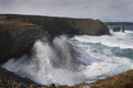
| 05/12/2007 10:00:59 AM | I will get you!by lastefComment: Greetings from the critique Club
Oh,what a nice moody image you have here. I love the way you captured the waves crashing against the rocks. And yes, the sea gets us all eventually, doesn't it...
I can see this as a big oil painting, showing the insignificance of man against the sea along with the bleakness of the bluffs on which he stands. But, like a few of the other people who commented on your picture, it would have been nice to see a little more color in the image. Color might have added contrast that makes the isolation stand out even more.
In any event, you have a nice piece here and I enjoyed looking at it.
I see you are in Akureyri! When I visited Iceland a loooong time ago, I was taken with the beauty of your city way up there near the Arctic Circle. |  Photographer found comment helpful. Photographer found comment helpful. |
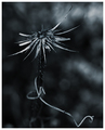
| 05/12/2007 09:52:01 AM | Crownby freakin_hilariousComment: Greetings from the Critique Club
Well, it's always nice to get an image to critique that is well done. I get to look at a good piece and get to say nice things.
It's beautifully composed in the frame, and the monotone treatment gives it the austerity you undoubtedly were trying for. The beautifully blurred background acts as a nice foil to the starkness of the main attraction. If it was mine, I'd probably try to get all the stem sharp. But I don't know if that would be an 'improvement'; just different.
In any event you have a nice image here and your score wasn't that crappy.
| | Photographer found comment helpful. |
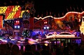
| 05/12/2007 09:38:05 AM | Funfairby bjoernComment: Greetings from the Critique Club
What a find! And a great capture of this incredible night scene. Not easy to do, IMO, but you did it.
There's the nicely in-focus lantern in the 'sweet spot' and all the motion behind it. You've captured the frenetic motion very well in this image.
Our voters are a hurried bunch, and they probably saw all the pieces without looking for the comprehensive whole. In my opinion, they missed the boat, but you didn't.
Keep up the good work and to heck with the scoring. | | Photographer found comment helpful. |
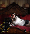
| 05/11/2007 06:19:16 PM | Just What I Needby LiehscComment: Greetings from the Critique Club
Now there's a man who likes his vodka martinis!
Very nice light to dark shades in this black & white image. And I very much like the way you used the black paper to curve around the background. It looks seamless and professional.
If it was mine, I'd probably try to control the ambient lighting a bit more. As some of your commentors said, the room is well represented in the bottle. Another way around the ambient light problem might be to frost the bottle as you have the glass. Might be messy, but might be interesting.
As far as composition goes, while I like the off-center position of the bottle and glass (the glass is VERY well done, by the way) I'm not sure why the items are offset. I think the left side of this very nice image could use a bit more punch. For example, if the gentle streak of light caused by the curve in the black paper were brighter, it might lead the viewer to the main attraction.
Okay, that's your 2¢ from this Critique Club member. And I do wish you much success in DPC. | | Photographer found comment helpful. |
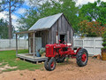
| 05/11/2007 02:31:38 PM | World's Smallest Farmby kelmatComment: Greetings from the Critique Club
Ha Ha. All it needs is a rocking chair on the front porch! And maybee a dawg...
Technically, this is nicely exposed with the reds and weathered grays good foils for each other. Nice subdued shadows make the colors glow. As one of your commentors mentioned, the trees are a bit green, but what the heck, it's spring.
Composition: Well that half-a-tree on the right side bothers me a bit. The image could well stand some closer cropping on the right side and on the bottom, thus removing that half-a-tree (which is anachronistic anyhow) and perhaps giving the image more pop factor. Try it and see what you think.
Overall, I think it was a good find and you handled it nicely.
You're new to DPC so let me be among the first to welcome you to the site. I hope you have fun here and I'll look forward to seeing more of your work. | | Photographer found comment helpful. |
| 05/11/2007 11:05:59 AM | Odd Kittiesby RiderGalComment: Greetings from the Critique Club
Well, this is a difficult sssignment: How do I critique Art (with a capital "A")
First of all, I like your piece, a lot. Great placement of the lamps, sofa, person, cats, even that thing with the yellow trim. Lighting is good for the mood you were evoking, with those dusky colors in the background and the soft, natural lighting on the person. Any brighter and the illusion would have left.
Of course the kittens are a bonus attraction, and it's a delight to come across them when one takes the time to find them.
But you know what our hurried voters saw and didn't see. They missed the story entirely and saw only the multitude of individual pieces. They called it "busy" and voted low and moved on.
I expect you are not too upset over your score. From examining your portfolio, yOu know you're good and you know you have a good piece here.
Enjoy your time among the beautiful hills of Ithaca. I have fond memories of the Cornell campus. | | Photographer found comment helpful. |
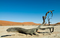
| 05/10/2007 03:25:49 PM | Chasing the treeby lecter1963Comment: Greetings from the Critique Club
Namibia. Wow, our members sure do get around!
Good colors in this bright and spare image. I very much like the orange in the hills contrasting with the complementary blue of the sky.
What bothers me a bit, compositionally, in this image is that all the interest seems to be in the right side of the frame. The rather featureless left end of the log and the somewhat over-exposed sand don't hold my interest very long, while the branches both in the log and the trees way back are intriguing and worth a second look. In tricky lighting situations like this, I always like to bracket my shots.
While I hope this information is helpful to you, it's all just my opinion.
This is only your third submission. I hope you find time to submit many more, as I look forward to seeing more images from you in future Challenges. | | Photographer found comment helpful. |
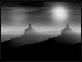
| 05/10/2007 03:12:18 PM | Climbing Highby NatashaComment: Greetings from the Critique Club
 Natasha Natasha, Nice Work!
I love to see this kind of experimentation and that's why it's fun to be in the Critique Club; surprises like this come along once in a while.
Your black to white balance is beautiful, and your subject matter intriguing. It could be desert plateaus in Arizona, or on Mars as one of your commentators suggests with his SciFi comment. Or it could be a couple of fully armed aliens...or...
About the only compositional thing that bothers me about this fine image is the number of light rays you've added. Two suns could be believable, but that extra set of rays, to me, well, maybe a bit much.
And yes, I see the vertical black line another commentator noticed. I bet you didn't see it until it was too late.
I'm glad you entered, and please don't wait a long time before you enter again! | | Photographer found comment helpful. |
| 05/10/2007 11:06:30 AM | Spring Beautyby rbeckerComment: Greetings from the Critique Club
Isn't it nice to see the spring flowers again? Daffodils and jonquils are some of the first to appear and with their unique shapes are fun to watch develop.
I like the way you placed the flower in the frame and I wonder if a different exposure would have made this image more successful. The background is a bit too prominent, and since I can't understand your stated settings, I'll just suggest a low number ISO with the same f4. Or blur it out in Photoshop, since this was Expert Editing. Your flower seems to have lost color as well with, perhaps, some of the original yellow still visible around the center of the petals.
Just a little tip: In a situation like this, I usually try to bracket my shots, and in addition, in the bright sun, carry an umbrella or some shading device so the subject matter is not in the full light.
You're just getting your feet wet at DPC, and I look forward to seeing more of your work in future Challenges. |
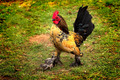
| 05/10/2007 01:52:03 AM | Bootsby GrandadComment: Greetings from the Critique Club
GREAT rooster! Love his feet with their feathered pantaloons.
You have a wonderful subject, and if you get a chance, you might try shooting him from different angles to see what shows him off best. For example, you might get down to his level to try a shot. Since this guy isn't perfectly sharp, I'd also suggest bracketing your shots to get a really good one.
Finally, and you may have done this deliberately, it is just a touch distracting to see the vignetting on this image. If you're trying to put Mr. Rooster in the spotlight, my suggestion would be to make the vignetting even darker, but not so dark as to obliterate the background.
In any event, you have a delightful shot of a chicken who is supremely proud of himself, and probably you have a nice reminder of a pleasant day. | | Photographer found comment helpful. |
|
Showing 6181 - 6190 of ~8911 |
Home -
Challenges -
Community -
League -
Photos -
Cameras -
Lenses -
Learn -
Help -
Terms of Use -
Privacy -
Top ^
DPChallenge, and website content and design, Copyright © 2001-2026 Challenging Technologies, LLC.
All digital photo copyrights belong to the photographers and may not be used without permission.
Current Server Time: 06/26/2026 04:59:09 PM EDT.
|