Greetings from the Critique Club
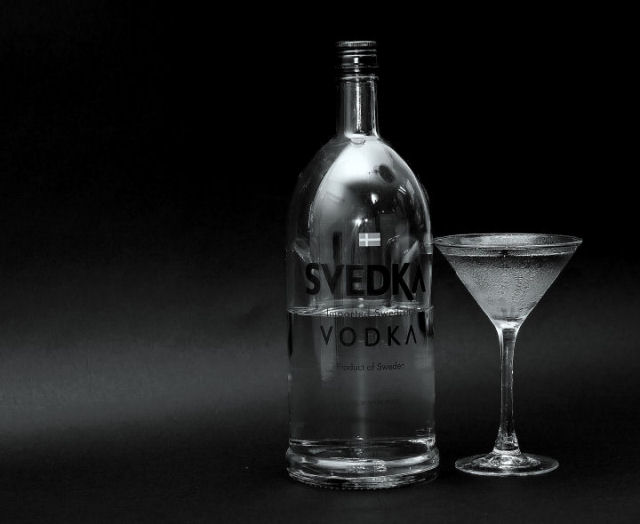
Now there's a man who likes his vodka martinis!
Very nice light to dark shades in this black & white image. And I very much like the way you used the black paper to curve around the background. It looks seamless and professional.
If it was mine, I'd probably try to control the ambient lighting a bit more. As some of your commentors said, the room is well represented in the bottle. Another way around the ambient light problem might be to frost the bottle as you have the glass. Might be messy, but might be interesting.
As far as composition goes, while I like the off-center position of the bottle and glass (the glass is VERY well done, by the way) I'm not sure why the items are offset. I think the left side of this very nice image could use a bit more punch. For example, if the gentle streak of light caused by the curve in the black paper were brighter, it might lead the viewer to the main attraction.
Okay, that's your 2¢ from this Critique Club member. And I do wish you much success in DPC. |




 Add photograph to your favorites
 Add photographer to your favorites


 Photographer found comment helpful.


