|
|
|
Showing 3431 - 3440 of ~8911 |
| Image |
Comment |
| 01/27/2010 12:09:15 AM | |  Photographer found comment helpful. Photographer found comment helpful. |
| 01/25/2010 07:35:52 PM | | | Photographer found comment helpful. |
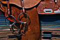
| 01/25/2010 03:36:13 PM | Just a "Bit" Happyby digichicComment: Greetings from the Critique Club
What excellent colors you found for this very interesting entry in the Smile Challenge. Very well photographed and excellent detail here. Fabric details, leather quality and tooling all show off to perfections.
Are you waiting for the "but?" It is hard to find one. true, you have included more real estate than required for the Challenge topic, but in a way it made it fun to search for the smile. Our busy voters? Well, not so much into searching. The very nice detail on the saddle blanket; that black arrow, does obscure your "Smile" just a little, making it even more of a challenge to find it.
All this may be why you scored in the middle instead of at the top of the pack. (herd?) In any event, you did get a good scoring number and you have an image you can be justly proud of.
Keep up the good work. | | Photographer found comment helpful. |
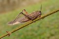
| 01/24/2010 08:58:36 PM | clinging to the branchby GiorgioBaruffiComment: GREETINGS FROM THE CRITIQUE CLUB
Oh, what a great find you have here, and look at the number of people who guessed it was YOU! Congratulations on being so well known, and with such a good entry!
Okay, to the business at hand. First, there were some tremendous insect pictures in this Challenge; yours was one of many good ones.
Second, it would be great to see the colors in the critter intensified a bit. There's still a lot of red in that guy to pull out and some yellow, and yes some green to intensify that background. If it was mine, I'd probably also crop down a bunch. Say start just to the rear of that bud on the branch. Measure about as much room to the front of the legs as between them. (On my screen, that's about an inch and a little). In other words, give him just enough room to move forward a little. I think the top is good the way it is.
All this fine-tuning might just give your very fine insect a little more 'pop.'
Keep up the good work. You're doing just fine.
| | Photographer found comment helpful. |
| 01/24/2010 08:28:24 PM | Noooo! Johnny Speak to Me!by jhess77Comment: GREETINGS FROM THE CRITIQUE CLUB
Congratulations on your very nice finish in the Humor Challenge with this charming image.
You really don't need much of a 'critique' on this carefully thought out and technically nice image, so with a 'well done' comment from me, I guess I'll move on to the next image in the queue.
I wish you continued success in your DPC entries. | | Photographer found comment helpful. |
| 01/24/2010 08:13:07 PM | | | Photographer found comment helpful. |
| 01/24/2010 02:49:18 PM | Freedom (Golden Gate, Freestate)by tinkie2010Comment: GREETINGS FROM THE CRITIQUE CLUB
What a lovely bit of South Africa you have presented here.
I rather enjoyed your remarks in the data line: "My preffered post processing process was follow and colour scheme is how I preferred it." but it leaves me little to actually critique, doesn't it.
Here goes anyhow: It goes without saying that you have captured a fine image of the landscape. If you had taken the image at a different time of day, you might have also captured more shadows in the hills and valleys to add even more interest to your composition. Since this was Advanced Editing, perhaps a touch more saturation in just that elegant foreground land area would have added to the already good score you received for this image. Also, (and then, I'll quit, I promise) there is the little bit of shrubbery in the left foreground. In my opinion, and just my opinion, that could have either been utilized a little more to add to the depth of the view or discarded.
Finally, while I do like the idea of borders, it was the first thing I saw when I opened your image. Not sure that's the effect you want, but there it is.
Your title is wonderful! I live in northern California and we have a Golden Gate of our own, but (alas) no "FreeState."
I was really pleased to have a second look at this very fine entry in the Challenge and wish you continued success at DPC. | | Photographer found comment helpful. |
| 01/24/2010 12:37:35 PM | | | Photographer found comment helpful. |
| 01/24/2010 11:09:07 AM | Reflections? Not quite :)by sarampoComment: GREETINGS FROM THE CRITIQUE CLUB
You are very good at these refracted water drop images. I very much like that you reversed the colors so that they line up with the pencils. and yes, having personally tried working with water drop photography, I agree that glycerine is a BIG help doing these.
I do think you may have processed this a bit more than necessary to get a pleasing effect. I rather think the bright hot spots detract from the overall composition, but that's just one DPCer's opinion. One person's 'hot spots' could be another person's 'design elements.'
You achieved a good score for this image, especially in this tough challenge with so many excellent pictures.
Keep up the good work! Message edited by author 2010-01-24 12:36:19. | | Photographer found comment helpful. |
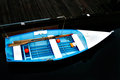
| 01/23/2010 08:38:13 PM | Simple Boatby MJITBComment: GREETINGS FROM THE CRITIQUE CLUB
Hello  MJITB MJITB! I see you are fairly new to DPC and I do hope you are enjoying the site. It is great for learning about photography and, of course, the people are just as helpful as can they can be.
I will first suggest that simplicity is one of the most difficult photographic feats to pull off. So, if you are starting out, wow, you have set yourself a great goal. You can do it. But study the masters; there is plenty of material on the web.
Meanwhile, back to this image: beautiful focus on the boat. excellent to see the two red balls that balance the composition. There are two rectangular white areas that do not appear to be part of the story. (psssst, remove them)
The dock is still visible. Um, this is a delicate area at DPC. was it so prominent that it 'must' remain, or was it so obscure in the original that it could be removed completely. Obviously, your subject matter was the boat and the blue/white shaft that held it.
I dunno. I could go on and on, but I wasn't there - you were.
Okay, truth in advertising: when I saw this image in competition, I did not vote it high. If the boat filled the frame at a different angle, if the dock wasn't there, it would be (IMO) a winner. but heck, I'm just another DPCer, what do I know, really!
In any event, my suggestion would be: if you are going for simplicity, go all the way. isolate, isolate. I think you can do it.
And I look forward to seeing more of your work. | | Photographer found comment helpful. |
|
Showing 3431 - 3440 of ~8911 |
Home -
Challenges -
Community -
League -
Photos -
Cameras -
Lenses -
Learn -
Help -
Terms of Use -
Privacy -
Top ^
DPChallenge, and website content and design, Copyright © 2001-2026 Challenging Technologies, LLC.
All digital photo copyrights belong to the photographers and may not be used without permission.
Current Server Time: 07/22/2026 06:25:29 AM EDT.
|