|
|
|
Showing 3191 - 3200 of ~8911 |
| Image |
Comment |
| 04/07/2010 09:20:45 PM | The striped outcastby giantmikeComment: Greetings from the Critique Club
What a nice, vibrant, very Orange image you have here. And, yes, it scored nicely, so congratulations on that.
You did find an interesting subject and photographed it well. Since this is a critique from the Critique Club, I'll 'nit pic' a little and wonder if it would be even better if that left-hand flower had been a bit closer and a tad behind the the very fine striped tulip. that would concentrate the viewer on the great shades of orange, and reduce some of the slight green stem distraction. this is just musing, you understand. It's fine as is. However, it is always fun to play around after your composition is in the bag. This is when you find the surprises that sometimes work - sometimes not.
So, again, congratulations on your image. Keep 'em coming.
Alice |  Photographer found comment helpful. Photographer found comment helpful. |
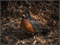
| 04/07/2010 09:08:27 PM | Watch Birdby mBastinComment: Greetings from the Critique Club
Great capture,  mBastin mBastin! It's a beautiful bird and looks pretty good from here.
It was sitting in a tough habitat and that may have been what did you in. It would have been fairly difficult to get this little guy in sharp focus and still blur out the background. The background is what's giving the most trouble here because it is essentially the same value and intensity as the bird and therefore fights with the bird for the "look at me" factor.
As you get to know that lovely new lens of yours, you will find it easier to isolate your subject from the background.
Now, yes, you had your requisite comment about the centered composition, and I'll add another. It would still be a fine composition if you came in to just before that bird's tail and drew the frame to include most of the rest of the left side of the image. See what you think, after you try it.
All of us have our own ways of looking at a picture. You have yours, and you will have a wonderful time fine-tuning your way. Keep 'em coming. I will look forward to seeing more of your work.
Alice | | Photographer found comment helpful. |
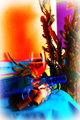
| 04/07/2010 08:10:47 PM | Orange You Going To Join Meby Luci11eComment: Greetings from the Critique Club
WooHoo, I LOVE it,  Luci11e Luci11e! Yeah, I know, we have Critique Club things to talk about, but dang, this is GOOD.
Yes, this is an art piece and yes, with one modification, I'd hang it on my wall - if I could find space. You solved many problems, including the reflective glass problem. (and for those who haven't tried it, photographing glass is a PITA except as done here.) You found complimentary colors that just shouted "look at me!" and they worked. Your overall composition is just fine.
Are you waiting for the But? Yeah, it's that vignette. IMO it's just a tad too big. Your strong composition and colors do not need that wimpy white space at the edges. Sure, the vignette is okay, but not-so-much of it, again in my opinion, of course.
So the scoring was dreadful, so what. You have a fine image. Appreciate it.
Alice | | Photographer found comment helpful. |
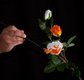
| 04/07/2010 07:48:04 PM | Painting the Roses... Orange???by MinsoPhotoComment: Greetings from the Critique Club
LOL, jminso, you get an Alice to critique an 'Alice' image. Heh, heh. You also get a painter, so that's where this Critique will head.
First, you didn't do all that badly in the scoring, especially in this tough Challenge.
Now, that second rose: if you were using watercolor paints (or anything that you can dilute, other than oils), you might thin it down lots with water and then just dunk the rose in it & keep it upside down until fairly dry. Presently, the poor thing just looks (er, ahem) destroyed. Then, on the foreground rose, I don't know what that rectangular orange slice of paper(?) is doing there. For verisimilitude, it would have been lots better to just hold a paint-loaded orange brush next to, or on a petal. The lighting to me is okay, and I don't mind the hand. Probably helps.
The completely black background is a strong plus and sets off your composition nicely.
So, to sum up, you did well, and obviously enjoyed making this image, so a big plus all around.
Alice
OK, PS a couple of days later: I see that IS the end of a brush there not an (ahem) piece of paper, but my comment still holds. The brush 'should' be a nice pointy long narrow bristled item that would touch the petal lightly. 'nuff of painterly critiquing, before I paint myself into another corner.
:-)) Message edited by author 2010-04-09 20:07:52. | | Photographer found comment helpful. |
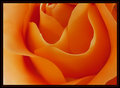
| 04/07/2010 07:26:18 PM | Orange Creamsicle by Ja-9Comment: Greetings from the Critique Club
Ja-9, you have a perfectly delightful image here that did as well as is possible in DPC's Challenges.
There certainly is not anything for a member of the Critique Club to do here except to enjoy your fine picture once more and move on to the next image in the queue.
Congratulations on a fine entry.
Alice
PS I see that oscarburd also gave you a CC critique. For some reason his did not register on our page since it came up again, so you get two CC critiques for an image that doesn't need any! | | Photographer found comment helpful. |
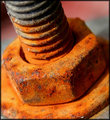
| 04/07/2010 03:58:09 PM | Oxidationby AbraComment: greetings from the Critique Club
When I first saw this and as I scrolled down I thought "Oh, I hope this did well in the Challenge!" Well, it did score quite well and that's a pretty good placement in this popular category.
The placement in the frame, the excellent definition of the rust and the excellent color throughout made this image a strong contender. Now, I'm gonna Pic a Nit here and suggest that since this was Advanced Editing, it would have been okay to color in, or clone out, those white spots here and there on your image. they are a touch distracting.
Other than that, this Critique is simply a positive 'well done' and keep them coming. Nice to see your scores trending up these days.
Alice | | Photographer found comment helpful. |
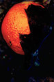
| 04/07/2010 03:51:57 PM | lune a l'orangeby posthumousComment: greetings from the Critique Club
Well, Posthumous, we meet again! I doubt I am the only one doing critiques in the Critique Club, so it must be pure chance.
Another of your abstracts that could be taken literally with its oranges and complimentary blues. But you chose to march to the beat of that other drummer again, and while some enjoyed your work, the scoring was downhill. However, I understand the scoring is not what you are after - and the Comment by  Spooky11 Spooky11, the person from Belgium, whose English must have come painstakingly from the dictionary, surely made it all worthwhile.
Best regards,
Alice
PS For those worried about the word Macula. It can mean dense or densely packed cells. Message edited by author 2010-04-07 19:59:18. | | Photographer found comment helpful. |
| 04/07/2010 03:26:33 PM | Poppyby jnenvirComment: Greetings from the Critique Club
Ah, California Poppy,  jnenvir jnenvir, so that means we are neighbors. This is as orange as they come and you certainly met the Challenge spot-on!
Yet it received just an average score. It has good definition, and that blue makes a nice complimentary contrast. Perhaps if that blue could have been brought out a bit more (I use Selective Colors a lot to make that happen) it would have made the image pop. Then, the poppy is just a tad flat and you do have such nice shadows in there. These are just thoughts to play around with.
There are SO many ways to shoot a California Poppy and aren't we lucky in our state to have so many of them to practice on!
Alice
|
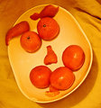
| 04/07/2010 12:55:58 PM | Hugh: "The Presentation of an Orange Raspberry..."by 777STANComment: GREETINGS FROM THE CRITIQUE CLUB
Awwww, 777STAN, and you worked so hard on this one too!
When doing a set-up like this, it probably is even extra-important to consider the size and make up of the props, keeping everything in proportion and in perfect balance to create the illusion.
Consider making the backdrop perfectly flat, perhaps with a poster board or even with the blanket you used on a very flat surface. Then, unless the chipped part of the plate contains some of your illusion information, either disguise it or select another surface. finally, consider that the "eyes" and the "mouth" are pretty much the same size here, where even in most illusions the 'eyes' are likely to be smaller (or larger).
You have good sharpness and probably used a tripod. Good! Did the shadows come from a flash? Or lighting? If so, with a tripod, it is usually possible to just select a long-enough exposure to get the image sharp without the extra light.
Still, all in all, it looks as if you had fun creating this cute little image, and that, 777STAN, is what it is all about! | | Photographer found comment helpful. |
| 04/06/2010 12:19:00 PM | 808 CSX 808by Ja-9Comment: Greetings from the Critique Club
Hello! You certainly found a fine example of a workhorse engine for your entry in the Plane/Auto/Train Challenge.
While you met the Challenge spot-on, your engine just didn't meet the tough creative expectations of our voting group. As one of your comments read, a different angle could have made a difference in its appeal. Perhaps a very tight shot could have been fun. With that strange windshield, a tight shot might have given it an other-worldly aspect that would stand out from the crowd.
Who knows! In any event, it looks as if you enjoyed finding this nice image and that's what counts.
Alice | | Photographer found comment helpful. |
|
Showing 3191 - 3200 of ~8911 |
Home -
Challenges -
Community -
League -
Photos -
Cameras -
Lenses -
Learn -
Help -
Terms of Use -
Privacy -
Top ^
DPChallenge, and website content and design, Copyright © 2001-2026 Challenging Technologies, LLC.
All digital photo copyrights belong to the photographers and may not be used without permission.
Current Server Time: 07/18/2026 11:13:13 AM EDT.
|