|
|
|
Showing 191 - 200 of ~338 |
| Image |
Comment |
| 05/21/2006 01:15:44 PM | Delightfully Psychotic Cyclistsby MelethiaComment: I have to admit it was a very hard challenge. Like many entries, yours is very strong on many photographic levels, but lacks a bit on the "movie" side - there's very few entries where the title really sounds like a film I might go and see.
In relation to the challenge, a bit of a stretch
In relation to the photo in its own right, you've caught a good moment with clear faces visible, each bringing their own character with those comical expressions. The tight composition with square composition works well, making it very action-packed. Colours are strong, shame the focus is a lttle soft. A lot of potential - you should definitely go out again til you've perfected the art :) |  Photographer found comment helpful. Photographer found comment helpful. |
| 05/21/2006 01:05:49 PM | Mission San Jose, founded 1720by MelethiaComment: Sorry to get to this so late - I'm aware you've reedited as per everyone else's advice, but I've tried not to read the other comments til i've left my own..
My first impressions are that you've found a great POV to give a really photogenic composition, but that the lighting/editing make it look a little blander, detracting from its potential. The non-symettry of the curves, leading you down to the main doorway work really well, echoed by the shadows on the ground doing the same thing, but I still feel the doorway is a bit too central - I'd maybe crop it a bit tighter at the bottom.
In terms of editing, it needs a bit more 'punch' - more contrast, work on curves etc. Depending on the location, it may be really photogenic in early morning/evening, where you'd get soft but distinct shadows, warm colours and lose the washed-out feel. Message edited by author 2006-05-21 13:06:53. | | Photographer found comment helpful. |
| 05/17/2006 09:35:07 AM | N-eye-Konby swallaceComment: its n-ick-on not n-eye-kon
pffft foreigners :P
j/k, its a good photo. I like the rough texture and tones, but there seems to be a slight blue cast to it as a whole | | Photographer found comment helpful. |
| 05/15/2006 10:52:19 AM | | | Photographer found comment helpful. |
| 05/15/2006 10:37:40 AM | | | Photographer found comment helpful. |
| 05/15/2006 08:20:26 AM | | | Photographer found comment helpful. |
| 05/14/2006 04:18:03 PM | Up, up and awayby ericwooComment: ~trading post~
This is a great photo, ,and i think you've composed it perfectly, with the different angles and the slight off-centredness of the main corner. The colours of the sky and building complement each other well, but the sky seems a little dark, and flat.
Personally I'd prefer a touch less contrast on the building, so that the bottom front is not so blown-out.
Congrats on the placing, and an awesome photo for the challenge, | | Photographer found comment helpful. |
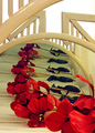
| 05/14/2006 04:10:30 PM | Silk Flower Rhythmby chaliceComment: trading post
I'm not really sure what i'm looking at here... and this puts me off a little. I get that its mirrors, with a repeated reflection, but I still keep trying to figure out how the metal bars all fit in...lol I think it works compositionally, but I personally get distracted by trying to figure out what's what.
The rhythm of the repetition works well, but I get a kind of clinical feel from it, I think from the greens of the sheets, and the metal bars.
It is quite busy, I think it may work better with a lower angle, and cropping out the bars in the top half so that it is simpler, and the reflections recede further into the distance. | | Photographer found comment helpful. |
| 05/11/2006 03:59:01 PM | Every Day Rhythmsby tngrndreamComment: ~trading post~
I think this would have made a much more interesting composition had you focussed on just a section, maybe a quarter of this view, to make it more of a study of the patterns & curves rather than a set of dinner 'things'. The lighting seems good, but could maybe do with a touch more contrast to bring out the colours, or maybe hue/sat.
The idea suits challenge fine, but I think the square-on centred format makes it a touch static. | | Photographer found comment helpful. |
| 05/11/2006 03:37:44 PM | Rainbow Rythm by timfythetooComment: ~trading post~
Congrats on the ribbon. This is one of those shots where you think "damn, I need those ideas let alone the ability to execute them well"
I didn't even notice the title was misspelt til you pointed it out, and the border doesn't really bother me.
I love how you've captured every texture in the 'q-tips' (pfft, americans :P) and got that sense of colour and movement.
The only things I'd hazard to suggest for improvement would be
1- grain in the sky. A perfect sky would have made this even more awesome. 2- A teensy bit of a lower crop at the bottom, just so that the purple drips don't touch the frame (yeah i'm fussy, but its hard to critique a ribboner lol)
| | Photographer found comment helpful. |
|
Showing 191 - 200 of ~338 |
Home -
Challenges -
Community -
League -
Photos -
Cameras -
Lenses -
Learn -
Help -
Terms of Use -
Privacy -
Top ^
DPChallenge, and website content and design, Copyright © 2001-2026 Challenging Technologies, LLC.
All digital photo copyrights belong to the photographers and may not be used without permission.
Current Server Time: 04/02/2026 01:31:01 PM EDT.
|