| Image |
Comment |
| 12/29/2011 07:27:33 AM |
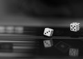
diceby betelgeuseComment: I apologise, I am new to this and you are "stuck" with my comments. Pls. realise that this is *my* learning curve more than yours!
I don't quite understand how "dice" go with the theme of "A+B". Dice are used singly, in 2s or several, depending on the game they are used for.
In any case, I think the picture is very striking. IMO, I think this is really well put together with the reflective surface at the bottom. Love the crop and placement of the main object. Nothing to distract the eye. Your choice of shutter speed, IMO was also really good. This is one of my favorite photos so far, except that I don't think it is within the theme, or at least I don't "get it" :-(. |
 Photographer found comment helpful. Photographer found comment helpful. |
| 12/29/2011 07:20:52 AM |
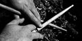
Hands & Drum Sticksby JarHeadComment: I apologise, I am new to this and you are "stuck" with my comments. Pls. realise that this is *my* learning curve more than yours!
I think this is an interesting interpretation of the theme. I like the composition of your picture, especially the stick on the diagonal in the light shade. However, not being a drummer or music person myself, I don't know what the rippley background is and I find my attention being drawn to that "mistery" in your picture almost more than the obvious hands and sticks and thus find it distracting. I do like the tight crop you used it really emphasised not only the hands and sticks but in fact "how" they go together. |
| 12/29/2011 07:20:43 AM |
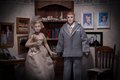
Husband & Wifeby nstevens85Comment: I apologise, I am new to this and you are "stuck" with my comments. Pls. realise that this is *my* learning curve more than yours!
I think the interpretation of the theme is good. I like that you used dolls rather than real people and still could get the "husband&wife" theme across. My eyes are drawn a lot to the background though. Especially the little boys pictures on the wall. the blue in those pics is very strong and draws my eye. Perhaps a brighter attire of the H&W or a shallower DOF would have emphasised the main charaters more. I do like the way you used the lighting. |
| Photographer found comment helpful. |
| 12/29/2011 07:20:34 AM |
Finger + Noseby IAmEliKatzComment: I apologise, I am new to this and you are "stuck" with my comments. Pls. realise that this is *my* learning curve more than yours!
OK, this is gross - but I suppose such a reaction to a photograph is a good thing ;-). I think your interpretation of the theme is somewhat outside the "usual", but definitely within the theme. I like the way you dealt with the background (or lack thereof) which really brings the face and hand to the forfront. I am not sure if the skin tone is not a bit on the "red" side. What I don't like so much is the prominence of the hand in this photo. Your title was "finger" + nose, yet the hand is the largest item in the picture. Perhaps shooting with a different lense, or cropping it tighter would have put more emphasise on the finger. I do love the models nose for this theme. and based on the whole take on the title, I like the "goofiness" that the model portraits. |
| Photographer found comment helpful. |
Home -
Challenges -
Community -
League -
Photos -
Cameras -
Lenses -
Learn -
Help -
Terms of Use -
Privacy -
Top ^
DPChallenge, and website content and design, Copyright © 2001-2026 Challenging Technologies, LLC.
All digital photo copyrights belong to the photographers and may not be used without permission.
Current Server Time: 07/17/2026 12:01:14 AM EDT.