| Image |
Comment |
| 11/14/2007 11:01:44 AM |
Dropsby erainmanComment: No foreground bokeh, or any background bokeh. |
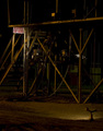
| 11/14/2007 10:22:18 AM |
Smokin' Dewaltby RegencyRiggsComment: For shots like this, thee are a few things that voters really look for:
1. Clarity
2. Sharpness
3. Simplicity (not cluttered and easily identifiable subject)
4. Execution
5. Meeting the Challenge (ones that are a stretch always suffer)
Perhaps this one scored the way it did was because the subject isn't entirely clear. As another commenter posted, you may have lost a bit of quality when going down to 640 pxs. I think the two main things though because it seems somewhat cluttered (has killed me in the past =) ), not sharp, and too dark.
It takes a while to figure out what the voters are looking for, but I think you have what it takes. Just look around at previous challenges to get ideas of how the voting tallies up on different sorts of shots.
Welcome to DPC and happy shooting!
goinskiing |
 Photographer found comment helpful. Photographer found comment helpful. |
| 11/13/2007 02:10:18 PM |
|
| Photographer found comment helpful. |
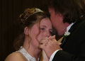
| 04/19/2006 10:47:54 AM |
To have and to hold...by bookwormComment: Congratulations on your first entry! You even did better than me on your first entry than I did on mine! I would definitely echo what was said about making the crop a little bit tighter to emphasize the embrace. There's just a tadd too much negative space on the bottom and detracts the eye from the intended subject and causes he ye to wander a bit. I realize that the S7000 uses a 4:3 ratio crop. With this shot I probably would have usd the traditional 3:2 ratio and cut off a little bit of the bottom. I think it might have helped to get a little more of the brides head in there, that may have also put the hands at one of the Rule of 3rds intersections. Hope that helps! Looking good! I look forward to your future entries. |
| 04/19/2006 10:41:09 AM |
Butterfly Kissesby photojennicComment: Way to go Jen! This definitely scored much better. Good shot I must say. Just for future reference, you can adjust curves, leves, etc. under the Basic Editing Rules to help brighten up pictures that are a tad on the darker side. Another cool little tool that most people use that is legal under the basic editing rules is a program called NeatImage. You can download it at www.neatimage.com and you can download the Noise Profile for you specific camera. If you have questions about that program, just do a search in the forums or make a forum post on it. There are a TON of helpful people here. BTW, I hereby challenge you to both the Negative and Complimentary Colors Challenges. Do you accept? |
| Photographer found comment helpful. |
| 09/10/2004 12:44:57 PM |
Too-Much-edit.jpgby RoosterComment: Not bad at all, I love this shot, it really captures the little girl's sweet personality. Well done Roost! |
| 05/24/2004 06:45:20 PM |
the big bangby fstopopenComment: I feel this is a HIGHLY underrated shot! Very nicely done and exectud very well. The colors are fantastic and exposure is spot on!
I just have to add the fact that I think this works well because when you look at it it really looks like space. This is a shot to be proud of!
;D Message edited by author 2004-05-28 17:39:15. |
| Photographer found comment helpful. |
| 05/16/2004 12:44:51 AM |
The Lighthouseby mariomelComment: WOW!!! You definitely should have entered this one. I would have given it a 9 or possibly even a 10. Mostly because I am a sucker to lighthouses, but I LOVE the crispness of this shot and how the composition centers around the lighthouse. I love how the other elements, such as the people, really enhance to the shot and compliment the lighthouse. Very nicely done! |
| 05/16/2004 12:16:24 AM |
Vortexby cabaComment: Oooo, very cool shot! I was think about doing a shot similair to this. I say that because the roundness and the nature of this shape is to lead the eye to the dead center. Even though it is "another's artwork," I still really like the shot anyways because of the lighting, colors, focus, etc.
Keep up the good work and good eye! |
| Photographer found comment helpful. |
| 05/16/2004 12:06:26 AM |
Nerdby goinskiingComment: Originally posted by suemack:
roflmao....how did you do that?
sue |
Too much time, computer, a Dr. Pepper, and nice people seeing that I was going for a record. |
Home -
Challenges -
Community -
League -
Photos -
Cameras -
Lenses -
Learn -
Help -
Terms of Use -
Privacy -
Top ^
DPChallenge, and website content and design, Copyright © 2001-2026 Challenging Technologies, LLC.
All digital photo copyrights belong to the photographers and may not be used without permission.
Current Server Time: 07/18/2026 01:48:14 AM EDT.