| Image |
Comment |
| 05/30/2006 08:03:50 AM |
Light & Shadow...by photoleonComment: I am not so sure about the title; but I really dig the use of negative shy space; and the warm orange against blue. |
 Photographer found comment helpful. Photographer found comment helpful. |
| 05/30/2006 08:02:50 AM |
creating spaceby saintaugustComment: Awesome use of traditional landscape reflection for this interior shot. I think it works because of the people. Great texture; good luck. |
| Photographer found comment helpful. |
| 05/30/2006 08:00:32 AM |
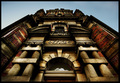
Summit Avby BlueZamiaComment: I like what you included in here, and what you didn't; there is a bit of a blown out feeling to the shot; but I really like the high key pinks contrasting with the black. |
| Photographer found comment helpful. |
| 05/30/2006 07:58:53 AM |
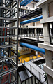
Dazzling Designby ajschelComment: I really dig the long vertical aspect of this shot that plays into the feel of the office. perfect colors and placement of the blue and yellow; and the red on the side makes a nice touch too.
Now, that being said, I don't feel you will "wow" people enough to win, but I personally think you are top three and you get my vote. |
| Photographer found comment helpful. |
| 05/30/2006 07:54:54 AM |
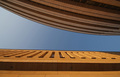
Nine to Fiveby whiteroomComment: I love the high key burnt colors; perhaps the angle is a bit stark; but it definitely creates an ominous and imposing feel fitting of certain workplaces. |
| Photographer found comment helpful. |
| 05/30/2006 07:44:46 AM |
Step into the pastby KHoltComment: Nice idea, perhaps the back and the foreground of the black and white is to detailed, losing the depth; but I like the composition otherwise. good luck. |
| Photographer found comment helpful. |
| 05/30/2006 07:43:38 AM |
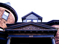
Housingby charmayneComment: I like your composition, and I love the brick on green glass color scheme. really contrasty, pops out and eccentuates the angles. Nice work. perhaps the only criticism would be that the crop is a bit wide for the type of shot. |
| Photographer found comment helpful. |
| 05/26/2006 01:17:06 PM |
~Me~by HBunchComment: great shot; nice transfer from light to dark; It complements the black lipstick and dog collar. There is also nice full range of black to white.
and oh yeah; from looking at your self portraits, that is your better side. Message edited by author 2006-05-26 13:17:54. |
| Photographer found comment helpful. |
| 05/24/2006 07:28:49 AM |
Chrome & Blindsby aimeethetooComment: This is a terrific shot; it has a fantastic summertime/ art deco feel to it. Perhaps a bit expanded or a different crop might make it better, but the design is still awesome. |
| Photographer found comment helpful. |
| 05/21/2006 08:24:28 PM |
|
Home -
Challenges -
Community -
League -
Photos -
Cameras -
Lenses -
Learn -
Help -
Terms of Use -
Privacy -
Top ^
DPChallenge, and website content and design, Copyright © 2001-2026 Challenging Technologies, LLC.
All digital photo copyrights belong to the photographers and may not be used without permission.
Current Server Time: 07/20/2026 03:53:59 AM EDT.