| Image |
Comment |
| 01/13/2007 07:26:40 AM |
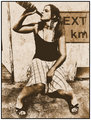
Randomnessby xXxscarletxXxComment: this is a great shot; it would make a fantastic album cover. That sides your good side too. |
 Photographer found comment helpful. Photographer found comment helpful. |
| 01/11/2007 02:26:46 PM |
|
| Photographer found comment helpful. |
| 01/08/2007 04:44:45 PM |
|
| Photographer found comment helpful. |
| 01/08/2007 04:43:37 PM |
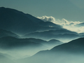
Ridges and Haze by briantammyComment: A truly maddening and inspiring shot; its just too good, too uplifting. I'm sure you'll get much better comments, but- once again, hell of a shot. |
| Photographer found comment helpful. |
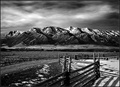
| 01/08/2007 04:41:23 PM |
Still My Favorite Mountains by dsidwellComment: never weary of such a beautiful place! I like how there is interest and different textures in this picture, but its not busy. Message edited by author 2007-02-20 08:10:42. |
| 01/08/2007 04:39:21 PM |
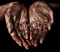
Hardened by Life by SpizzerComment: fantastic laethery skintone face folds of skin; great textures, and a great look on his face; quite dignified. great work. |
| Photographer found comment helpful. |
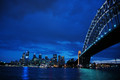
| 12/29/2006 07:37:49 AM |
Sydney Harbourby MichaelCComment: I can't believe the gradation in blue colors; its all teh way from neon blue glass to powdery blue birthday balloon. Absolutely perfect contrast to the golden bridge focal point; can't you warp the image to straighten the horizon? would make a great print. Nice work. |
| Photographer found comment helpful. |
| 12/29/2006 07:34:44 AM |
|
| Photographer found comment helpful. |
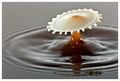
| 12/28/2006 11:34:12 AM |
coffee with a "drop" of milkby IreneMComment: Beautiful technically, but more importantly there is a scientific artistic beauty to this shot that is dare I say for lack of a better term, life affirming; like the beauty of a snowflake, you show this, and its nice work. |
| Photographer found comment helpful. |
| 12/27/2006 11:55:18 AM |
Cirque de Stickee Notesby aimeethetooComment: amazing visual image. terrific ice queen appearance here, and the surreal quality of the face. supremely creative and spontaneous. |
| Photographer found comment helpful. |
Home -
Challenges -
Community -
League -
Photos -
Cameras -
Lenses -
Learn -
Help -
Terms of Use -
Privacy -
Top ^
DPChallenge, and website content and design, Copyright © 2001-2026 Challenging Technologies, LLC.
All digital photo copyrights belong to the photographers and may not be used without permission.
Current Server Time: 07/22/2026 08:24:17 PM EDT.