| Image |
Comment |
| 01/30/2004 10:52:47 AM |
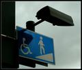
Life in the Shadowsby e301Comment: Greetings from the Critique Club!
Hi! This image does make the viewer really stop and think about it for a moment. The title is perfect as without the shot would make me say, "Hey, there's a shadow cutting across the wheelchair!"
I like the overall effect of the shot but from your desciption of post processing, it might have been overdone. You sharpened it twice and then added a blur twice. Instead of applying a blur to help remove the noise you might try Neat Image. It helps clear up the noise in a shot without losing the edges if applied correctly.
I like the overall composition of the shot, the dark edge on the left adds more to the shot for me than takes away. I think you left it darker to go with your theme of the shadows but the contrast is missing. A bit more contrast to make the blue really pop out would really make this shot speak to me.
The cropping is well done, I also like the abstract nature of the shot, it's well balanced and the lines take me through the whole shot.
So neat image, contrast to make the blue pop and take out the blur process would be my suggestions.
Hope this helps!
Good Luck In Future Challenges!
Deannda
DNeufer@stny.rr.com if you have any questions or want to discuss this further! |
 Photographer found comment helpful. Photographer found comment helpful. |
| 01/30/2004 09:05:52 AM |
|
| Photographer found comment helpful. |
| 01/28/2004 07:15:24 AM |
|
| Photographer found comment helpful. |
| 01/26/2004 11:43:52 PM |
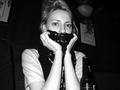
Black & white point of viewby mikeysbistroComment: Greetings from the Critique Club!
Hi! This shot has a lot of interesting points to it that can hurt or help the shot overall, it's really going to depend on the viewer. The candid nature of the shot appeals to me, I love candid shots and catching life as it happens. The girl in the shot is looking at you but doesn't look posed, reminds me of my Mom when it comes time to take pictures, she's hiding most of the time too.
The angle of the shot works very well, like you are sitting below the bar, looking up. The cut off of the elbows is a bit distracting though and the background is also a bit distracting to me. Maybe a slightly tighter crop on the sides and a longer one on the bottom.
The contrast is very well done, the shirt is a touch bright but it works for this shot with the darker scarf covering her lower face.
Good Luck In Future Challenges!
Deannda
DNeufer@stny.rr.com if you have any questions or want to discuss this further! |
| Photographer found comment helpful. |
| 01/20/2004 12:00:31 PM |
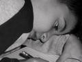
Study Hardby bassemComment: Greetings from the Critique Club!
And welcome to DPC! Your first challenge entry and it did just fine!
I loved this shot during the challenge, reminds me of my girls when they are really involved in their homework. The biggest thing that jumps out at me with this shot is the lack of a focal point. A depth of Field (DOF) would have really worked well with this shot. Having his face is sharp focus with the rest slightly blurred would really have helped bring the study message home. The black and white on this is a good choice, I'm really starting to appreciate the black and white shots. Though it does seem a bit dark overall. A tad more brightness and contrast would also make this shot pop for me. I see how dark the overall shot is and I want to turn on a light for him, LOL!
The overall composition of the shot is well done. The cropping, while a bit tight works with this shot, in fact I would have cropped just a bit tighter on the left, about 1/2" left of the pencil so you have the pencil in the shot but not so much of the shoulder leading in.
Hope all this helps and if you do any changes on this shot I would love to see them!
Good Luck In Future Challenges!
Deannda
DNeufer@stny.rr.com if you have any questions or want to discuss this further! |
| Photographer found comment helpful. |
| 01/20/2004 11:50:57 AM |
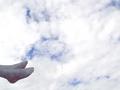
I´ll put my feet on the ground (Colocarei meus pés no chão)by cristiano79Comment: Hello again from the Critique Club!
We have got to stop meeting like this, LOL!
This is a wonderful overall shot but I'll be honest when I first saw it, the feet seemed to be in the wrong place. HUH? Well, the title tells me you want to put your feet back on the ground but instead of looking like you are walking on clouds it looks like you are sitting on them with your feet sticking out. A 90 degree rotation to the left might have made a big difference on this shot.
I would have never guessed this was a billboard (what we call them here in the US) The feet do look almost pasted in, so sharp and crisp against the soft sky. Maybe if you could have softened them up just a tad?
Also the sky is very white and bright against the socks, if a better balance on the light could be found.
Actually, rotate the shot, crop what is now the top part and make this a tall shot and I think it would really make a difference. If you decide to do this, please let me know and see the new shot.
Good Luck In Future Challenges!
Deannda
DNeufer@stny.rr.com if you have any questions or want to discuss this further! |
| Photographer found comment helpful. |
| 01/20/2004 11:40:16 AM |
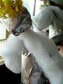
The "strangels"by cristiano79Comment: Originally posted by zeuszen:
The title is even more ambiguously puzzling than the image, given that 'strangles' denotes an infectious disease afflicting horses. Even as a corrupted colloquial term for 'strangulation', I cannot, for the life of me, find a remotely sensible application here... ?? |
Strangles = Strange + Angels.
Deannda
Does that help? :) |
| 01/20/2004 11:36:40 AM |
this year .... less cookies?by GunnahComment: Greetings from the Critique Club!
Hi and welcome to DPC! Your first challenge and you did pretty darn good! This is an adorable shot of your son, he's got that look in his eyes that just exudes mischief, LOL!
This is a wonderful candid shot of a child and overall it's very well done. The crop seems just off to me for some reason. I can barely make out his ear on the left and the curtains on the right are fighting for my attention. Tightening in on either side really makes a difference in this shot (I put paper up to the screen to get an idea). And maybe just a little looser on the top and bottom of the shot so you can see a bit more of his hand. The duo tone is a good choice for this shot though I wonder what b/w would look like also.
A fine placement in your first challenge and I hope this helps some. If you do any of the suggestions I put forth I would love to see the new shot.
Good Luck In Future Challenges!
Deannda
DNeufer@stny.rr.com if you have any questions or want to discuss this further!
|
| 01/20/2004 11:24:36 AM |
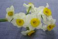
Spread the fragrance of Love.by razanaqviComment: Greetings from the critique club!
Hi! Welcome to DPC first of all! What a wonderful first time shot to enter! I love the colors of the shot and the light appears to be natural coming from a window behind the flowers?
The biggest thing I'm sure you heard about is the focus and the background. The blue material pattern seems to be fighting with the flowers for my attention. A solid black or white background would really make these flowers pop, yes even a white one, but you would have to be very careful with the exposure on that one. The composition of the shot is well done, even and the stem is leading me into the shot to the flowers. A bit more brightness and contrast would really make this shot pop for me. If you decide to try to reshoot this I would love to see the new pictures. This shot has a lot of potential and I would love to see any reshoots you do.
Good Luck In Future Challenges!
Deannda
DNeufer@stny.rr.com if you have any questions or want to discuss this further! |
| Photographer found comment helpful. |
| 01/20/2004 11:14:04 AM |
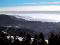
Idaho Wildernessby goinskiingComment: Oh so close to my home of Montana! I love this shot. The mountains, the snow, the line of trees in the front to offer an starting point. The clouds are awesome, the line of grey going through would have made a perfect top to me. The blue sky is beautiful (really reminds me of home) but in this shot it pulls me away from the rest of the shot. I put a paper up and set it just above the grey line of clouds and what a difference. A 9 |
| Photographer found comment helpful. |
Home -
Challenges -
Community -
League -
Photos -
Cameras -
Lenses -
Learn -
Help -
Terms of Use -
Privacy -
Top ^
DPChallenge, and website content and design, Copyright © 2001-2026 Challenging Technologies, LLC.
All digital photo copyrights belong to the photographers and may not be used without permission.
Current Server Time: 06/19/2026 05:25:13 AM EDT.