| Image |
Comment |
| 05/12/2004 10:39:29 PM |
|
 Photographer found comment helpful. Photographer found comment helpful. |
| 05/12/2004 02:12:54 PM |
Balloonby MattOzComment: Not sure how it meets the challenge, I'll go with dark/light? The spider web on the edge of the light does help create the illusion of a helium balloon and it almost works but the lack of contrast and the other treads from the web ruin the illusion. :( A 3 |
| Photographer found comment helpful. |
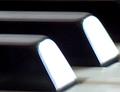
| 05/12/2004 02:07:26 PM |
Melodyby clearshotComment: If this was in focus and the end of the keys weren't blown out with light this would probably rate an 8 or above, I like the crop and the composition of the shot but the other factors hurt it a great deal. A 3 |
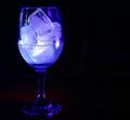
| 05/12/2004 01:52:09 PM |
Liquid-Solid Blueby ExoticChaosComment: This shot has a lot of potential with the right lighting and composition and angle. The way it is set up now is uninteresting to me personally, the glare on the glass is distracting and the negative space on the right does nothing for the shot to me. Maybe if you tried lighting from behind or underneath? Also, focus is lacking on the base even though most of the glass looks like it's {b]almost[/b] in focus. A 2 as is, sorry |
| 05/12/2004 01:49:46 PM |
Deadly Oppositesby rigelComment: Interesting idea, not a very good shot though. Sorry, out of focus, grainy and nothing to really hold my attention. A 2 |
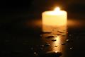
| 05/12/2004 01:45:54 PM |
Fire/Waterby borisonComment: The front of this shot is pretty good, the water droplets, the shine on the surface and then you see the candle, out of focus and glaring out at me. The negaive space on the left doesn't add anything to the shot for me personally. A 2 |
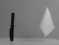
| 05/12/2004 01:44:25 PM |
Left & Right in Black & Whiteby GeneralEComment: Huh, interesting. Well one thing I know is that you are on the site counsil from the buttons available to you :) Wonder how many others will catch that. The shot doesn't really offer me much overall. A 2, please don't delete me! :) |
| Photographer found comment helpful. |
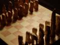
| 05/12/2004 01:42:19 PM |
chessmenby MorbidAngelComment: Opposite sides of the board? Guess that works, the shot is out of focus, the light doesn't work well for this shot and the cropping and composition leaves me wanting. A 2 |
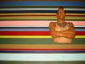
| 05/12/2004 01:41:10 PM |
Stripes and Solidby elinenbeComment: I guess it meets the challenge, barely. Nothing to really hold my attention, the lighting is off and the colors are more distracting than appealing. A 2 |
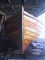
| 05/12/2004 01:39:00 PM |
Ready for launchingby skalman69Comment: I'm guessing the Opposite is the boat on dry land? Not really sure. The shot is blown out on the right side and too dark on the left. It seems a bit hazy also. The composition is okay but nothing to really hold my attention. A 3 |
Home -
Challenges -
Community -
League -
Photos -
Cameras -
Lenses -
Learn -
Help -
Terms of Use -
Privacy -
Top ^
DPChallenge, and website content and design, Copyright © 2001-2026 Challenging Technologies, LLC.
All digital photo copyrights belong to the photographers and may not be used without permission.
Current Server Time: 06/18/2026 08:19:50 AM EDT.