| Image |
Comment |
| 05/15/2004 03:09:36 PM |
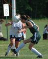
oppositeheadersby rrp1Comment: Hope no one got a headache! This would be a great shot if it was in focus as I'm sure you have heard but catching sports action can be so hard. A 3 |
| 05/15/2004 03:08:39 PM |
My opposing friendsby novetanComment: Not sure how this meets the challenge. As for the shot, the legs and feet that are in the shot end up being a distraction and the shadow on the left is cut off. Maybe a smoother surface and a different angle for yoU? A 3 |
| 05/15/2004 03:07:24 PM |
Smell Dead Freshby frogsComment: Ewwwwwwwww! I bet you seen a lot of those this past week, if not, sorry. I used to be a smoker and even then I was always grossed out by the ashes and butts of the cigs and now you mixe the toothpaste in, ick! ;)
Anyway, the shot meets the challenge, fresh minty breath vs. stale stinky breath. As for the shot, it's not appealing overall, maybe if you went with the toothbrush, toothpaste and a whole cig? Or even just a couple of them and didn't mix them it might have more overall appeal. The lighting seems fine but the contrast seems off just a bit to me. Started with a 3 but will raise to a 5 |
 Photographer found comment helpful. Photographer found comment helpful. |
| 05/15/2004 03:04:58 PM |
Mother Roseby JorelmComment: Not sure how the title fits here but the shot works well for the challenge, alive vs. dying. A nice shot but nothing special to hold my attention. A tighter crop to put more focus on the two flowers might help and a slight boost in contrast and colors might really help this shot pop. As is a 3 |
| 05/15/2004 03:03:37 PM |
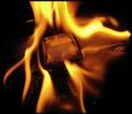
Fire & Iceby kaenmeyComment: Wow, that's a lot of fire, hope nobody got hurt! Good idea as you probably figured out by all the other fire and ice entries. This shot seems off and the rull of thirds doesn't really apply either and the flames going off the edges bother me just a bit, I would reallly have liked to seen them all or maybe a tigher crop so the ice is centered more and it's surrounded by flames with no negative space, let me get my trusty envelopes and see! :)
WOW! that made a difference, I put the envelopes on the sides and bottom, leaving the top as is and it really made the shot jump out more! I started with a 3 on this but am raising to a 7, would love to see it if you decide to recrop! |
| Photographer found comment helpful. |
| 05/15/2004 02:59:55 PM |
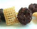
circles and squaresby binkyat3Comment: Back to this one again. I have pulled this one up 4 different times trying to figure out just what about it is bother me. I like the opposite of the square vs. round but something in the shot just doesn't sit quite right for some reason. I'm thinking it might be the background cereal for some reason. It's distracting to me personally and I think this would look better with just the two peicies or maybe the 4, the two to be the models and the two behind to hold them up. Also the reflection on the surface or shadows are a bit distracting to me. I started this at a 3 but am raising it to a 6, it's a great effort and with some tweeking I think it could be an awesome shot to me personally :) |
| Photographer found comment helpful. |
| 05/15/2004 02:56:46 PM |
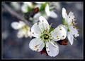
Focus & Unfocusby MonaComment: This is a lovely shot, it really is and the DOF gives you your opposite requirement. But thre is something that was bothering me when I first saw the shot and gave it a 3 to start and coming back to comment and take more time to look I think I figured out what it is. I know this will sound nitpicky, but the flower you are using for your focus part is slightly out of focus on the bottom. I know, picky, but that is what got my attention the first time when I went through and scored according to title and first glance. Upon a second look, the 3 was harsh and I am raising the score to a 6 because it does meet the challenge but the one petal is really bugging me, especially since the bud to the right of it is in focus, I don't know why. But a 6, I may be back again :) |
| Photographer found comment helpful. |
| 05/15/2004 02:53:28 PM |
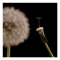
Socialby AaronComment: I'm guessing the opposite is one compared to a group? Nice idea but the execution of the shot leaves me wanting more contrast and a little better composition overall. Maybe the full one in the shot as a whole would help? The DOF works for this shot but also maybe if the background dandylion was just a bit closer, not quite a fuzzy? A 3 |
| 05/15/2004 02:51:34 PM |
Struggle For Power: Bullets Vs. Electricityby notonlineComment: Interesting idea. Not sure I really get the opposite idea behind it, both are ways to defend, just different methods. As for the picture, the gun is cut off as is the electric device, I get the feeling that a better composition and different background would make a huge difference in this shot. Also maybe more of a spot light type lighting instead of the overall effect? As is a 3 |
| Photographer found comment helpful. |
| 05/14/2004 01:23:53 PM |
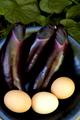
Family Reunion?by photomComment: I don't get it. Not sure what the opposite theme is supposed to be. I'm guessing those are eggplants behind the eggs? I personally wouldn't know since I have never bought or even looked at an eggplant in the store :)
The shot is cropped a bit tight on the sides and bottom, would like to see the whole bowl and the focus is really lacking on the plant part. The eggs look almost too sharp compared to the plants considering they are in the same bowl, not sure why that came out that way. I like the green on the top, adds a splash of contrast to the bowl and it's contents. Also, if the lighting was just a bit brighter it might really help this shot jump out at me. I like the overall composition but as it stands a 3 |
| Photographer found comment helpful. |
Home -
Challenges -
Community -
League -
Photos -
Cameras -
Lenses -
Learn -
Help -
Terms of Use -
Privacy -
Top ^
DPChallenge, and website content and design, Copyright © 2001-2026 Challenging Technologies, LLC.
All digital photo copyrights belong to the photographers and may not be used without permission.
Current Server Time: 06/17/2026 08:08:22 PM EDT.