| Image |
Comment |
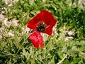
| 05/15/2004 08:26:04 PM |
Red Shaghayeghby balvardiComment: And the way this fits the challenge is ........??????? I really don't see anything opposite in this shot. Not a bad shot of a flower but a tighter crop would really help bring the flower out and make it pop. A 3 |
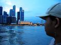
| 05/15/2004 08:24:28 PM |
From the Bayby gedumbakComment: I have no idea how this fits the challenge unless you were going for a sea/land thing? The shot is not bad, has a lot of potential but the young lady on the right is too distracting to start with and the lack of focus in the over all shot is also a minus. If the camera panned a bit more to the left and captured more buildings or even if the crop was tighter on the right it might make a huge difference in this shot. A 3 as is |
 Photographer found comment helpful. Photographer found comment helpful. |
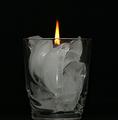
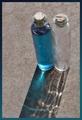
| 05/15/2004 08:22:12 PM |
Ice Candleby CODEComment: A different idea which helps but the crack in the ice and the way it leans is very distracting. Also the coaster or plate you set the ice candle on is a bit distracting. Maybe if you set it straight on the mirror and then you could have used the straightening tool so it wasn't leaning? A 3 |
| Photographer found comment helpful. |
| 05/15/2004 08:19:50 PM |
Fire and Iceby MinnieComment: Nice capture on the flame, it isn't blown out too much in the shot. It also looks like you took a little time to try to arrange your ice so it had some shape to it. But the shot left me wanting, the crop seems a bit loose and the background on the right seems wrinkled. Also if the candle was lower so you couldn't see the wax part but just the flame? Build the ice all the way around the candle so the light comes from within? A 3 as is |
| Photographer found comment helpful. |
| 05/15/2004 08:17:22 PM |
Fire & Iceby rha600Comment: Good idea but the glass takes away from the shot rather than adding to it at this angle to me. The rim of the glass is distracting, maybe if you had taken the shot from above? Also, a bit more contrast would really help this shot. Started at a 3 but am bumping to a 5 |
| 05/15/2004 03:19:57 PM |
Cubs Win! Cubs Lose!by toddheadComment: Very nice attempt at a longer exposure or double exposure. But the lack of focus, lighting and contrast really hurt this shot. Also the backdrop is very distracting with the folds and such. But keep trying, the expressions are priceless! :) A 3 |
| Photographer found comment helpful. |
| 05/15/2004 03:17:49 PM |
Extra Extra!by zwhitleyComment: This comes accross more as opposing than opposites to me. Th shot has potential but the cropping seems a bit loose on the sides, I put my handy dandy trusty envelopes on the screen and took it in so it was just outside the sides of the stands and it made a huge difference in the shot, the distracting cars and store fronts were gone. Also if you played with the contrast and hues just a bit to really make the stands POP out, this shot has potential. As is a 3 |
| 05/15/2004 03:15:28 PM |
Bright Sky - Dark Beachby jkarsgaardComment: I love this shot, the composition and cropping but that is about all I love. The colors seem off for some reason to me and the lack of focus overall is very distracting in the end. If you handheld the camera for this shot, try a tripod or monopod (I think that's what they call it) and see if that helps with the focus aspect. As is a 3 |
| 05/15/2004 03:13:39 PM |
Full/Empty (water/air)by hannafateComment: Good idea, bad execution of the shot. The shadows really hurt this shot and the bright sun, while normally is a great light source is overpowering in this instance to me. Also the surface has too much texture and is also a distraction. Maybe if you could have done this inside, using light from a window to provide the natural light but giving you the chance to have a more solid background? Also the angle of the shot seems off, maybe a more head on attempt? I could see this shot well done and if you do decide to redo it I would love to see the results. As is a 3 |
| Photographer found comment helpful. |
| 05/15/2004 03:11:06 PM |
the Big oppositesby mrBlueComment: You can send all the money to me right now! :)
Not a bad shot but the lighting is too yellow and the glare on the coin is very distracting. Also the contrast is really lacking in this shot. Not sure how the church and money are really opposite since most churches want your money, LOL! As is started at a 3 but going to bump to a 5 |
| Photographer found comment helpful. |
Home -
Challenges -
Community -
League -
Photos -
Cameras -
Lenses -
Learn -
Help -
Terms of Use -
Privacy -
Top ^
DPChallenge, and website content and design, Copyright © 2001-2026 Challenging Technologies, LLC.
All digital photo copyrights belong to the photographers and may not be used without permission.
Current Server Time: 06/17/2026 01:06:52 PM EDT.