| Image |
Comment |
| 04/26/2005 08:08:17 AM |
"JC"by GalimagesComment: Congrats! WTG!!!! Very nice placement for your first Free Study!! |
| 04/19/2005 11:53:28 AM |
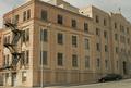
"The Old Saint James Hospital"by SamTComment: From Butte, MOntana? Don't they use it for apartments anymore? I didn't get a chance to go by there when I was home last summer but it's sad to think this might no longer be in use. If it's not from Butte, MT, then there is another that looks just like this building in Butte, MT :)
As for the shot itself, the light is a bit harsh and unforgiving and the street lamp is distracting as is the car. Maybe if you had come from the front and did a shot going up the front of the building showing the name and the broken out windows and the cross?
A 6 |
 Photographer found comment helpful. Photographer found comment helpful. |
| 04/19/2005 11:13:39 AM |
Helping Handsby graphicfunkComment: Rather Creepy actually! While a great idea, having the two hands joined at the wrist with different wines, there are just a few things that really end up being a distraction to me. One is the bump on the bottom of the wrists slightly to the right. Second is the hair on the wrist/arm area. If it was more uniform on the inside wrist it might not be so distracting to me personally or better yet, a woman's hand might have made a big difference here. WIth the polished nails and such. The hands here look almost to big or manly for the delicate glasses. The lighting is okay, the refelctions in the glasses are a bit distracting overall but otherwise a very unique idea and good for you for trying something different. A 7 for overall effort and shot :) |
| Photographer found comment helpful. |
| 04/19/2005 11:08:48 AM |
Stairsby flip89Comment: Whoa! Glad I'm not looking at this while drunk! LOL!
Great visual, the way the stairs take you through the whole shot, too bad about the people though, they end up being a distraction for me. And your feet at the bottom of the frame? But otherwise, love this shot. An 8 |
| Photographer found comment helpful. |
| 04/19/2005 11:07:22 AM |
"So, You're a Cubs fans, huh.?"by parrotheadComment: Rut Roh! Don't tick off that Cardinal fan, LOL! :)
Very cute, nice shot but the branch cutting through the top feathers is very distracting but sadly, even though this was an advanced challenge, the entire removal of said branch might be considered a major element. I like the composition and set up otherwise though a slightly tighter cropping on the bottom to take out all those distracting colors there might really pull the viewer to the bird. A 6 |
| Photographer found comment helpful. |
| 04/19/2005 11:05:24 AM |
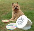
Let's Play Frisbeeby hallswelComment: I'd have sworn I saw this shot in the Pet Portrait challenge but I guess not. A cut shot, very cute, the expression, the set up. But its seems off balance, slightly crooked and lacks contrast, the lighting seems a bit dull. A 5 |
| 04/11/2005 10:35:54 PM |
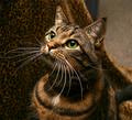
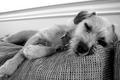
Peek-A-Boo!by annasenseComment: Hi! I didn't get a chance to comment during the challenge so here goes. I gave this shot a 7. I like the conversion to black and white and I like the overall feel of the shot, the textures, the relaxed mode it put me in. You must have wore that little guy out!
I never noticed the one eye peeking out, it's almost hidden and I think that was part of why I started with a 7 on this, had I been able to get back to it I would have probably bumped to an 8. The overall shot lacks the contrast needed to really make it stand out but an excellent shot still the same. :) |
| Photographer found comment helpful. |
| 04/11/2005 10:27:46 PM |
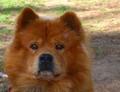
"Ruggy"by neenee1999Comment: I didn't get a chance to get to this one during the challenge but I will go ahead and comment now. I gave this a 7 and here is the reasoning. I love the dog. I love the expression and I even love the slightly off center. What bugs me though the most is the lighting. There is some nice bright light in the back (too bright for what you want) and while it could work for back lighting, it's too far back and ends up being distracting instead. I'm not a fan of dodging and burning but this is one situation where just a slight amount, burn the back just a bit and dodge the dog just a touch would really bring the balance of light back. Hope this helps! |
| Photographer found comment helpful. |
| 04/11/2005 09:05:50 PM |
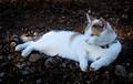
Trouble reclinesby reificationComment: I didn't get to this one during the challenge. I gave this one a 7, I have a very soft spot for calicos so that earned you an extra point right there! :)
This is a lovely, relaxing shot and well composed. The only thing that bothered me was the dark edges. I'm not a big fan of burning the edges to darkly for a shot. If you just used a vinette filter then , well, still, not my personal taste. But still a lovely kitty, give Trouble some scritches for me, kay? |
| Photographer found comment helpful. |
| 04/11/2005 09:49:53 AM |
The Shredder of Couchesby dragonladyComment: I didn't get to this shot during the challenge but wanted to come back and let you know I gave this one an 8. I really like the overall feel of the shot and the use of lighting is wonderful. Just one thing really bugged me about the overall shot, the lower right corner, the leg seems to come out of nowhere and then is gone, maybe just a little tighter crop on that side to really give the negative space on the other side the chance to really enhance the kitty. |
| Photographer found comment helpful. |
Home -
Challenges -
Community -
League -
Photos -
Cameras -
Lenses -
Learn -
Help -
Terms of Use -
Privacy -
Top ^
DPChallenge, and website content and design, Copyright © 2001-2026 Challenging Technologies, LLC.
All digital photo copyrights belong to the photographers and may not be used without permission.
Current Server Time: 06/11/2026 10:24:54 PM EDT.