|
|
|
Showing 391 - 400 of ~2077 |
| Image |
Comment |
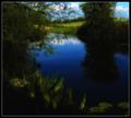
| 05/10/2005 08:08:29 AM | An Evening by the Pool by ArtanComment: Very nice, very nice indeed. Wish my dreams looked this this, LOL! I like the feel of the overall shot, the composition, the balance, the only thing that throws me off just a bit is the dark lower left corner. Maybe you were going for the idea that the dream fades off into nothingness but I'm not really good at the in depth meaning of most shots, I just know if I like it or not, LOL! :O The corner doesn't really bother me so much, it does work well, it's just the way it suddenly goes black, a more subtle fade might have worked better for my taste personally.
A 9
Deannda |  Photographer found comment helpful. Photographer found comment helpful. |
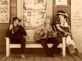
| 05/10/2005 08:05:22 AM | Serenaded in my Dreamsby BAMartinComment: What a great shot! I'm guessing a play or re-enactment of some sort? Now the title would probably fit better if she didn't have that look of utter shock and disgust on her face, LOL! :)
I like the choice of using sepia for this because of the costumes the people are wearing but just a few things botter me with the shot. The sunglasses on her dress, out of character and period, could have been cloned and for some reason the balance seems off. The way the people are sitting when I look to the center of the shot it's the bench and even though you have two people on one side and one on the other the overall shot doesn't feel like an off balance teeter totter, does that make sense? Using my magic envelope, if you had cropped just a little bit more on the left, taking out the wall and poster it seems to balance just a little better overall.
A 9
Deannda
Again, great capture | | Photographer found comment helpful. |
| 04/30/2005 05:02:15 PM | Finding comfort and securityby lawlessComment: Greetings from the Critique Club!
What a wonderful, candid moment and you can tell the little one is not feeling all that well. It's in her eyes. And in yours. It's so hard when they don't feel good and you really can't do anything for them but try to comfort them, isn't it? I know, mother of 3 here.
This is a great shot, the expressions, the love that comes through is just fantastic. The crop seems a bit loose, using my magic envelopes (they are becoming famous you know) I took off the excess on both sides, bring the edges to the top of her head and the left side of your hat and it really makes the shot jump out at me more. Also the black and white points aren't really there for me and yes, my monitor is calibrated, a slight adjustments in levels or curves might really make this shot pop.
This is one you will want to print out for her and put in a safe place, it will become one she cherishes later on. Especially when she's 13 and yelling at you that you just don't understand and never will. Take the picture out and just say, "I will always understand." ;)
Good luck in future challenges!
Deannda | | Photographer found comment helpful. |
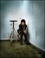
| 04/30/2005 04:56:22 PM | Weatheredby nico_blueComment: Greetings from the Critique Club!
This is a great shot, I really like the overall feel of the picture, the moodiness of the person works well with the surroundings. I read your comments and find it hard to think of this as a classroom area, the walls are so bare and such. I'm used to lots of things all over the place.
I read the comments below and really can't add much to them. I love the shot and even though I didn't get to it during the challenge to vote, I would have given it an 8. The points off would have been one for the title, while it fits the background it certainly doesn't fit the person inside the shot :) And two for the dodging and burning done around the edges and such. The way you left the bright light go up the center bothers me personally for some odd reason, maybe if it was more balanced with the bottom. I agree about the cropping, it's perfect, nothing to change there.
Hope my comments help, not that you need any help with this one! Great job!
Deannda | | Photographer found comment helpful. |
| 04/30/2005 12:19:58 AM | Freestyleby pmichaudComment: Greeting from the Critique Club!
Hi! This is a fantastic action shot and I love the sepia tone you used in the end. It reminds me of older shots of wrestling and the uniforms haven't changed that much, have they?
Looking at this shot and it's final score I have to wonder, "WTF?" This should have been a 6 or better, I think what might have made it really go though are just a couple of minor things, to me. While a great action shot, it's off kilter, leaning from the right to left, perhaps a slight straightening on this for the background horizon to be more level? The wrestlers actually look fine, it's the line across the back that throws me off a bit. Also, another nitpicky thing is the wrestler's foot on the right getting cut off. Perhaps if they were completely in the picture, again, giving it more balance it might have helped the final score.
The capture of emotions and intensity is wonderful, keep up the good work!
Deannda | | Photographer found comment helpful. |
| 04/30/2005 12:13:18 AM | What The Zoo Animals Seeby TommyMoe21Comment: Greetings from the Critique Club!
What the animals see. Interesting perspective. You're right about the girl though, she's thinking what a cool monkey and what silly parents I have, while the monkey is thinking, "What is wrong with these people?" LOL!
This is a very nice snapshot type picture to me. Captures a moment of the family, teaching their child and a great capture of a moment in time.
What I see is lots of bamboo and rocks and not a lot of people per say. There are many distractions in this shot and they all take away from the main subject. Possibly a different crop would really help bring the people to the center of attention but not necessarily the center of the shot. I like the fact they are just off to the side a bit but there is too much on the left trying to take my attention away from them. Using my magic envelopes and cropping this in a bit tighter, come in on the left to the edge of the rock, taking out the distracting stick in the lower left corner, come in on the right to the mom's shoulder, taking out most of the coat and light colored bamboo on the right and come in from the bottom to the bottom rail, taking out most of the rock and it really brings out the subject and still leaves enough enviorment for the viewer to know where the subject is.
The colors are good, lack any real pop value, perhaps a slight tweek in the levels to make them stand out a bit more or curves?
Again, lovely overall shot, hope my comments help!
Deannda | | Photographer found comment helpful. |
| 04/30/2005 12:03:45 AM | A work in progressby LesleyNelsonComment: Greetings from the Critique Club!
This is a wonderful image and a great idea. I love the work you put into it, like you said, all that work for what? A funny picture!
I noticed in some of the comments that people thought it was a mushroom but my first impression was that it was a tack made out of tacks? Hope I'm right! ;)
I like the use of red in this shot also but the two different reds where the board meets the table almost ends up being a distraction. And the line isn't quite level or crisp which does end up being a distraction in the end. The overall set up is well done with the exception of the few crooked lines on the left but when you're rushed, whatcha gonna do? :) The last tack on the table is also very well done but there seems to be some kind of reflection or white shadow or something above the one on the far left, another minor distration that could have been cloned out but again with your time constraints. :)
One last thing, a bit of levels adjustment to really make the red stand out, it seems a tad dull overall, the shine on the tacks is great but the rest is just there, not really adding to the shot, actually taking away a bit from lack of oomph value. Hope that makes sense.
Again, great shot, nice idea and good luck in future challenges!
Deannda | | Photographer found comment helpful. |
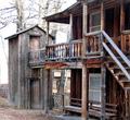
| 04/28/2005 10:09:59 PM | "The Art Chateau"by TressiderComment: Thought something was missing and I was right, it's the building next door, LOL! :) I love this place, my grandparents lived right across the street when they first moved to Butte, it was when Clark's son still owned it and had parties there. I used to work at the Copper King Mansion as a tour guide when Mrs. Smith owned it. A lovely picture, the cloning on the right is just a little obvious right on the edges of the building, maybe just a slight blurring there would help with that edge. The colors are nice for the sky but the bricks could use just a touch more contrast and color, just a slight touch to really make it pop. Maybe just a slight levels adjustment next time. Thanks for taking such a great shot! :) |
| 04/28/2005 10:01:04 PM | |
| 04/28/2005 09:41:15 PM | |
|
Showing 391 - 400 of ~2077 |
Home -
Challenges -
Community -
League -
Photos -
Cameras -
Lenses -
Learn -
Help -
Terms of Use -
Privacy -
Top ^
DPChallenge, and website content and design, Copyright © 2001-2026 Challenging Technologies, LLC.
All digital photo copyrights belong to the photographers and may not be used without permission.
Current Server Time: 06/11/2026 05:39:55 PM EDT.
|