|
|
|
Showing 361 - 370 of ~2077 |
| Image |
Comment |
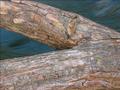
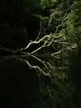
| 09/18/2005 10:36:17 PM | Branch over the River Guad(alupe)by amjltComment: Greetings from the Critique Club!
A very nice shot with the composition and textures.
The colors on the branch seem a bit blown or washed out. While I can see the different textures on the branch, the lack of tonal difference in the colors make it all seem flat and a bit boring. The green blade or start of branch adds a nice touch but again the color seems a bit flat.
Maybe an adjustment on the curves or levels would help really make this shot pop.
Other than that, you have a great start on this shot.
Deannda |  Photographer found comment helpful. Photographer found comment helpful. |
| 09/18/2005 10:26:42 PM | Bareby LevTComment: Greetings from the Critique Club!
So, you didn't tell the results of yoru experiment! :)
This is square on topic and the tacky colors seem to have backfired a bit looking at your score, people liked it!
I personally look at it and say, "Cool colors, but very unnatural." The edges around the branches don't seem right for some reason, not exactly sure why.
The lines coming in and out are very nice, leading in, leading out. I'm thinking if you had just adjusted the colors to a more natural blue it would have done even better but we may never know, right?
Nice job.
Deannda | | Photographer found comment helpful. |
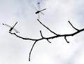
| 09/18/2005 10:04:19 PM | Dragonflightby Pug-HComment: Greetings from the Critique Club!
What a great capture! I love the silouette effect of the still dragonfly. The tones are there, the effect of a lucky capture, all there.
But what also is there is that other dragonfly, darnit! It really ends up pulling your attention from the still dragonfly. Being a basic challenge you couldn't clone him out but maybe a tighter crop across the top and on the right to put the rule of thirds in play. Using my magic envelopes if you take the top line to the top of the branch in the middle and just a bit off the right it offers a whole new view of the shot. Really keeps your attention on the still dragonfly.
Other that than, FANTASTIC CAPTURE!!!
Deannda | | Photographer found comment helpful. |
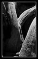
| 09/18/2005 09:57:38 PM | An old treeby jmleliiComment: Greetings from the Critique Club!
Wow! That was my first impression when I saw this come out of the que. This is an amazing shot. Then I saw your score and said, "WHAT THE ????"
This is an amazing shot, the shadows, the tones are all very well done for my taste. I like the border, I immediately thought that this would make a fantastic print.
The only reason I can see why it might not have done as well as I THINK it should have is the bottom could be cropped just a touch more, taking out the root area on the left and the light on the right is just a bit blown out.
But otherwise, WOW!!! Good Job!!
Deannda | | Photographer found comment helpful. |
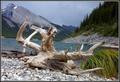
| 09/18/2005 09:50:31 PM | Dead Branch Driftingby ShecoyaComment: Greetings from the Critique Club!
What a lovely shot! Reading your comments and the comments of others, there really isn't much I can add to that.
Yes, it's tilted and can be corrected.
The setting is very nice and the overall colors and light are great. I see this is your first entry, good luck in future challenges!
Deannda | | Photographer found comment helpful. |
| 09/18/2005 09:44:22 PM | Make Up...by bamihooComment: Greetings from the Critique Club!
What a lovely shot! I like the reflection, the clarity on the branch, very nice.
The balance seems off just a bit on the vertical, just missing the rule of thirds I think. The branches are centered in the vertical but they don't land on the thirds line either making it feel off for some reason.
The colors and the light also seem just a touch flat, nothing major, just a touch.
Other than that, it's a great shot!
Deannda |
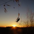
| 09/18/2005 03:15:14 PM | Poiseby hlpme123Comment: Greetings from the Critique Club!
WOW! What a great capture! I love this shot and would have given it a 7 or 8 had I had the chance to vote at the time.
I'm sure you've heard this before, (I haven't read the other comments) but the trees on the right, DARN IT! If you could have either come from a different angle or been able to clone them out, this would have been a top 10 shot for sure. The colors, the clarity on the bug, it's all there, it's just those darn trees!
Hope this helps!
Deannda | | Photographer found comment helpful. |
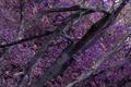
| 09/18/2005 03:11:44 PM | the wonka branchby gclarkComment: Greetings from the Critique Club!
It's rather amazing the first thing I thought when this came up on my screen was, "HEY! Willy Wonka colors!" LOL, then I saw your title!
This is a well composed shot overall, you have the branches leading you from left to right, the only change I might make on cropping is to have the bottom left corner cropped right to the main branch so it leads you in either right from the corner or right above the corner. A better lead into the shot.
Also the clarity of the overall shot, there almost seem to be shadows or ghosts in some areas, not sure if that's from a long exposure or post processing but in it's own way it's good because it's making me look at it again and again to see if my eyes are playing tricks on me, nice illusion effect.
The hue and saturation do leave something to be desire for me personally. The colors or nice but they seem flat and a bit boring, a touch more contrast or levels adjustment might make them come alive just a bit more
Overall, a good shot with the potential to be a great shot!
Welcome to DPC!
Deannda | | Photographer found comment helpful. |
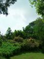
| 09/18/2005 02:47:29 PM | A nice nature compositionby Wilson LowComment: Greetings from the Critque Club!
This is a lovely image, the colors of the grass and trees are very nice. The sky seems a bit blown out, could use a touch of adjustment to really bring out the blue which in turn would bring out the green even more.
I'm looking at your final score and guessing the reason for this is people, from looking at the winners, were looking for a more definitive branch, not a bunch together and you can't see many individual branches. Also the focus seems just a bit soft. Perhaps if you had gone for just the upper branches of some of the trees against the blue sky, cutting out all the bushes on the bottom it might have done better.
Also the composition, you are all filled in on the right for a frame but have a hole on the left and the top. The top would be okay if you have the left filled in, bringing you in and around the picture then back out the other side is my thought process here.
Oh and I see this is your first submission! Well congratulations on taking the plunge, it's really a nice shot overall, just a few tweeks here and there and it can be an awesome shot.
Deannda
| | Photographer found comment helpful. |
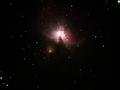
| 09/17/2005 11:22:17 PM | A giant glow in space's darknessby PascalComment: Greetings from the Critique Club!
This is a wonderful idea for the High Contrast Challenge, nothing much blacker than space, right? :)
The cropping seems a bit loose, maybe if you had tightened it up more around the Nebula and then the other stars wouldn't be so distracting.
It's a great shot otherwise, not really much I could add or detract from the shot. Well done.
Deannda | | Photographer found comment helpful. |
|
Showing 361 - 370 of ~2077 |
Home -
Challenges -
Community -
League -
Photos -
Cameras -
Lenses -
Learn -
Help -
Terms of Use -
Privacy -
Top ^
DPChallenge, and website content and design, Copyright © 2001-2026 Challenging Technologies, LLC.
All digital photo copyrights belong to the photographers and may not be used without permission.
Current Server Time: 06/11/2026 04:03:59 PM EDT.
|