|
|
|
Showing 351 - 360 of ~2077 |
| Image |
Comment |
| 09/22/2005 09:43:21 PM | Those Eyesby mystical_princessComment: Greetings from the Critique Club!
WOW! Hubba, Hubba! Oh wait, just read your comments, sorry, Hubby, Hubby! ;)
This is a wonderful shot, I loved it in the thumbnails and I love it in full size. His expression, those eyes! Great capture!
About the only things I can see that might make this a better shot for me personally would be a tighter crop on the bottom, you cropped or shot right at the top of his head and left all that space under his chin. I'm funny about balance on stuff like that, I like negative space when used with the rule of thirds but that's not in play here that I can see.
Also, the only thing I see as a bit of a distraction is the background. A more solid backdrop or just the brick would be better to me. Again, these are all just personal things that I like. :)
Hope my comments help!
Deannda |  Photographer found comment helpful. Photographer found comment helpful. |
| 09/22/2005 09:39:38 PM | The evil ....by RefwhettComment: Greetings from the Critique Club!
Wow, I love the expression! Very well done and unique. I love unique!
Reading through the comments you already received there really isn't much I can add to this. The horizontal cropping would really empasize the long face and some adjustments for the colors would make this a very interesting and fun shot!
Good Luck!
Deannda | | Photographer found comment helpful. |
| 09/19/2005 04:53:25 PM | Curlyby DvosdonComment: Greetings from the Critique Club!
What a cool shot! I love the curl of the branch and the way it is silhouetted against the sky! Very well done.
One thing that bothers me is the leaves on the sides, maybe a slightly tighter crop on the sides so it's not so much part of the shot? Bring more focus back to the curly branch?
Otherwise I really can't offer much on this shot, the contrast is great, the colors pop, the shot is overall very well done!
Good Luck in future Challenges!
Deannda | | Photographer found comment helpful. |
| 09/19/2005 04:42:45 PM | Branchesby ph223048Comment: Greetings from the Critique Club!
Well, what can I say?
WOW! I love this shot, there really isn't a lot to critique on because it was a basic challenge you couldn't do any cloning (like the branch across his back) but then again I wouldn't touch that branch, it adds to the picture and really helps capture the overall mometn.
The clarity, the overall composition of the shot is wonderful, the only other thing I would have changed for my personal taste was to bump up the contrast just a touch, barely a touch, a whisper is more like it. Other than that, WELL DONE! :)
Deannda |
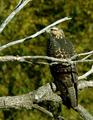
| 09/19/2005 04:28:02 PM | Through The Branchesby sajinComment: Greetings from the Critique Club!
What a nice shot! Good clarity on the bird, nice framing overall and the way the bill of the bird works with the leaves on the branch is very interesting!
The color seems a bit flat, almost like there is some back lighting on the bird but not quite there. As a result the gray on the bird comes out really flat looking and the detail on the feathers seems just a tad soft in some areas.
The branches and leaves on the top and side are very well placed for the shot but the one shadow or leaf on the bottom in front of the rock is a bit distracting to me. I know these are little things but honestly that is all I have to work with, little things but all the major things are there already! A wonderful shot overall!
Deannda | | Photographer found comment helpful. |
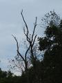
| 09/19/2005 04:21:23 PM | reaching for heavenby melodeeComment: Greetings from the Critique Club!
This is a good idea for the challenge, branches against the sky and I like the concept.
The problem that I see are the branches all around it. Maybe if you had zoomed in more on the ones against the sky, leaving out the others? Also the picture does not appear black and white on my monitor but it could be converted quite easily and then adjust the levels or curves to really make the tones come through, or even leave in color and adjust your levels and contrast to help bring out the blue against the black branch.
My thought process is that if you move a bit to your right and take the shot zoomed in more on just the branches in the middle, cutting out the side and bottom and then work on the levels if the lighting is again low, you would have a much more dramatic and wow kind of shot. Maybe even angle it a bit so the branches come in from the side or corner.
I see you have only been here a short time, not sure anyone has said WELCOME yet, so here you go WELCOME TO DPC! I think you will find a great source of help and information here.
Good Luck in future challenges.
Deannda | | Photographer found comment helpful. |
| 09/19/2005 03:56:29 PM | Rockingby sandeepviswaComment: Greetings from the Critique Club!
This is a very interesting shot and yes, I can see several faces! This is an interesting choice for the Branch Challenge. Not really sure what you were going for and without looking at the comments I'm betting you got a lower score because many felt it did not meet the challenge. Just looked at the comments and I was right. I would love to hear how you felt it meet the challenge though.
As for the picture, it does have a lot of different facets to it and with some minor adjustments in post processing you could probably really bring out those shadows and faces even better. Right now the lighting and color seems a bit flat and it all really rather blends in together.
If you decide to play with this some more I would love to see the results!
Again, nice shot!
Deannda
Hope my comments help
|
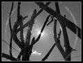
| 09/19/2005 03:45:22 PM | Torn Branchesby SilienceComment: Greetings from the Critique Club!
This is a very cool shot on several levels, I like the lines of the branches, I like the sun peeking through the branch, I like the overall feel with the black and white.
Now, what is wrong you ask? Well, things I'm sure you've already heard, hang on, let me check the comments. :::Scrolling down::::
Yep, the electrical wires, while they do add more lines to the shot and could work with it, the problem I have is the size of them compared to the branches. Too bad this was a basic challenge.
What I would like to see if the shot without the lines and see if that also affects the way I look at the halo and sun spots caused because with the extra lines they too are a bit distracting. But maybe with the lines removed..............
But again, the thorns, the branches, nice job, if you redo this shot (clone out the lines) I would love to see the results.
Deannda |
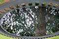
| 09/18/2005 11:17:07 PM | Bird Bathby ElaineComment: Greetings from the Critique Club!
And welcome! I see you just started here! I think and hope you will find lots of great information and ideas here.
Now, on to the critique of your entry. I like the idea you came up with, the reflection in the birdbath is very unique and good! But what could make it better is your next question I'm sure. Well, I'm no expert but I can tell you what I see and what I would change.
First the grass around the edges is very distracting and pulls away from the main subject of the shot, the branch on the tree. I think you could have cropped the top and bottom edges so you only had the edge of the bird bath left. Leaving it there actually gives me a bit of vertigo because it looks like you flipped your shot upside down and I can't look at it for very long because of the illusion you created. While this can be cool for some shots, the main subject isn't bold and interesting enough to make me want to keep looking at it and coming back to it.
The lighting seems a bit flat as do the colors, maybe a slight levels or curves adjustment would help there. It would help bring up the colors as well to really help make this shot stand out. That adjustment with just a slight cropping to leave the feeling of vertigo could really make this shot one that people have to keep coming back to just to make sure they saw what they think they saw.
Hope my comments help and again, WELCOME to DPChallenge!
Deannda | | Photographer found comment helpful. |
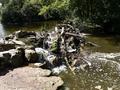
| 09/18/2005 11:08:40 PM | Dam Waterby Tony275Comment: Greetings from the Critique Club!
This is an interesting shot. It meets the challenge in that there are branches but there is so much more also, competing for my attention. The rocks, the water, the moss, the trees. Maybe if you had focused more on the branches themselves, either through cropping or zooming in more on one area. The entire bottom area and the sides of the shot really adds nothing to it but distracting elements that draw attention away from the main subject of the dam.
The lighting, while natural is a bit harsh and either using a polorizing filter or through post processing could be softened a bit and maybe bring the colors out more. If you work with this shot at all Iwould love to see the results.
I see this is also your first entry, congrats, you did better than I did on my first entry! :)
Deannda |
|
Showing 351 - 360 of ~2077 |
Home -
Challenges -
Community -
League -
Photos -
Cameras -
Lenses -
Learn -
Help -
Terms of Use -
Privacy -
Top ^
DPChallenge, and website content and design, Copyright © 2001-2026 Challenging Technologies, LLC.
All digital photo copyrights belong to the photographers and may not be used without permission.
Current Server Time: 06/11/2026 04:03:53 PM EDT.
|