|
|
|
Showing 341 - 350 of ~2077 |
| Image |
Comment |
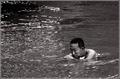
| 11/03/2005 12:53:30 AM | Silentby TiberiusComment: Greetings from the Critique Club!
This is a wonderful shot. I like the quiet look on his face. Me? I would have been panic city, but that's only because I can't swim, LOL!
The first thing that I notice about this shot is that it seems just a bit tilted to the left. Almost as if all the water is going to spill out that side and the poor man will fall out as well. It's a bit disconcernting (sp?). Maybe just the slightest tilt back to the right? The use of grain on this one is well done, not too much, not too little, just right!
The lack of contrast in this also makes it just rather sit there on the screen despite the motion of the water. It almost looks like a cross between a sepia tone and a black and white, like it can't quite decide and that is also a bit bothersome to me personally. I like one or other, I like both, but not at the same time, LOL :)
I hope my comments help!
Good Luck in future challenges!
Deannda
if you redo this I would love to see the results! |  Photographer found comment helpful. Photographer found comment helpful. |
| 11/03/2005 12:48:59 AM | America's Finest Cityby emtmdhComment: Greetings from the Critique Club!
Hello and just what city is this? I have no clue as I'm not familier with most city skylines, LOL! :)
This has the potential to be a wonderful great shot. The idea is there, the composition is there but the post processing really hurt this one in the end. The halos around the building, the tilt on the horizon and the uneven colors really hurt this shot. Also, while you used the 640 on one side the other side is so short you lose the chance to really make this shot work.
The bridge coming out on the right hand side is not needed IMHO, if you cropped it tighter on that side and then straightened it out and don't sharpen so much it leaves a halo, add a noise filter if you need to. If you rework this I would love to see it!
Good Luck in Future Challenges!
Deannda |
| 11/03/2005 12:45:14 AM | Bewareby LadeeMComment: Greetings from the Critique Club!
I saw you had posted this in the forums for critique also, let me check that thread before continuing since I'm sure you really don't need to hear the same things over, LOL :)
Well, between the forum posts and the notes here there really isn't much I can add. I like the overall idea, it's very good and would work well with a grainy image but the end effect seemed to have been lost in the post processing. If you take everyone's advice and redo this shot I would love to see it!
Good Luck in Future Challenges!
Deannda
| | Photographer found comment helpful. |
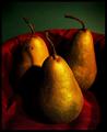
| 11/03/2005 12:41:44 AM | Three Pairby bobdaveantComment: Greetings from the Critique Club!
I loved this shot when I was voting in the challenge and I love it still. The colors, the grit, it all works so well together. I normally do not like grainy shots but this one really appealed to me because you darkened it in a manner that really made it work.
The composition is wonderful the colors, again, wonderful, the shadows on the left are a bit distracting but not so much that it really hurts the overall picture.
There is really nothing here for me to critique! A beautiful shot! It would make a great print!
Deannda
Good Luck in future challenges | | Photographer found comment helpful. |
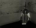
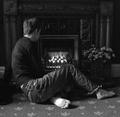
| 11/02/2005 10:18:09 PM | contemplationby barbaraanneComment: Greetings from the Critique Club!
Hi! I like this image, the emotive factor is there and the black and white sets a very nice tone.
It looks like a decent use of the rule of thirds with the person covering the left and bottom side of the frame but I would have liked to maybe seen their face a bit more, just a slight turn more towards fireplace so you could at least see one eye and the look of deep thought in it.
The grain is a bit much, just a bit more than really needed for this shot though this shot does work well with grain.
There is one spot on the bottom of the foot that almost looks blown out, not sure if it was a light or from post processing. And possibly just a touch more contrast to give it a little more edge.
Hope my comments help!
Deannda | | Photographer found comment helpful. |
| 10/29/2005 04:20:53 PM | Tanyaby bamasterComment: This is amazing! A lovely shot showing a great time in a man's life (by this stage the woman is only wanting the evil thing inside of her OUT!) but this woman hides that very well, LOL!
Truly a lovely shot, it jumped out at me from the thumbnails while looking for another.
Deannda |
| 10/11/2005 12:26:08 AM | Sweet Freedomby idnicComment: Okay, you need to quit abusing this poor dog all in the name of a ribbon, ROFLMAO!!! Nice job! A 10 for the dog and 1 for you for being so mean and I'll settle for a 10 because of the thought and work that went into this. You know the dog is going to end up a chunky monkey if you keep bribing it, LOL !:) | | Photographer found comment helpful. |
| 09/28/2005 07:35:56 PM | Tangleby pcodyComment: This is you? WOW! It's awesome! What a classic look and feel! You should have done much better!
Deannda | | Photographer found comment helpful. |
| 09/28/2005 04:08:47 PM | |
| 09/22/2005 10:24:46 PM | Sultry Redheadby BowerbirdComment: Greetings from the Critique Club!
This girl looks very familier to me, don't know why but she does. This is a very nice shot, the set up, the model. Reading over the comments you already received I would have to agree with comments about the expression in relation to the title, I did not think Sultry when I first saw the shot, I thought more along the lines that she was not to happy or warm at the time.
I love wind shots when the hair is blowing away or around the face but hair is the face is a personal pet peeve of mine, it's me. Sometimes, if done just right I like but in this case it's hiding a lovely face and not really adding anything to the shot for me.
The colors seem really muted, one thing I like about redhead shots is when the hair really looks alive and vibrant. I'm an auburn myself and when I have shots taken I play with the tones until the true color comes out. Again, these are all just personal opinions, hope they are helping.
The background is a bit distracting but with some blurring and burning it could work very well to your advantage.
If I were to rework this shot the only things I would do are boost the colors, mute the background and maybe crop in a little tighter on the left side, putting the rule of thirds in play.
If you do any other work on this shot I would love to see the results! Again, great shot, lovely girl!
Deannda | | Photographer found comment helpful. |
|
Showing 341 - 350 of ~2077 |
Home -
Challenges -
Community -
League -
Photos -
Cameras -
Lenses -
Learn -
Help -
Terms of Use -
Privacy -
Top ^
DPChallenge, and website content and design, Copyright © 2001-2026 Challenging Technologies, LLC.
All digital photo copyrights belong to the photographers and may not be used without permission.
Current Server Time: 06/11/2026 04:04:11 PM EDT.
|