| Image |
Comment |
| 11/15/2003 07:43:02 PM |
Entryby karmatComment: That is so pretty, it looks like an entry way to a lake or pond, how nice! The flowers on the right are a bit distracting and if you could have shown just a bit more of the lake in the background. Started at a 6, am going to a 7 |
 Photographer found comment helpful. Photographer found comment helpful. |
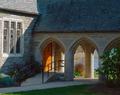
| 11/15/2003 07:41:51 PM |
Missionby JPRComment: This shot is well cropped and set up very well. The lighting and contrast leaves me a bit wanting though. The shadows on below the lower ledge and the upper lerft ledge is really noticable and hurts this shot a bit to me. Perhaps if you had gone black and white or duotone to play on those shadows? A 7, up from a 6 |
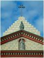
| 11/15/2003 07:39:52 PM |
Altered Imageby jfaulknerComment: This shot is close to perfect on second looks. only two things are keeping me from giving it a 9 or 10, the roof on the upper right and the wall on the left, a slightly different stance so you could have cropped differently perhaps? The light is close to perfect, maybe just a tad brighter but the colors and the clarity is fantastice. Had a 7 but am going to an 8 |
| Photographer found comment helpful. |
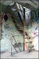
| 11/15/2003 07:37:21 PM |
sacred and profaneby SeanachaiComment: Yes it is, isn't it? This is a good shot of what is important to one part of our society and an eyesore to another. An outlet for their creative energy and a plce to call their own while society turns a blind eye and does't offer solutions to these problems. I like the shot overall but it seems a tad oversharp and the light is a bit blown out on the right side. A 7 |
| Photographer found comment helpful. |
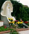
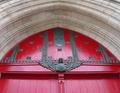
| 11/15/2003 07:35:50 PM |
Angel at the Entranceby Spork99Comment: Very well compositioned shot, the way the arch meets at the top and draws you around. But the angel is so small and hard to see , the arch overpowers her. Also, the angle makes her look like she is looking down the front of her dress, I know that sounds horrible but it does, either that or she's pregnant because of the roundness and the way her hands are placed. The contrast is a bit lacking and the color of the door could pop just a bit more. A 7 |
| Photographer found comment helpful. |
| 11/15/2003 07:33:47 PM |
Golden Lightby dinnComment: This is so pretty, the gold tones and the light coming in the top window is just wonderful. The different way the pews run helps take you through the whole shot and keep you looking. The only thing I would have done differently was possibly straighten out the crop on the top or loosen it just a tad so the upper right corner didn't get cut off like it did. Also the corp on the left could be just a tad tighter. Started at a 7 but am going to a 9 |
| Photographer found comment helpful. |
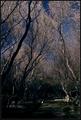
| 11/15/2003 07:32:05 PM |
Sacred Groundsby heidaComment: I really like this shot, the way the trees draw your eye up from the edges to meet at the top. The path bringing you in and taking you to the back of the shot. The only thing that could be better for me would be a bit more light on the bottom part, seems just a tad darl, I like the soft border, works very well. Started at a 7, raising it to an 8 |
| Photographer found comment helpful. |
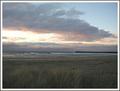
| 11/15/2003 07:26:35 PM |
Sacred Shoresby Silent SisterComment: A nice quiet ocean view, very relaxing for some. I like the composition of this shot, the way the beach runs acroos the lower middle of the shot and the clouds coming at an angle is very good. A bit brighter and more clarity would have gotten this an 8 or above, as is a 7 |
| Photographer found comment helpful. |
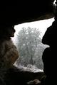
| 11/15/2003 07:24:55 PM |
Stone Sanctuaryby rll07Comment: I really like this shot, the dark interior to the bright snow outside. If the crop was a little tighter on the top, getting rid of the distracting crack in the upper right corner. An 8 |
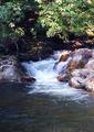
| 11/15/2003 07:16:52 PM |
special trout holeby wetlandComment: This is a lovely shot, the motion of the water almost makes me have to go to the bathroom, LOL! I like the overall composition of the shot and the crop is also well done. The top seems a bit bright but not too much and a bit more clarity in the rest of the shot would have scored you a 9 or 10, as is, an 8 |
| Photographer found comment helpful. |
Home -
Challenges -
Community -
League -
Photos -
Cameras -
Lenses -
Learn -
Help -
Terms of Use -
Privacy -
Top ^
DPChallenge, and website content and design, Copyright © 2001-2026 Challenging Technologies, LLC.
All digital photo copyrights belong to the photographers and may not be used without permission.
Current Server Time: 06/19/2026 11:20:06 PM EDT.