| Image |
Comment |
| 11/16/2003 11:53:34 PM |
Cape Cod Canalby jmritzComment: This is a wonderful overall shot and the colors are nice but don't really pop to me and the black triangle in the lower right corner is a bit distracting to , maybe a slightly tighter crop? Started with a 5, ending with a 7 |
 Photographer found comment helpful. Photographer found comment helpful. |
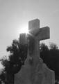
| 11/16/2003 11:52:33 PM |
Cemeteryby StevePaxComment: The light peeking over the top is a bit more of a distraction than an addition to this shot, can't quite place my finger on it. The shot could be sharpened and less grain and noise. A 5, changed my mind about the light upon looking again but the lack of focus still bothers me a bit.
Another look and I'm going to a 7 on this for my final vote :) |
| Photographer found comment helpful. |
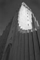
| 11/16/2003 11:52:07 PM |
Hallgrimskirkjaby heidarthorComment: Wow! What a building! I like the line of the roof, the way it curves around and takes you up into the shot and the bright light on the one wall is a nice contrast. But the contrast in the overall shot is a bit wanting. I would have liked to seen this in color as well. A 5 to start, a 7 to finish |
| Photographer found comment helpful. |
| 11/16/2003 11:50:46 PM |
Comeby mariomelComment: I commented on this one already but it never took! EEK!
I like the idea and the shot but the crop could have been tighter on the top, leaving the lettering out. The lines look good taking you across the shot and the angle is also well done, looking down on you as he protects you. The contrast and brightness could be brought up just a touch to really make the shot pop. Started at a 5, going to a 6 |
| Photographer found comment helpful. |
| 11/16/2003 11:49:14 PM |
Our Lady of Lourdesby sleekrComment: Very nice idea and the off center works because of the plant on the right. I think I would have liked to seen a little more open crop on the top to finish out the arch above the statue and just a tad more sharpness on the statue. Maybe a little higher angle too so you could see more of her face? Started at a 5, finishing with a 7 |
| Photographer found comment helpful. |
| 11/16/2003 11:47:43 PM |
Saint Josaphat's Ukranian Catholic Churchby wdebeau1Comment: There was something about this shot that bothered me, I mean it has clarity and light but the shadows on the domes is distracting to me and the tree on the right and left are also distracting to me. I'm thinking a tight crop on that very interesting looking window would look cool or maybe to see it in the daylight without all the shadows. A 5 to start, a 7 to finish |
| 11/16/2003 11:46:16 PM |
Bowby sherComment: I like the idea behind this shot, just not sure about the final product. The shot seems a bit dull to me and maybe that is what you were going for, a more subdued shot but the color makes me want to see just a bit more contrast. Also the crop could be just a tad tighter on the top for me. I do like the border also. Started at a 5, am moving to a 7 |
| Photographer found comment helpful. |
| 11/16/2003 11:43:35 PM |
Sunrise at St Peter'sby ladpupmoeComment: A very nice idea, the colors are a bit dull and there is too much darkness across the bottom for my taste. A tighter crop and just a little more adjustment on the brightness and contrast would have really made this shot pop. A 5 |
| Photographer found comment helpful. |
| 11/16/2003 11:42:37 PM |
Worship comes from the heart... Church building is optional!by smellyfish1002Comment: How true! This is why I didn't enter the sacred challenge, it's not just about the church. The idea behind this shot is very well thought out and I love the title. But the darkness on the one side is a bit too much for me. I like the shadow it throws but not the complete darkness on the left and across the top. I started with a 6 but am raising it to a 7 |
| Photographer found comment helpful. |
| 11/16/2003 11:41:00 PM |
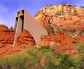
On Solid Rock I Standby ArtifactsComment: I can see why this had to be validated, LOL! That building certainly looks like it was placed in there by Photo shop, very nice clarity.
The angle of the shot threw me off at first and while the clarity and sharpness is there, it's almost too sharp, you know, too perfect and for me that's a bit of a minus. A different angle might have helped, more from the front of the structure possibly. I started at a 6, am going to an 8 |
| Photographer found comment helpful. |
Home -
Challenges -
Community -
League -
Photos -
Cameras -
Lenses -
Learn -
Help -
Terms of Use -
Privacy -
Top ^
DPChallenge, and website content and design, Copyright © 2001-2026 Challenging Technologies, LLC.
All digital photo copyrights belong to the photographers and may not be used without permission.
Current Server Time: 06/19/2026 03:18:31 PM EDT.