| Image |
Comment |
| 11/17/2003 09:54:39 PM |
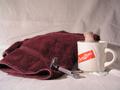
Wet Shaveby FactoryXComment: Hi! I'm here from the Critique Club. This is a great shot and I love the cup! I do remember Burma-Shave signs on the highway from when I was just a baby mind you, LOL!
I like the set up of the shot, the razor, the towel, the cup and brush to spread the cream which is just coming over the side. An excellent set up overall.
Now for what doesn't sit quite right with me, the lighting, seems a bit dull and the back drop is cloth. In a situation like this I would expect ceramic or tile and I know that can be very difficult to come by in some situations but perhaps some white board or white poster board would offer a better reflection for the light and really make the picture pop with color and life. The shadows on the right are also a bit of a distraction to me, if they were behind the cup or offset by another light on the right so they weren't so dark. Also, the sheet looks like it's been ironed which is good but maybe also if it was pulled tighter so you didn't have any creases or folds in it?
The focus is good through out most of the shot, the backdrop is a bit blurred as it should be in a shot like this but so is the cup handle. It seems just a bit off from the rest of the shot.
The cropping is also well done except for the towel on the left, if the whole towel had been in the shot or cropped slightly tighter on the right to balance it out better. And a reddish/orange towel to match the cup would really make this shot pop.
Overall this is a very good shot, just a few tweeks and you would have a great shot. I liked this one during the challenge and like it even more coming back to take another look.
Good Luck In Future Challenges!
Deannda
DNeufer@stny.rr.com if you have any questions or want to discuss this further! Message edited by author 2003-11-17 22:55:10. |
 Photographer found comment helpful. Photographer found comment helpful. |
| 11/17/2003 09:40:48 PM |
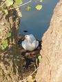
Please, don't move!by GREENMEMComment: Hi! This is my first time doing this, so please be aware! :) I'm with the Critique Club.
I left a comment on this in the original challenge, now let me be a little more detailed as I really take some time to look this over.
As I'm sure you are aware, there was a lot of discussion if this type of shot even fit the challenge since it included something that was alive even though it was being very still. That decision is entirely up to you in my opinion, if you think it fits, it fits.
As for the shot, as I said before, the framing seems off a bit, if you had something that had come across the top it would have made a very natural frame, if there was a branch you could have moved? Also the DOF is well done with the blurred tree trunks in the front and the sharper focus in the back ground though the duck still looks just a tad soft to me. The light on the trees is also very bright and almost looks blown out on the right side, a slight adjustment on the contrast might have helped that. Also a tighter crop on the top and bottom would cut out those branches all together and be less of a distraction.
The shadows on the duck are very subtle and look very nice, you can see the sharper one going down his/her back and it's a nice contrast. I'm guessing this was a lucky shot and you probably didn't get too many shots off so overall it's a very nice shot and could probably be tweeked a bit more in photo shop and even put up for a print!
Good Luck in future challenges!
Deannda
DNeufer@stny.rr.com if you have any questions :) Message edited by author 2003-11-18 00:19:13. |
| 11/17/2003 05:46:15 PM |
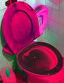
Potty Book for Boys. 2 by Alyssa Satin Capucilliby kinksComment: Ah, the joys of potty training! I get to look forward to that very soon with my son and I can imagine my toilet looking like this very quickly, ICK! But I think this would have looked better with less pink and red and more white and black, perhaps black and white with a higher contrast? A 2 |
| Photographer found comment helpful. |
| 11/17/2003 05:36:36 PM |
Government Building Authority in dutch: Publieke werkenby doginroomComment: Not quite sure what a hotel has to do with a government building but it could in another country I guess. This shot is overexposed on the left, and very much out of focus. The tree on the right is a bit distracting also the the shot could be rotated just a bit to the right. A 2 |
| 11/17/2003 05:18:23 PM |
"Are you my mother?"by thefragileComment: I'm sorry but this is so distasteful compared to the actual book and while it's a part of nature, it certainly wasn't part of the book. A 1 |
| Photographer found comment helpful. |
| 11/17/2003 05:15:52 PM |
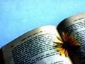
Blossom in a World of Darknessby LoveCriesHateComment: Not sure I really get the connection to the title except for the blossom part but the shot is much to noisy and out of focus, the cropping needs to be more angled, so maybe the corners of the book run from one side to the other, half book/half background. The light is also over exposed on the center of the book. This is a great idea, just needs some fine tuning. :) A 2 |
| Photographer found comment helpful. |
| 11/16/2003 11:58:58 PM |
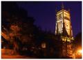
Cirencester Churchby jonpinkComment: This is a great shot of a building on the right but the trees on the left hurt this shot to me. Also the bright light on the right is very distracting to me. A 5 |
| 11/16/2003 11:57:00 PM |
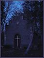
Woodland Sanctuaryby Ten13Comment: This is a lovely shot but a bit too dark, grainy and out of focus. I like the idea but think it might have come off better coming directly in front of the building and losing that tree on the right that curves in front of the building. A 5 |
| Photographer found comment helpful. |
| 11/16/2003 11:55:43 PM |
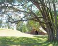
Home Sweet Homeby christyrackComment: This is a lovely overall shot but the colors seem a bit dull ovearll at the same time. A bit more contrast and little less brightness would really make this shot jump out at me. I like the crop and the overall feel, started at a 5, moving to a 7 |
| 11/16/2003 11:54:30 PM |
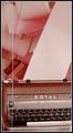
At the Altar of Free Speechby GeneralEComment: I like the idea behind this but all the paper in the background is really distracting as is the line that runs down the left side, I'm guessing this was in a window? The sharpness could also be touched up a notch. A 5 |
| Photographer found comment helpful. |
Home -
Challenges -
Community -
League -
Photos -
Cameras -
Lenses -
Learn -
Help -
Terms of Use -
Privacy -
Top ^
DPChallenge, and website content and design, Copyright © 2001-2026 Challenging Technologies, LLC.
All digital photo copyrights belong to the photographers and may not be used without permission.
Current Server Time: 06/20/2026 03:16:26 AM EDT.