| Image |
Comment |
| 11/23/2003 10:28:45 AM |
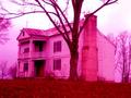
Looking at History through Rose Colored Glassesby jpb323redComment: A good idea and not a bad shot. The picture looks slightly tilted to the right and to me, to make it really literal I would have had the glasses just in front of the camera so you could see the edges of the eyeglass frame, so you would see some of the real color around the edges. Also the focus is just a tad too soft for my taste. A 5 |
 Photographer found comment helpful. Photographer found comment helpful. |
| 11/23/2003 10:26:32 AM |
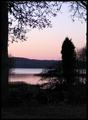
Love Is In The Airby MonaComment: While this is a lovely shot I don't see how it feels the challenge of literalism. I see no "love" per say and there's a lot going on in the shot. A 5 |
| Photographer found comment helpful. |
| 11/23/2003 10:25:30 AM |
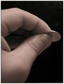
Penny Pincherby vonautschComment: Very cute, I love it! The colors leave me wanting though and it seems it could be just a tad sharper though the cropping is well done and the contrast is there. Also, looks like someone else is a nail biter like me, one reason I never shoot my own hands, :) Started at a 5, am going to a 7 |
| Photographer found comment helpful. |
| 11/23/2003 10:23:44 AM |
Your Mileage May Varyby ellamayComment: Not sure I quite understand what you were going for here, it just doesn't come across as literal to me for some reason but the shot is very nice, well done and it's almost as if he's looking right at you. A 5 |
| Photographer found comment helpful. |
| 11/23/2003 10:22:44 AM |
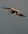
Flying south for the winterby AV8RComment: A good idea overall but the execution of the shot left me wanting. I love the sky, the colors but the clarity and the reversal of the letters leaves me wanting. I understand you wouldn't have gotten the same backdrop coming from the other side but this way it almost looks like the picture was flipped over. A 5 |
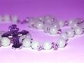
| 11/20/2003 10:29:10 PM |
Sacred corner in my houseby royansComment: Critique Club
Hi! I had commented on this shot during the challenge, now let me see if I can be a little more specific! :)
Like I said before, I love the shot overall, the composition is well done, the cross off the the left and the beads leading your around the shot.
The DOF is well done but a tad more clarity/sharpness on the cross the the front beads I think would really make this shot jump out at me. The color still bothers me a bit too. The purplish/pink hue just doesn't seem to quite fit the scene to me. I would love to see this shot in black and white or with a sepia tones. Or possibly bring up the contrast just a touch to really make the shot pop out at me.
I also like the angle of the shot but if you do reshoot this, maybe come up just a 1/4 of an inch so you could really get the feel of the flow of the beads through the shot. The beads in the front are just a bit blown out, not sure what lighting you used, maybe a light coming in from each side to defuse the light from the front. Also the beads seems to have a halo around them, this is a great effect for this challenge and I would love to know how it was achieved.
Hope this helps!
Good Luck In Future Challenges!
Deannda
DNeufer@stny.rr.com if you have any questions or want to discuss this further! |
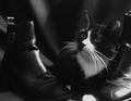
| 11/19/2003 02:17:00 PM |
Puss In Bootsby NeuferlandComment: WOW! thank you everyone for the compliments and the scoring! I'm looking at those 10's and 9's and saying, "THEY LIKED IT!"
Tweety is my subject, she's a shelter kitty and she's the sweetest thing, she let me pose her and take over 150 shots over 3 different set ups. She got a can of tuna for her trouble. :)
Deannda
WOWOWOWOW!!! :) |
| 11/19/2003 12:02:21 AM |
|
| Photographer found comment helpful. |
| 11/18/2003 11:09:03 AM |
Closin' Timeby joannadivaComment: I like this shot on a lot of different elements, the crop, the chairs, the lights all work well together. The reflections are at a minimum and even with her in the back it's just as powerful to me having been the closing person in many a small business and having to clean up at the end of the shift. I also like that the focus is in the shop and not on the window lettering, excellent DOF for this shot. And the sepia tone is perfect for this kind of shot.
Art or crap? ART!!! Well done!
Deannda |
| Photographer found comment helpful. |
| 11/17/2003 09:56:16 PM |
|
Home -
Challenges -
Community -
League -
Photos -
Cameras -
Lenses -
Learn -
Help -
Terms of Use -
Privacy -
Top ^
DPChallenge, and website content and design, Copyright © 2001-2026 Challenging Technologies, LLC.
All digital photo copyrights belong to the photographers and may not be used without permission.
Current Server Time: 06/19/2026 04:54:21 PM EDT.