| Image |
Comment |
| 01/06/2004 05:08:19 PM |
December Saluteby AshezzComment: I'm guessing this is someone who came home or on their way out? A wonderful idea but the shot itself really leaves me wanting. The set up is a bit off, the flag pole looks like it's coming out of his head and the shot itself is a bit blurry. I think you wanted the flag in the shot but the set up could have been different. The cropping is a bit loose on the sides and if he was more to the side of the flag pole. A 4
Whoever it is, please tell them thank you from me and my family for their service and willingness to serve. |
| 01/06/2004 05:05:41 PM |
Illusionby Spanish_GreaseComment: These glasses look sooooooooooooo familier, I wonder, LOL! :)
I love this shot, very inventive and creative. The lighting is excellent and I love the set up but the black line across the bottom is a bit distracting to me. Started with an 8, going to a 9, would be a 10 without that line ;( |
 Photographer found comment helpful. Photographer found comment helpful. |
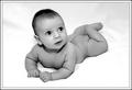
| 01/06/2004 05:03:54 PM |
Samuelby JackoComment: Gosh, this little guy looks so familier :) He's a doll and very little you could do to improve on this shot. A 10 |
| Photographer found comment helpful. |
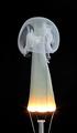
| 01/06/2004 05:03:12 PM |
Fingering Ghostby kiwinessComment: This is so cool, I still haven't figured it out and can't wait to see just how this was done, I've turned it upside down, sideways and still can't quite figure it out. Excellent. A 10 |
| Photographer found comment helpful. |
| 01/05/2004 12:02:05 AM |
Celebrate life by timmiComment: And yet another ribbon! You need to complain more often, LOL!
Congrats!
Deannda |
| Photographer found comment helpful. |
| 01/05/2004 12:01:39 AM |
Imagine... by JasperComment: A Beautiful shot, well worth the ribbon!
Congrats!
Deannda |
| Photographer found comment helpful. |
| 01/05/2004 12:01:11 AM |
|
| Photographer found comment helpful. |
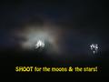
| 01/03/2004 10:13:35 PM |
Goal Orientedby channeledComment: Not quite sure how you tried to achieve the effect of moonS and starS but it didn't quite work for me personally. It's fuzzy, blurry and while the cloud effect on the left is well done the rest leaves me wanting. Also the font used just doesn't quite work and the all caps on the first word and none of the rest also gives it a sense of imbalance to me. A 4 |
| 01/03/2004 10:11:26 PM |
Little Ninja's Uniteby BigMoComment: A good idea and a lovely model but his eyes are almost laughing, to me a ninja, large or small should have more intense eyes. Also the cropping just leaves me feeling a bit closed in, maybe if it was loosened up just a tad, a very small tad. Started with a 4, am raising to a 6 |
| Photographer found comment helpful. |
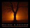
| 01/03/2004 10:07:15 PM |
Dreams are like rainbows. Only idiots chase them.by johnmComment: Just how motivational is that title? The shot is wonderful, Not quite sure how you pulled it off but it is well done. The lack of border hurts this shot for this challenge and the shot seems it could be rotated just a tad clockwise to line up the railing so it was more leve. A 4 |
Home -
Challenges -
Community -
League -
Photos -
Cameras -
Lenses -
Learn -
Help -
Terms of Use -
Privacy -
Top ^
DPChallenge, and website content and design, Copyright © 2001-2026 Challenging Technologies, LLC.
All digital photo copyrights belong to the photographers and may not be used without permission.
Current Server Time: 06/20/2026 02:52:00 AM EDT.