| Image |
Comment |
| 11/17/2003 02:43:01 PM |
|
 Photographer found comment helpful. Photographer found comment helpful. |
| 11/17/2003 02:37:46 PM |
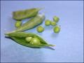
Two Peas in a Podby justineComment: Good choice of literalism. Somehow the arrangement of pods here isn't as aesthetically striking as it might be. Maybe a black velvet background would have made these stand out. more as well |
| Photographer found comment helpful. |
| 11/17/2003 02:32:08 PM |
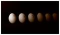
Don't Count Your Chickens Before They Hatchby Spanish_GreaseComment: Good literalism. I like the tonal progression idea here, though it may be too dark too quickly. One other just purely aesthetic comment is that the picture might have been more interesting a shot photographically/artistically if 1) taken with a bigger perspective emphasis, and with another means to indicate counting besides the handwritten numbers (maybe a tape based caldulator) |
| Photographer found comment helpful. |
| 11/17/2003 02:29:19 PM |
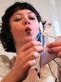
Girls Are Weird!by darcyComment: Interesting shot, though I don't believe this is a llteralism. It's just a fact ;-)
Might have been good to run this through neat image to reduce the noise; though it's also possible you just have too high a JPEG compression ratio. |
| Photographer found comment helpful. |
| 11/17/2003 12:25:58 AM |
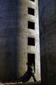
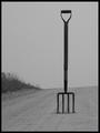
Look for the fork in the road!by ColeyComment: Excellent idea. Good scene and composition. A little more contrast might improve this, and a bit of NeatImage for noise reduction. |
| Photographer found comment helpful. |
| 11/17/2003 12:23:58 AM |
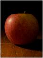
The Big Appleby tomlewis1980Comment: Good shot; perhaps it would have been good to include something else to give us a perspective that this was really "big". Something that's smaller than usual. Or use distance perspective to make it look bigger than it is. |
| Photographer found comment helpful. |
| 11/16/2003 10:35:00 PM |
|
| Photographer found comment helpful. |
| 11/16/2003 10:23:21 PM |
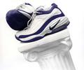
Nikeby ArnayComment: Critique Club:
This is a good, sharp, generally well exposed image. It's well composed, offering the focal point (shoes) close enough to the upper left intersecting thirds gridlines. It offers a nice duotone-like image with the predominately blue and white theme.
I think the choice to slant the pillar is key here, and a good design. I think even a little more pitch on the slant might have been a little more interesting, giving you a bisecting diagonal composition.
Small relatively non-significant issues here: the center bottom of the column is slightly hot; the bottom of the right shoe could have more shadow detail.
I am not sure what the real message is here; if a product shot, I am not sure the placement of the shoes would sell; if an artsy shot, I am not totally convinced it would "sell"; if it's a shot for running or sports enthusiasts, I think it would work very well for those who like nikes.
Overall, I think its done very well. |
| 11/16/2003 09:53:42 PM |
Communionby ellamayComment: Nice shot; it would have been cool if you could have taken it with the water "aglow" as it sometimes is just around that time (maybe earlier.) |
| Photographer found comment helpful. |
| 11/16/2003 09:52:47 PM |
|
| Photographer found comment helpful. |
Home -
Challenges -
Community -
League -
Photos -
Cameras -
Lenses -
Learn -
Help -
Terms of Use -
Privacy -
Top ^
DPChallenge, and website content and design, Copyright © 2001-2026 Challenging Technologies, LLC.
All digital photo copyrights belong to the photographers and may not be used without permission.
Current Server Time: 09/26/2026 12:05:35 PM EDT.