| Image |
Comment |
| 03/31/2004 12:24:53 AM |
Discardedby RefocusedComment: Very good idea, and has the artistic flare I think one needs here. Good composition. |
 Photographer found comment helpful. Photographer found comment helpful. |
| 03/31/2004 12:04:55 AM |
Inner Sanctumby TooCoolComment: Beautiful work! I am shocked this did not ribbon. I am also shocked at the number of 1s, 2s, and 3s. Come on people!
Anyway, congrats on a great finish. |
| Photographer found comment helpful. |
| 03/27/2004 11:42:39 AM |
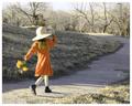
Spring, where are you?!by SonifoComment: This is a wonderful composition and a good take on the challenge. The motion of the girl is put to good use here. One area I think this can be improved is in the background--the slightly saturated, pale grass and background for some reason calls attention to itself to me, perhaps simply because it doesn't provide enough contrast with the orange dress and the girls stockings and hat. It may not have been possible during the challenge, but I think this is just the perfect shot to selectively desaturate the background to grayscale. I bet you wanted to do this for the challenge, but were stopped by the similarity in color between the girl and the background. Overall, this is a very nice photo--and I bet it will sell well if you can enhance the contrast of the elements later. |
| Photographer found comment helpful. |
| 03/26/2004 11:59:53 PM |
Clouds of Fireby GraciousComment: Beautiful sunset and reflection. I like the composition with the water and the shore. If I had to pick out one small suggestion, I would say that it would be nice not to have lost part of the shoreline on the right. |
| 03/26/2004 11:58:25 PM |
Orange in motionby kosmikkreeperComment: I like what you did here, and moreso, perhaps can see lots of good shots coming from this. I think with the motion going to the left, it seems I am being forced to move my eyes out of frame, rather than into the frame, which might have been stronger IMHO |
| 03/26/2004 11:56:30 PM |
untitledby israfelComment: Lovely colors and good aesthetics. I think it would have been improved by more DOF. Very nice overall! |
| Photographer found comment helpful. |
| 03/26/2004 11:54:56 PM |
|
| 03/26/2004 11:54:01 PM |
The Center of Thingsby Beerme425Comment: Very nice overall. Good aesthetics. I think I can see this is very good and as you wanted; but I think it might have been stronger with more DOF. |
| Photographer found comment helpful. |
| 03/26/2004 11:52:36 PM |
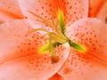
Orange Flowerby cooliakComment: Very nice overall. Good aesthetics. II like the way the petals form the background. I think it would have been a bit stronger without the foreground stamen OOF. |
| 03/26/2004 11:50:45 PM |
Navel Orangeby sherComment: Very nice clarity and color. I think it would be nice to see a bit more of the flower on the left and bottom. |
| Photographer found comment helpful. |
Home -
Challenges -
Community -
League -
Photos -
Cameras -
Lenses -
Learn -
Help -
Terms of Use -
Privacy -
Top ^
DPChallenge, and website content and design, Copyright © 2001-2026 Challenging Technologies, LLC.
All digital photo copyrights belong to the photographers and may not be used without permission.
Current Server Time: 07/24/2026 01:55:43 PM EDT.