| Image |
Comment |
| 08/08/2004 09:47:35 PM |
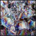
Intersectionsby MickComment: Wonderfully different and very beautiful. Makes a great abstract--I wonder if the macro impact might have been greater though if you limited the scope a little more--it's busy for a macro (but works well aesthetically anyway).. |
 Photographer found comment helpful. Photographer found comment helpful. |
| 08/08/2004 09:45:59 PM |
|
| Photographer found comment helpful. |
| 08/08/2004 09:45:05 PM |
wallpaperby binkyat3Comment: Beautiful color and overall work. I hope you also have this in 16 bit color; I bet there are many more gradations and variations in this beautiful capture. Well composed as well. |
| Photographer found comment helpful. |
| 08/08/2004 01:32:43 AM |
Road to the Soulby LokiComment: Good sharpness. Hard to criticize such a difficult shot, but the left overexposed and somewhat posterized area detracts from the overall effect. Also, if you could have caught the ends of the dark lashes at the top I think it would have been stronger. |
| Photographer found comment helpful. |
| 08/08/2004 01:31:00 AM |
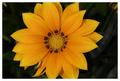
Flowerby NgporterComment: Beautiful color and sharpness. I think it would have been good to 1) avoid the orange in the upper right (or clone it out). Also, while in one way I think the crop is nice on the flower, I think it would have been a bit better whole. |
| 08/08/2004 01:28:48 AM |
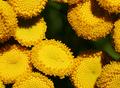
Yellow Macroby BiduleComment: Great colors. I am not sure about the crop/composition here. Seems my eyes are drawn to the gap (though usually the brightest spots draw you, so I am not sure why this is true here.) Overall, I think you picked a difficult subject to compose. I think if yoiu could have isolated one it would have made a better study. |
| 08/08/2004 01:24:00 AM |
Sunflowerby pumaComment: I like the crop on thi. The top left bright spot and petal detract from an otherwise very good shot. You might try burning it in, or cloning over the bright highlight, but I think if that petal were upward, it would be a lot nicer. |
| 08/06/2004 08:27:35 PM |
MoonStormby ozthunderComment: I like this capture. I think it might work better, however, without the sun in it, as that distracts. You might want to consider some crops of the upper portion. |
| Photographer found comment helpful. |
| 08/06/2004 08:25:56 PM |
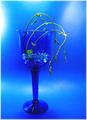
Still Life in Blueby artvetComment: This has great aesthetics. The only nit is the very bright area on the left. I don't think its necessary. |
| Photographer found comment helpful. |
| 08/06/2004 08:25:12 PM |
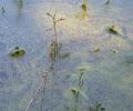
Blue Lagoonby dphillipsComment: This is really quite different and special! The light adds an interesting texture but to some extent works against you as it is not quite in the right area aesthetically. Also, I would consider cloning ou the brown stick in the foreground. Overall, I really like this. |
| Photographer found comment helpful. |
Home -
Challenges -
Community -
League -
Photos -
Cameras -
Lenses -
Learn -
Help -
Terms of Use -
Privacy -
Top ^
DPChallenge, and website content and design, Copyright © 2001-2026 Challenging Technologies, LLC.
All digital photo copyrights belong to the photographers and may not be used without permission.
Current Server Time: 07/26/2026 01:31:30 AM EDT.