| Image |
Comment |
| 07/12/2005 11:30:23 AM |
Color Me Beautifulby tcrock41Comment: This is a really nice shot overall. However, while the color pops, and the clouds and trees are great, there's something about it that doesn't click for me. In the spirit of our "landscape class", I'll try to explain, but here I am having more trouble than usual isolating it, so I'll free associate a bit. At first, it looked a bit unclear, but staring more, it's reasonable for this size. The building edge seems more out of place, but I do like the trees on the bottom right. The left lower side of the shot is perhaps a tad too dark. And something about the clouds in the upper left--their color, or perhaps it's that they appear a bit blurry here and they are somewhat dominant.
Actually, I think analyzing this photo would be a great "class" exercise, because I'd love to see how others break it down in hits and misses (often, I break down photos this way...this aspect is a hit, this is a miss, etc.). |
| 07/12/2005 10:34:13 AM |
Twilight's Last Gleamingby NeilComment: Originally posted by traquino98:
Originally posted by cpanaioti:
For more interest though I feel the need for some lights in the houses on the far shore. |
Agree.
I do really like the rest of the photo however, especially the dock and clouds. What post processing did you do for this image? |
Thanks, both to you and Colette. The funny thing about this is that one of the things I did in postprocessing was to burn in the lights across the shore to more or less eliminate them. I wanted the focus of the shot to be the sky. Other than that, I cloned out a buoy, and if I recall right, used a gradient adjustment layer to bring up the light in the water slightly and deemphasize the dock (as I recall--I also was using a GND filter when shooting, upside down, but I'll have to check to see if this is one of those or if it was done in software). The soft feel to the water is due to the long exposure.
I'll see if I can dig up the original and post it in the landscape forum thread. |
| 07/11/2005 10:49:02 PM |
|
| 07/11/2005 09:44:36 PM |
|
 Photographer found comment helpful. Photographer found comment helpful. |
| 07/11/2005 09:44:12 PM |
Bondby TranquilComment: Nice portrait, but to me this fairly frontal pose needs full DOF. |
| Photographer found comment helpful. |
| 07/11/2005 09:42:23 PM |
|
| Photographer found comment helpful. |
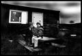
| 07/11/2005 09:41:13 PM |
Where is dad?by garlicComment: Great work! Love the grittiness and contrast here. Very holga-ish. Top marks. |
| Photographer found comment helpful. |
| 07/11/2005 09:39:47 PM |
|
| Photographer found comment helpful. |
| 07/11/2005 09:39:05 PM |
|
| Photographer found comment helpful. |
| 07/11/2005 12:14:03 AM |
Hello by gaurawaComment: Very beautiful (as pretty as a fly gets). Congrats on the ribbon! |
| Photographer found comment helpful. |
Home -
Challenges -
Community -
League -
Photos -
Cameras -
Lenses -
Learn -
Help -
Terms of Use -
Privacy -
Top ^
DPChallenge, and website content and design, Copyright © 2001-2026 Challenging Technologies, LLC.
All digital photo copyrights belong to the photographers and may not be used without permission.
Current Server Time: 06/17/2026 09:01:06 PM EDT.