| Image |
Comment |
| 12/10/2005 10:19:00 AM |
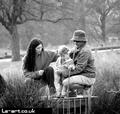
Family Portrait at Richmond Parkby moonwalkerComment: The background works exceptionally well here--almost like a setup with some lights behind them and a hair light. Overall the lighting and feel is just perfect. I think the centered composition weakens it slightly here as maybe does the inclusion of the platform (a little distracting). You might consider a crop at the bottom; then look and play with taking them somewhat offcenter, if anything works to improve on this already fine photo (I can't see it here though without cropping in too much).
Very nice candid work! |
| 12/10/2005 09:59:00 AM |
Post-Bath Babyby ArtysteComment: Fantastic shot and processing! It hits the mark and I'm sure you're rightly completely happy with it. But if you want to do just a tad of 'perfecting', you might clone out the white object in the corner. Also, perhaps see if you can lighten her eyes a tad.
Lovely!
|
 Photographer found comment helpful. Photographer found comment helpful. |
| 12/10/2005 09:55:26 AM |
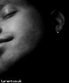
Me and the dark 1by moonwalkerComment: An interesting composition! The OOF sort of works here, but might work better with some postprocessing effort. perhaps a bit of soft glow, and some tonal adjustment. Good shot overall. |
| 12/10/2005 09:49:52 AM |
Bus Stop IIby banmornComment: Gee you are surrounded by geometric patterns ;) It's amazing how you notice so many things many people just miss! And by people I mean me! I'd love to have your eye to catch these.
Technical. Love the strong contrast, the background pattern, and the balance of the people. One thing I can see might improve this is a biit of dodging of the foreground right person--a little lighter might provide a better balance to the other person. |
| Photographer found comment helpful. |
| 12/09/2005 07:44:46 PM |
chad4.jpgby buzzrockComment: Lovely shot. I like how the eyes and the person seem "small" compared to all that protective gear. You have his eyes out of the shadow pretty well, but I think it might be nice to try and get them even further "out of the shadows".
Very nice! |
| Photographer found comment helpful. |
| 12/09/2005 07:42:33 PM |
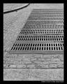
Cobbles & Grid IIby KaveyComment: Very nice Kavey! Great pattern and tones. Have you also tried just the top part, playing the grate shape and angle more strictly against the round curb in composition? Tried square, cropping the bottom?
Great eye! |
| Photographer found comment helpful. |
| 12/09/2005 07:39:06 PM |
Giro di San Francisco 3by three_small_dogsComment: Excellent shot! Good capture of the action, good sharpness, good colors. One thing you might consider is a small crop on the left or cloning just to remove that colorful sign. |
| 12/08/2005 01:02:46 PM |
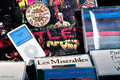
Ain't never gonna change my tuneby strangeghostComment: Congratulations on 5000 views. I can't believe you only got one comment here despite the relatively low score. Shame on us. (We'll I didn't vote, so I am double guilty.)
I think some interesting lighting and thinking about the positioning of the materials would have improved this. Perhaps, showing the various media entirely, against a black background might have made it clear that music collections have changed in format over the years. It might have also been cool to show the same album in multiple formats, from LP to CD to iPod. Perhaps for lighting, you could have done an iPod like blue, but really not from the iPod because you'd need more light, and you'd still want some color to show. Worth thinking about for the next time!
|
| Photographer found comment helpful. |
| 12/08/2005 11:58:55 AM |
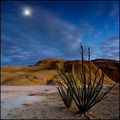
Desert Tendrilsby crabappl3Comment: Beautiful image. Congratulations on top 10! Sorry you didn't make your 7.0+ mark on your final member entry. |
| Photographer found comment helpful. |
| 12/07/2005 11:05:22 PM |
FRAGILEby RikkiComment: This is a great composition, and could be a winning shot. There's a problem, however, in that it seems to be very low resolution, or perhaps has too much neat image applied. Hopefully, the base image is technically good and you can produce a better quality version of this compositionally and subject-wise stunning shot! I wonder if this is Rikki's entered by mistake shot? He does like to play with neatimage! (Sorry if you are not Rikki!) |
| Photographer found comment helpful. |
Home -
Challenges -
Community -
League -
Photos -
Cameras -
Lenses -
Learn -
Help -
Terms of Use -
Privacy -
Top ^
DPChallenge, and website content and design, Copyright © 2001-2026 Challenging Technologies, LLC.
All digital photo copyrights belong to the photographers and may not be used without permission.
Current Server Time: 07/30/2026 04:36:08 PM EDT.