| Image |
Comment |
| 02/06/2006 01:07:58 AM |
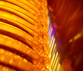
Orangeby sabphotoComment: A good overall abstract. I think it might have been stronger if the gap played along at a larger angle (e.g., following the diagonal. Also, perhaps brightening the red on the right. |
 Photographer found comment helpful. Photographer found comment helpful. |
| 02/06/2006 01:05:24 AM |
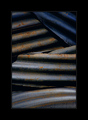
Metalby BradComment: Well done, I like the idea and the composition. It does appear to have a bit of a blue cast, and seems a little low in contrast. But those are relatively mnor points, and the image works pretty well in emphasizing lines, form, and colors. Nice work. |
| Photographer found comment helpful. |
| 02/06/2006 01:01:08 AM |
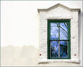
Reflections in the Window by docurrieComment: Wow, this is great. I love the contrast of colors, and the contrast of starkness with the beautiful reflection. Congratulations on your first ribbon with this Super Image! Into my favs. |
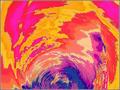
| 02/06/2006 12:27:57 AM |
Nature's Brush Strokesby rasdubComment: Nice aesthetics. I love the detail in the yellow; the reds are overexposed though, I believe, which is why the have such a large uniform patch. Consider playing down the curves on red, also a bit overall where it's blooming in the yellow. Also, consider cropping sucj that the split isn't so centric. Still, overall, a good idea. |
| Photographer found comment helpful. |
| 02/06/2006 12:22:17 AM |
Power of Dreams by LevTComment: Great idea, beautiful shot. Congratulations on the ribbon, and filling in the one missing color from your profile! (I still need to do that!) |
| Photographer found comment helpful. |
| 02/05/2006 11:25:32 AM |
Portrait of an Off-Centered Artist Off-Centeredby ColeyComment: Interesting setup, a good idea. Oddly, though, it comes off as pretty centered! I would have suggested perhaps more white space and thrown the whole thing off into one quadrant (if practical).
Subject looks a lot like Coley :) |
| Photographer found comment helpful. |
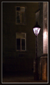
| 02/05/2006 11:11:17 AM |
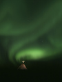
Ghostly Greenby dickelComment: Very interesing juxtaposition. Nicely done. I'd like to have seen a bit more below the top of the tent(?), but still very cool! |
| Photographer found comment helpful. |
| 02/05/2006 11:03:35 AM |
Dead Endby rhipsterComment: Very painterly--looks like it was buzzed, I think, and it works very well here! Full marks from me. |
| Photographer found comment helpful. |
| 02/04/2006 09:15:31 AM |
|
| Photographer found comment helpful. |
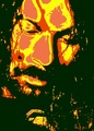
| 02/04/2006 02:02:51 AM |
Richard Avedon : The Sixtiesby TejComment: Greetings from the Critique Club.
Technical: Composition is very strong, the fill the frame of your subject works very well here. As a posterization, it appears to be done well, but I don't have a lot of experience in that area, posterization being something I normally try to avoid.
Aesthetic: Overal, I think this works well. However, as I look at it for an extended period of time, I find the abrupt change of colors distracting--as they create their own lines. I wonder how it would have looked with wild colors like this but smooth transitions? Maybe something to try.
Challenge: I couldn't find a similar Richard Avedon shot.
Conclusion: I think you have created something special here. It works, but I still think there might be improvements--or at least fun experiments--to do with it.
|
Home -
Challenges -
Community -
League -
Photos -
Cameras -
Lenses -
Learn -
Help -
Terms of Use -
Privacy -
Top ^
DPChallenge, and website content and design, Copyright © 2001-2026 Challenging Technologies, LLC.
All digital photo copyrights belong to the photographers and may not be used without permission.
Current Server Time: 06/10/2026 04:08:08 AM EDT.