|
|
|
Showing 1531 - 1540 of ~3841 |
| Image |
Comment |
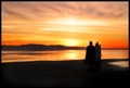
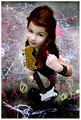
| 03/06/2006 01:14:51 AM | Heaven & Hell by pearlseyesComment: Great concept, and so well done! Congratulations on your first ribbon. Not bad after only 11 challenges. I know this will become a new habit for you ;) Congratulations Alecia! |  Photographer found comment helpful. Photographer found comment helpful. |
| 03/06/2006 01:13:06 AM | Jack & Jill by QartComment: Wonderful! Congratulations on your first ribbon! | | Photographer found comment helpful. |
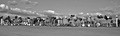
| 03/05/2006 04:55:13 PM | Mail Boxesby wisdomp11Comment: Greetings from the Critique Club:
This is a nice photo, and it was adventurous of you to attempt a panorama on DPCs limit 640 pixel budget.
Aesthetics: This is a good theme, with a nice feel to it. Tones are good. Composition is good horizontally but less so vertically. I think the mailboxes are too centered on that axis. Also, there's not much punch to the geometry here. It works on the expanse theme, but that wears quickly. Looking down the line with perspective might have been another interesting approach. The current view is especially problematic at this resolution, since the boxes end up being so small. A tilted shot running the diagonal might have also been interesting. Or laying down on the ground in front of them, against the sky, wide angle lens, is another thought.
Technical: Hard to see here, but sharpness appears good, and tones are excellent.
Nice imaginative shot.
|
| 03/05/2006 04:50:25 PM | Gimme Some Candyby patio127Comment: Greetings from the critique club.
I was glad to get this to critique. Not only is it a cute photo, I have very little I have to criticize!
I don't usually comment on score, but I'll say that this is underrated. This probably has more to do with subject bias than anything else. Kids, dogs, flowers. Some people just vote low and never look back.
Aesthetics: Very nice shot, cute subject, great head tilt. Composition is good except that you would have been better off with some space on the left and not cutting of his ear. A square crop is perfect for this--so you would need more space on the left and less on the right. More background blur or a simpler background would have been good, but it's not a major issue here.
Technical. Sharpness is excellent. Tones are generally very good. One issue is the area of overexposure/processing burnout on her head and a little possible burnout on her fur on the sides of her nose.
Nice shot, cute dog. What else is there to say! Hope what little I had to say critically is of some help.
| | Photographer found comment helpful. |
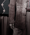
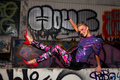
| 03/05/2006 12:49:11 AM | Men with styleby floydroweComment: Greetings from the critique club.
I see you've asked for a critique, but I note in your response to critiques during the challenge, you've marked only those that said they liked it, with no critical comments, as helpful. So I am guessing you don't really want a critique. It would be a good idea if you want to improve, to treat critiques as the valuable feedback they are.
Aesthetics. The tones are interesting here, but it's not enough to carry the package. The crop is unbalanced, and the photo is quite unlike what I would expect to see advertising or displaying fashion. Sure the clothes look fashionable, but they are not presented in such a way that I would say, "wow, that looks like a really nice..."
I'm not even sure whether there are two sets of clothes being shown here or one. I can't really tell if the left side of the photo is a second person or set of clothes. Kind of looks like it, but I honestly can't tell for sure.
Technical: Focus looks good; tones are interesting; composition and setup/subject are off, IMHO.
Keep on shooting, and remember, you learn from critical comments, not from the atta-boys. Yes, they can be motivating, but you are already motivated, or you wouldn't be here! | | Photographer found comment helpful. |
| 03/04/2006 10:51:58 AM | what a faceby mimsydotesComment: Greetings from the critique club!
Aesthetics: This is a nice shot, with good tones, and clearly duotone for the challenge. The dog is not engaging the viewer, however, since it's looking off to the side, and that loses a bit of the cuteness factor dogs have when they look into the camera. Yes, it looks less "candid" that way, but it's generally more endearing to people. Also, while DOF is working for you here, the objects in the background do not add to the story, and hence while not emphasized by the treatment, it still would be better without them.
Which brings me up to the "candid" aesthetic. A candid often tells a story. There's no context for a story here. So you might has well have gone for the posed, looking the viewer into the eye. Or next time, add some context and tell a story to charm us!
Technical. The shot is produced well in general, but there appear to be some reduction and sharpening artifacts around the whiskers (jaggies). I've run into this as well with my dog, and sometimes there's little you can do about it--especially in a basic editing challenge. In a full editing challenge, you can try some selective softening of those areas before reducing.
Overall. Cute dog, good picture. Looking forward to seeing some more shots of this dog! |
| 03/03/2006 12:24:28 AM | Rebel Yellby jaxedComment: So well done and such a perfect model! Great shot, congratulations! | | Photographer found comment helpful. |
| 03/03/2006 12:23:11 AM | | | Photographer found comment helpful. |
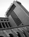
| 02/28/2006 12:35:12 PM | The force of the architectureby lunixComment: Greetings from the critique club.
First, regarding score and placement, I think the issue voters have here is deciding how this relates to the theme. The connection appears to be to obscure for the amount of time the "judges" spend voting. I can't honestly say I see it either, and I've been looking at it longer.
As for the image itself, composition is interesting with nice lines. The subject works well here.
Technical factors which can be improved: the sky appears overexposed, and some posterization is evident in the upper left, which may mean that some of the blow out is from adjusting levels and/or colors in processing. The building itself may have been in shadow, and the loss of sky may have been a consequence of adjustments. The buiding has nice tones, but perhaps could have more contrast.
If you are shooting to please yourself, you are most likely on track. If you are going for scores, you should think of your photo as means of communicating, and the message must clearly speak the challenge topic.
Summary Overall: Nice shot, good composition but weak on topic, with some technical issues that can be handled by more controlled exposure and processing.
Hope that helps.
Neil |
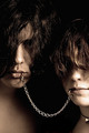
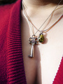
| 02/27/2006 09:48:50 PM | Key to Her Heartby vergComment: Greetings from the critique club.
This was a good idea for the challenge. The colors and focus are good.
You've already received some good constructive comments about issues of lighting and setup. I agree with these. As for my helping comments, I'll focus on composition. I find the composition of this is interesting, but distracting. The position of the dress on her (seems uneven on her neck and breasts) with this crop adds confusion to her form. There's no sense of balance of objects in the composition, no salient geometric design. More towards chaos--perhaps that was intentional, as the two necklaces do add to that feeling. But while romance often leads to chaos, I'm not sure the opposite is true, and to me the photo doesn't really tell the same story as the title.
My thought when seeing this as to a derivative approach (perhaps using an outtake or a reshoot): why not crop her neck out, and use the dress and neckline to catch the abstraction of a heart. Center the key in it, and use the cleavage for "context".
Hope that helps. Regards--Neil
| | Photographer found comment helpful. |
|
Showing 1531 - 1540 of ~3841 |
Home -
Challenges -
Community -
League -
Photos -
Cameras -
Lenses -
Learn -
Help -
Terms of Use -
Privacy -
Top ^
DPChallenge, and website content and design, Copyright © 2001-2026 Challenging Technologies, LLC.
All digital photo copyrights belong to the photographers and may not be used without permission.
Current Server Time: 06/09/2026 09:59:44 PM EDT.
|