| Image |
Comment |
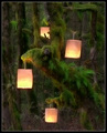
| 03/05/2007 12:13:43 PM |
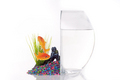
SNAFU by muckpondComment: Congratulations! A clever shot, well done and well received! |
 Photographer found comment helpful. Photographer found comment helpful. |
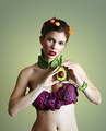
| 03/04/2007 06:13:16 PM |
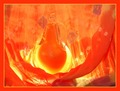
\"I love pears 2.\"by FlatwmnComment: Greetings from the critique club:
Strengths: Pretty color, somewhat abstract feel. Good use of leading lines.
Weakness: The abstract feel, while adding to aesthetics, makes the connection to the theme a bit less clear. And after a couple of moments looking, it starts to become less abstract, so it's kind of in-between artistically. The pear feels a bit too centered (though not exactly so). Not sure what the pattern on the 'curtain' adds, and the blueish tones which come through strongly bottom right, and in other spots, seems to break the nice orange feel. There's double ambiguity in the connection to the theme: I presume the pear is actually perfume, which does bring in love and romance; but then the title takes it a different direction, loving pears.
Suggestions: A slightly different composition, following the rule of thirds; a duotone approach with the orange; single, strong, connection to the theme; simplify visual elements, use a plain cheescloth (or whatever it is) curtain rather than one with patterns. Consider more dramatic lighting.
Hope that helps!
|
| 03/04/2007 06:05:06 PM |
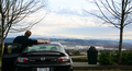
Arm in arm with my true love.by smardazComment: Greetings from the Critique Club:
Strengths: Fits the theme with a bit of humor. Pretty good control over exposure, considering the strongly backlit scene.
Weakness: If you can forgive the pun, the garbage can trashes the shot. It's very salient and distracting. The haze in the background, and the buildings, don't give this the full lover's lane feel that would have earned this more points.
Suggestions: This would have been really great with a colorful sunset background, or golden hour hues, and using the car/person sillouettes. Or a night scene, with city lights below, depending on the region. In any case, the garbage can needed to go. I haven't read any ocmments yet, but I'm sure that really hurt. You probably should have cropped a bit more at the bottom to, to get rid of the partial plate.
Hope that helps. Good idea, just a bit more time on setup, and you would score well. |
| Photographer found comment helpful. |
| 02/22/2007 06:04:38 PM |
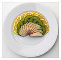
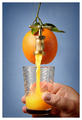
CRW_1513-01-a.jpgby timfythetooComment: I am tempted to say I like this better than your entry, but actually I like them both a lot. This one might edge over if you had perhaps shot half the plate or cropped it. I think it would have been best here to include half the plate and take advantage of the plate as yet another semicircle layer. Then I'd pick this.
But both are cool, and you did very well both as photographer and chef. |
| Photographer found comment helpful. |
| 02/19/2007 07:03:47 PM |
|
| Photographer found comment helpful. |
| 02/19/2007 08:38:50 AM |
Avo Coutureby escapetoozComment: Very nice! Congrat's on your top 10 and a wonderful shot. I agree with Kiwiness too! |
| Photographer found comment helpful. |
| 02/19/2007 08:19:21 AM |
|
| Photographer found comment helpful. |
| 02/18/2007 05:40:58 PM |
|
| Photographer found comment helpful. |
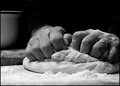
| 02/13/2007 05:02:32 PM |
The Baker by jrjrComment: Congratulations on the blue -- well deserved for this wonderful photo. |
| Photographer found comment helpful. |
| 02/12/2007 12:41:50 AM |
The Screamby dsidwellComment: Great job David! I knew this was genius the moment I saw it. Congratulations. |
| Photographer found comment helpful. |
Home -
Challenges -
Community -
League -
Photos -
Cameras -
Lenses -
Learn -
Help -
Terms of Use -
Privacy -
Top ^
DPChallenge, and website content and design, Copyright © 2001-2026 Challenging Technologies, LLC.
All digital photo copyrights belong to the photographers and may not be used without permission.
Current Server Time: 07/27/2026 02:12:51 AM EDT.