| Image |
Comment |
| 02/24/2026 09:09:13 PM |
|
 Photographer found comment helpful. Photographer found comment helpful. |
| 02/24/2026 09:08:46 PM |
Farm Road by glad2badadComment: Congratulations on being named a jury selection in the Art of 2025 challenge!
 |
| Photographer found comment helpful. |
| 02/24/2026 08:35:13 PM |
Farm Roadby glad2badadComment: Great art invites—or provokes—a perspective I might not otherwise bring to the world. In photography, this often means composing an image that arrests attention and elicits a response. This image does exactly that. On the surface, it’s a well-timed, well-processed shot of a puddle on a country road. But at a deeper level, it exists because the photographer noticed what might otherwise be overlooked: not just the puddle, not just the reflected structures, but the inversion of reality and the fleeting, unexpected beauty of a found moment. I don’t know precisely what the artist intended to communicate, but that seems secondary. What matters is that this photograph enables me to share the artist's unique perspective on their world. |
| Photographer found comment helpful. |
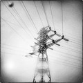
| 02/24/2026 08:34:12 PM |
glitchby TiberiusComment: The title suggests imperfection, or perhaps an interruption in the orderly nature of things. Visually, the composition registers as deliciously imperfect, too: Hints of something mundane made profound by the circumstances of the seeing. A water-smudged lens and grainy processing which enable us to see what the artist sees. It's a study in abstract geometry and garish artifice that interrogates as much as it exalts. Is the human feat represented by the subject a crowning achievement or a questionable adulteration of reality? As any good piece of art does, this image leaves that up to the viewer to decide. |
| Photographer found comment helpful. |
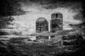
| 02/24/2026 08:33:12 PM |
|
| Photographer found comment helpful. |
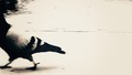
| 02/24/2026 08:32:04 PM |
byeby kichuComment: I truly love this image. Never mind the base aesthetics which appeal to me—the use of grainy, lo-fi processing that hints at an era of "found" moments and casually grabbed exposures that are accidentally profound. Let's talk instead about the way that even if this was 100% an accidental exposure—which it honestly could have been—its curation and digitally realized presentation demonstrate the artist's attunement to things which the casual eye might otherwise ignore if the bird's face and body were in perfect rule-of-thirds composition within the frame. What I see here is an invitation to contemplate the story that precedes this moment. The negative space is a blank canvas on which I'm allowed to project my own idea of what came in the moments before the shutter exposed this scene—and to imagine the possibilities of what is happening outside the frame to provoke the sudden flight. Above and beyond all of that, I find in this composition an interrogation of the conventions that define what makes an image "pretty" and a gentle suggestion that perhaps the backside of a pigeon is equally as worthy of consideration as its frontside. |
| Photographer found comment helpful. |
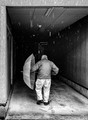
| 02/24/2026 08:30:48 PM |
Cold dayby LevTComment: Art tells stories. Or at least it suggests them and lets the viewer fill in the narrative gaps. Of all the images in this challenge, this one most appeals to me for its storytelling. It wonders, "Where is he headed? What important life matters have compelled him to get out in this weather? The darkness at the vanishing point of the frame is deliciously open-ended—as if this could be a man marching resolutely to his own certain demise...or maybe just to the dentist for a routine check-up. The viewer projects his or her own story on the proceedings, and that's to this image's credit. Message edited by author 2026-02-24 20:31:24. |
| Photographer found comment helpful. |
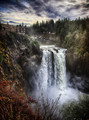
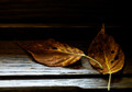
| 02/24/2026 08:29:48 PM |
Falls Memoryby Art RoflmaoComment: Good art stirs something in the viewer, and when I first loaded this image, I had to admit that I felt something. Something I struggled to articulate, but something very real and pleasantly evasive. A catch in the throat. A second-take wondering at whether what I was seeing was real or imagined. A pause to study the individual pixels to identify the seams separating the fantasy from reality. The gray boundary between ultra-real and surreal is deliciously explored in this scene, which for me is stimulating at a multisensory level. I "hear" the distant roar of the water. I "smell" the woodsy-fresh aroma of the environment. And—most of all—I feel connected to the reality of the moment even as I feel transported by its painterly presentation. |
| Photographer found comment helpful. |
| 02/24/2026 08:29:07 PM |
Window Sillby BarronessComment: I know I'm looking at a compelling photo when my initial impression is better described using "feel" words than "think" words. This image immediately evokes warmth, softness, and contemplation. With its low-key, Rembrandt-like palette and gentle lighting, it invites the viewer to slow down and notice the subtle beauty even in the quiet, overlooked corners of everyday life. |
| Photographer found comment helpful. |
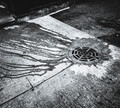
| 02/24/2026 08:28:03 PM |
petty meandering jellyfishby tateComment: One sign of an interesting art piece is the way it instantly makes me want to have a conversation with someone. Here, the abstruse provocation and high-contrast presentation invite a second look at the grungy subject matter to try discerning what the artist wants me to see. And here's what I see: Urban blight every bit as unwelcome as stinging jellyfish washed up on the beach where my family is trying to vacation. A metaphor for the encroaching tradeoffs of modern progress. An interrogation of who the "jellyfish" in this image really is, and a suspicion that maybe it's me. |
| Photographer found comment helpful. |
Home -
Challenges -
Community -
League -
Photos -
Cameras -
Lenses -
Learn -
Help -
Terms of Use -
Privacy -
Top ^
DPChallenge, and website content and design, Copyright © 2001-2026 Challenging Technologies, LLC.
All digital photo copyrights belong to the photographers and may not be used without permission.
Current Server Time: 06/20/2026 03:06:20 PM EDT.