| Image |
Comment |
| 03/23/2026 10:59:38 AM |
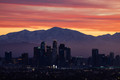
Snow and Los Angelesby ryant35Comment: One of my challenge favorites. The kind of serenely dramatic skyline that sets the standard for all the rest. |
| 03/23/2026 10:54:11 AM |
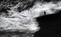
Stand or fall by NeatComment: Wonderful composite. I always love it when you're working in this register. Melodramatic or not. |
 Photographer found comment helpful. Photographer found comment helpful. |
| 03/23/2026 10:43:11 AM |
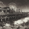
Rideby PaulComment: Simply brilliant. The surreal and timeless mood here is incredible. |
| Photographer found comment helpful. |
| 03/23/2026 10:22:49 AM |
|
| Photographer found comment helpful. |
| 03/20/2026 10:43:19 AM |
Love the Lightby lovemelvinComment: I was one of your 9s on this one. This is simply an astounding portrait and my favorite for the bold decision to center that ribbon as part of the composition. |
| Photographer found comment helpful. |
| 03/18/2026 12:58:45 AM |
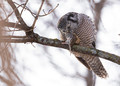
Dinner Time by cdn1Comment: Originally posted by Martus:
It feels like the owl is saying grace, before starting its meal! |
Very nicely articulated. |
| 03/18/2026 12:57:23 AM |
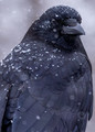
A Crow In The Snow by RefocusedComment: Fabulous image, Larry. Congrats! I love the story--and knowing that the sense of "personality" in this image isn't just imagined. |
| Photographer found comment helpful. |
| 03/18/2026 12:11:55 AM |
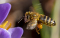
busy beeby primabarbaraComment: This was one of my challenge favorites, Barbara. I wondered what kind of lens you were using to get it, and I'm pleasantly surprised to find I have that same focal length in my kit. I need some pointers, please. :-P Congrats! |
| Photographer found comment helpful. |
| 03/17/2026 11:18:50 AM |
Too Small to Shareby bob350Comment: Incredible capture. Looks like this image suffered some in the processing because of poor detail in the shadows. But I think you've done an admirable job recovering as much as possible. The presentation is quite lovely, and this is a challenge favorite for me. |
| Photographer found comment helpful. |
| 03/16/2026 01:24:14 PM |
|
| Photographer found comment helpful. |
Home -
Challenges -
Community -
League -
Photos -
Cameras -
Lenses -
Learn -
Help -
Terms of Use -
Privacy -
Top ^
DPChallenge, and website content and design, Copyright © 2001-2026 Challenging Technologies, LLC.
All digital photo copyrights belong to the photographers and may not be used without permission.
Current Server Time: 06/21/2026 11:57:22 AM EDT.