| Image |
Comment |
| 04/03/2026 11:31:34 AM |
|
 Photographer found comment helpful. Photographer found comment helpful. |
| 04/03/2026 11:30:51 AM |
|
| Photographer found comment helpful. |
| 04/03/2026 11:29:44 AM |
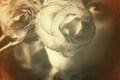
the perks of being a wallflowerby kichuComment: Challenge favorite for me. And not just because I'm a sucker for vintage distress applied to beautiful subject matter. The conceptual angle here is simply quite compelling. |
| Photographer found comment helpful. |
| 04/03/2026 11:27:46 AM |
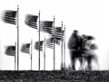
Headwinds by PaulComment: My favorite kind of patriotism. The kind that artfully--and tastefully--reminds people that interrogating power structures is part of what it means to exercise civic duty. This is a masterful image without or without the political evocation, though. Congrats! |
| Photographer found comment helpful. |
| 04/03/2026 11:24:57 AM |
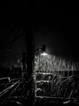
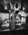
The fog of sleepby mariucaComment: Nice one, Mariuca. This one definitely arrested my attention and frustrated my attempts to make its disparate elements cohere. The choice to blur the statuette's face while keeping the gaze fully intact is evocatively genius. |
| Photographer found comment helpful. |
| 04/03/2026 11:22:40 AM |
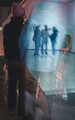
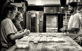
meetingsby primabarbaraComment: One of my challenge favorites. This is truly artistic seeing, composition, and processing. |
| Photographer found comment helpful. |
| 04/01/2026 11:46:14 PM |
|
| Photographer found comment helpful. |
| 03/30/2026 10:47:03 AM |
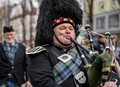
traditional tuneby primabarbaraComment: From the same parade as the dog walkers, I presume? This is a lovely, classically framed capture that was among my highest scores this challenge. :-) |
| Photographer found comment helpful. |
| 03/30/2026 10:42:17 AM |
A time to laughby NeatComment: Another lifestyle shot that just sets the standard for the whole crowd. This was my top pick. |
| Photographer found comment helpful. |
| 03/30/2026 10:41:19 AM |
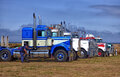
Last Experiment of the Day by lei_73Comment: Awesome work, and congrats! :-) I would love to have (adult) models as cooperative as this for my stock photography work. These sorts of fill-in-the-blank storytelling moments are golden for all kinds of repurposing. |
| Photographer found comment helpful. |
Home -
Challenges -
Community -
League -
Photos -
Cameras -
Lenses -
Learn -
Help -
Terms of Use -
Privacy -
Top ^
DPChallenge, and website content and design, Copyright © 2001-2026 Challenging Technologies, LLC.
All digital photo copyrights belong to the photographers and may not be used without permission.
Current Server Time: 06/21/2026 11:57:02 AM EDT.