| Image |
Comment |
| 07/03/2011 11:43:52 PM |
Faint Memoryby escapetoozComment: I'm guessing this is some sort of sheer fabric, it gives a really nice effect. Great job. |
 Photographer found comment helpful. Photographer found comment helpful. |
| 07/03/2011 11:43:14 PM |
|
| Photographer found comment helpful. |
| 07/03/2011 11:42:22 PM |
|
| Photographer found comment helpful. |
| 07/03/2011 11:41:45 PM |
Nine Pawnsby DistantColoursComment: This is really well done. I wish I knew how to keep the detail in my highlights like this. |
| Photographer found comment helpful. |
| 07/03/2011 11:41:03 PM |
|
| Photographer found comment helpful. |
| 07/03/2011 02:37:22 PM |
|
| Photographer found comment helpful. |
| 07/03/2011 01:41:49 PM |
Pyscle and Cupidby tigerluongComment: This is an interesting looking clock, I am thinking the main problem with this photo is the background IMO, as is I am left wondering why you chose to take a picture of a clock on a blank wall. When I set up a photograph I try to look at the picture as a whole, not just the subject, the background must add to the photo not detract. Try making a grouping of similar still life objects like placing a nice flower arrangement with it on an interesting looking table. Then you still showcase your beautiful clock but make the picture as a whole much more interesting. |
| 07/03/2011 01:36:30 PM |
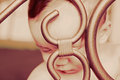
Sadness of the youngby manavgComment: IMO this photo is too much about the gate instead of the child behind it. I would like to see this redone with the focus on the child instead of the gate. With the child out of focus it is hard to catch the emotion. I think if the child was moved to the left a bit so you can see the face it would be more effective as well. That heavy square over one of the eyes bothers me somewhat. |
| Photographer found comment helpful. |
| 07/03/2011 01:30:56 PM |
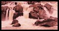
Falls with heronby rhoadesurfComment: Beautiful falls, but this photo has much more of a purple/red tint than sepia on my computer. |
| 07/03/2011 01:28:58 PM |
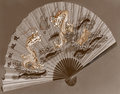
Dance of the Dragonsby BrianRComment: This is an interesting looking fan, I am thinking the main problem with this photo is the background IMO, as is I am left wondering why you chose to take a picture of a fan on a wall. When I set up a photograph I try to look at the picture as a whole, not just the subject, the background must add to the photo not detract. Try making a grouping of similar still life objects like propping it in front of a bonsai tree, or have a model hold the fan in front of her face, then you still showcase your beautiful fan, but the picture on a whole becomes much more interesting. |
| Photographer found comment helpful. |
Home -
Challenges -
Community -
League -
Photos -
Cameras -
Lenses -
Learn -
Help -
Terms of Use -
Privacy -
Top ^
DPChallenge, and website content and design, Copyright © 2001-2026 Challenging Technologies, LLC.
All digital photo copyrights belong to the photographers and may not be used without permission.
Current Server Time: 07/17/2026 11:15:58 AM EDT.