|
|
|
Showing 1261 - 1270 of ~3734 |
| Image |
Comment |
| 05/22/2003 02:52:55 PM | colors of the heartby giseleComment: Critique Club Critique
Title: "colors of the heart", by gisele
Composition: A simplistic subject well placed in the frame of the picture. Being a set up shot the blue color seems a bit dark.
Technical: you have good exposure and focus on the subject, even with the slight angle of the shot you have controlled the depth of field to keep all of the image in sharp focus. The dust specks of foreign matter on the white portion is very distracting. I can't see that it is necessary for this shot.
Challenge: you have definitely met the challenge and were on the right track for a win here. It seems to me that splashy, vibrant pictures do well on DPC.
Suggestions: My main suggestion would be to mix some white into both the blue and yellow to lighten them up. It looks as though your lighting, or post processing has taken the impact out of the colors you have presented. At least on my computer they appear dull and not as bright as they need to be to make them POP.
Keep up the nice original work, and thanks for sharing it with DPC.
Disclaimer:
Bear in mind that I am here to learn, just as many others and any comments that I have made are not intended to be offensive in any way, and are only constructive criticisms. If you wish to comment or discuss this critique please feel free to do so at any time.
Thank you,
Dick Pattee (Autool)
Autool@attbi.com
|
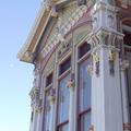
| 05/22/2003 09:52:58 AM | Painted Ladyby autoolComment: Connie,
Finally, I am getting around to my mail. Thank you for your wonderful and complimentary evaluation of my "Painted Lady".
It was a wonderful Saturday in San Francisco, a rare clear day with very little wind. When I finally found the Mish House I immediately found the difficulty in getting pictures with normal lenses. A professional could have worked around this problem but as a novice I was quite lost. I was not happy with the flat finish on the house, from the information I had, I assumed it would be bright and shiny. I had came to specifically do this house and that is what I did.
I feel that you have given it a fair and honest critique, and certainly one that I appreciate. Of the many different crops, saturations and tilts I settled on this rendition-which probably doesn't do the old Victorian justice. I knew that the subject was a little off the challenge but as you probably can tell from reviewing my earlier entries, that doesn't really matter much to me. The entry would have had to be a lot splashier with defined colors, and a little trickery to do well on DPC, but I like it and several others liked it, and most of all I had fun doing it.
You must have a never-ending array of subjects in beautiful Montana. Your pictures reflect your ability to seek and present them for our enjoyment please don't ever stop!
Thank you, keep shooting, and most of all have fun.
Dick
|
| 05/21/2003 11:18:09 AM | Cinnamon Redby StevePaxComment: Critique Club Critique
Title: "Cinnamon Red" by StevePax
Composition: A very original and well-composed shot. The overall result is that of a commercial picture for advertisement. I feel the negative space adds to this picture giving it a hot feel.
Technical: All of the ingredients for a perfect photo are in this one. You show very good control of light and have used it to your advantage. The focus seems to be ever so slightly off, that may have been on purpose, but I feel the lettering would be absolutely sharp if it were to be used as a commercial picture. I keep going beck to that commercial thing but it just has that effect on me.
Challenge: You have met the challenge, however I think most entries were centered around using all three primary colors. Nothing said it was necessary though. Your use of only red gives it what I call simple elegance.
Suggestions: I think the subject in your picture narrows the field of viewers that would be very interested in having it on their wall. It definitely has a place though, which I have mentioned already. I a deserved 7 on this entry, and only whish I could accomplish the control of light that you have. Your "Orange County, CA" postcard entry is another very nice example of light control. It has been a pleasure to critique your work, so keep shooting and have fun!
Dick
Disclaimer:
Bear in mind that I am here to learn, just as many others and any comments that I have made are not intended to be offensive in any way, and are only constructive criticisms. If you wish to comment or discuss this critique please feel free to do so at any time.
Thank you,
Dick Pattee (Autool)
Autool@attbi.com
|  Photographer found comment helpful. Photographer found comment helpful. |
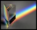
| 05/19/2003 10:11:58 AM | Prismby autoolComment: Doug,
I went on quite an adventure with this entry, for an old DIY type of guy. It was alot of fun and it is quite encouraging when so many people write complimentary comments.
The real fact of the matter is that I have never been completely satisfied with the final picture, and when the mood strikes I am going to try it some more. I have been trying not to fill the hard drive on my old computer, butI guess I am going to have to try "Neat Image".
It is always a pleasure when one of the better photographers do a critique, I know I am getting an honest report. When they praise my work it gives me a super high. Thanks so very much!
Dick
|
| 05/18/2003 05:46:02 PM | | | Photographer found comment helpful. |
| 05/17/2003 10:26:53 AM | In a New York Momentby dimitriiComment: Critique Club Critique
Title: In a New York Moment, by dimitrii
Composition: You have an interesting composition, taken only by an experienced New Yorker. Having never been to NY, I probably would have been looking straight up and all of my shots would be from the low angle. Your perspective projects the definite feeling of the hustle and bustle of the big city from a point of view not normally seen in a postcard.
Technical: The intentional blur has a rewarding effect on the picture. You have used this effect to its fullest advantage to portray the feeling of the picture. Even with the camera movement to develop the blur, your focus appears to be dead on.
Challenge: You have an unconventional picture of the most popular city in the world. I am not sure if it would work to get people to come visit, or if it would cause them to stay away, but either way you have met the challenge in a very special way.
Suggestions: Your experience far exceeds mine and in my opinion you are a very good expressionistic photographer. I have no suggestions for your picture and keep up the good work. Thanks for sharing it with us.
Disclaimer:
Bear in mind that I am here to learn, just as many others and any comments that I have made are not intended to be offensive in any way, and are only constructive criticisms. If you wish to comment or discuss this critique please feel free to do so at any time.
Thank you,
Dick Pattee (Autool)
Autool@attbi.com
| | Photographer found comment helpful. |
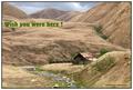
| 05/16/2003 10:50:11 AM | 1910 Hand Colored Postcardby autoolComment: Ursula,
Firstly a congratulations is in order for your,"Come Visit the Mer Bleue Bog in Ottawa!", A very wonderful place to enjoy, someday I will get to Canada and see for myself. You have some very stunning photos in your collection on DPC, an indication that the competition just keeps getting tougher. Keep up the good work.
I had a lot of fun making the "1910 Hand Colored Postcard". I had picked up my oldest daughter to go with me on the hunt for my perfect post card picture and when we decided to use this setting we knew it was the spot for us. After hiking back into the place, picking up garbage that passersby's had dumped, and taking quite a few pictures we started our walk back to the truck. This was quite a long walk and I kept looking over my shoulder hoping to get a better view, and wishing that the sun would peek through the clouds for just an instant. It was during this walk that I had the perfect vantagepoint for this picture.
It was a poor call for me to add the green message, but I had some old cards and some of them had similar messages so I went with it. Oh well live and learn!
I thank you for such a complimentary critique and hope you enjoyed writing it as much as I have had in my response. Keep shooting and most of all have fun.
Dick
|
| 05/14/2003 10:33:51 AM | Got Till It's Gone by arnitComment: I spent a couple of days trying to get something like this. Congratulations and I too hope you share the technique. | | Photographer found comment helpful. |
| 05/13/2003 04:43:45 PM | Rolling Coilsby DoorskidderComment: Critique Club Critique
Title: Rolling Coils, by Doorskidder
Composition: You have taken this picture from a unique vantage point. I am not sure that it was the best for a well-composed picture, as it is hard to tell that the train cars themselves are your main subject. The coils of wire seem to come on the strongest to me.
Technical: Your focus and exposure are very good and you have made good use of available light.
Challenge: With the train cars being the subdued subject meeting the challenge was a little weak in my opinion.
Suggestions: I give you due credit for going out and finding something different and interesting for your entry. I do however suggest that you work with making it even more interesting by tying in the main subject with some other part of the picture to exemplify it. Low angle shots of train tracks and the cars wheels always seem to draw the viewer in for a longer look. I know that my suggestion is somewhat traditional and their is nothing wrong with using your own interpretation and expression, but you will probably find it takes a lot of experimenting to find a new view of an old subject that really stirs the viewer. Keep shooting and good luck in the future.
Disclaimer:
Bear in mind that I am here to learn, just as many others, and any comments that I have made are not intended to be offensive in any way, and are only constructive criticisms. If you wish to comment or discuss this critique please feel free to do so at any time.
Thank you,
Dick Pattee (Autool)
Autool@attbi.com
|
| 05/11/2003 10:48:59 PM | Modern Country Stationby autoolComment: Frisca,
Flattery will get you everywhere! I also spent some time with your photos and must say that they are stunning. I am so glad you share them,with DPCers.
My transportation shot was a taken of one of three daily commuter trains that pass through our small town of Tracy, CA. It is growing so fast that it will never be the same as it was when I first moved here thirty years ago. One of my objectives is to capture some of the old and also take pictures that show the new growth moving in.
I shot about seven pictures the morning of this one and really only had this one to work with. With its low exposure and snap shot approach I didn't have much faith in the results on DPC. I was surprised to see how well it did.
I thank you for your kind evaluation and support your suggestions. I am looking forward to seeing more of your work, so don't let me down.
Dick |
|
Showing 1261 - 1270 of ~3734 |
Home -
Challenges -
Community -
League -
Photos -
Cameras -
Lenses -
Learn -
Help -
Terms of Use -
Privacy -
Top ^
DPChallenge, and website content and design, Copyright © 2001-2026 Challenging Technologies, LLC.
All digital photo copyrights belong to the photographers and may not be used without permission.
Current Server Time: 07/24/2026 10:25:58 PM EDT.
|