|
|
|
Showing 411 - 420 of ~1207 |
| Image |
Comment |
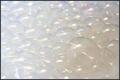
| 09/21/2005 08:19:38 PM | Shineby capikawComment: Certainly meets the challenge! The color is a bit too washed out for me, perhaps its edging too much towards blown out in the upper left hand corner which then makes the bottom right hand look dingy and unattractive. I think there is some interesting patterns and texture to be seen and the opalescence really gives the image some spark. Perhaps if the light were a bit more subdued, the intensity muted somehow and spread more evenly over the image it would make the impact greater. I wish the focus was a bit more crisp as well since you have softness in the curvy nature of the bubbles, a sharp focus would add a nice balance and draw those curvy details to the forefront. I gave a 4. |  Photographer found comment helpful. Photographer found comment helpful. |
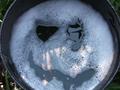
| 09/21/2005 08:14:59 PM | Bubble Impactby ajschelComment: Technically very nice, the lighting highlights the impact very well, there are oodles of bubbles, the concentric rings playing out over the bubbles give some nice contrasts and interest. Focus is good. The idea isn't very innovative in my opinion but it is executed very well. It doesn't inspire me to delve too deeply, so I gave it a 6 on its technical merits. | | Photographer found comment helpful. |
| 09/21/2005 08:11:51 PM | The Evil Mister Bubbles Shows His Face.by roscoComment: Definitely has bubbles, the focus is good, the lighting is okay, the fact that it is mottled adds interest but over all the main focus of your image is kind of dull. I think the subject, though a cute idea, doesn't have a great deal of impact after the initial glance. I'm not sure what, compositionally, I could suggest changing to give it more depth, just doesn't hold my interesting long, seems kind of snapshot-ish. I gave a 4. | | Photographer found comment helpful. |
| 09/21/2005 08:07:41 PM | I Hate Bubble Bathsby jaroadieComment: Ha, the pup certainly doesn't look pleased. I think this has some nice "aww.." factors to it. The lighting is a bit harsh on the bubbles which is distracting and gives an odd blue hue on the left side, but it looks to be natural lighting so other than a tight crop on the dog's head, I don't know how to combat that. The colors are a bit washed out where the dog is, the focus is his face and misery, so that area should be lit, though softly, and with a bit sharper focus than is shown here in my opinion. Working with pets can be a pain so I know getting him/her to stay in a useful position, particularly during something he's none to pleased about isn't the easiest. It looks like maybe a finger is on the left side also, its very unfocused and skin toned, a bit distracting - maybe its suds on the lens. I think the idea is great, the composition is good - probably stronger with a tighter crop, focus is alright, use of natural light needs some tweaking (crop may help here) and there is a good emotional impact and of course bubbles. I gave a 4. | | Photographer found comment helpful. |
| 09/21/2005 08:01:45 PM | Waiting for the bubblesby MontagueComment: I like the rich tones that the jewelry box helps to create, it makes a nice foil for the black background. This tone also seems to be highlighting the glasses in an interesting manner and the focus is pretty good but where it a little crisper I think it would give the image more impact. The rings/box seems to be an integral part of the image so I wish it was a skosh more in focus. Also, I would suggest adding a bottle of champagne to help further the impression of an impending celebration. I'm afraid that I do not see this as meeting the challenge as there are no bubbles present that I can see - the absence of bubbles and indicating such with the title doesn't quite cut it for me in this instance. Had there been a wine glass or champagne or something liquid that I could say, ahh the bubbles are in there, then I could probably make the leap. I do like the idea, I think the composition is good - the tones are nice - the lighting is pretty good, maybe a bit too harsh on the ring box, but overall decent. I gave the image a 4 due to the lack of bubbles, bit of harsh lighting and the focus I mentioned, I would've scored higher had bubbles been present. | | Photographer found comment helpful. |
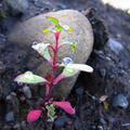
| 09/21/2005 07:55:19 PM | Natures own water bubblesby AnnapannaComment: I like the contrasting colors as well as the nice texture of the background versus the smoothness of the leaves on the plant. The use of light is a bit iffy - looks like you were using natural light, which can be a pain, the direction you took the photo from has the light washing out some of the details and causing harsh highlights in other areas. I wish the focus was a little deeper in a vertical sense, so that all of the plant was in great focus. It certainly meets the challenge, I think the biggest drawback is the way the light is being used. I gave a 4. | | Photographer found comment helpful. |
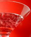
| 09/21/2005 07:52:42 PM | Raspberry Martiniby idnicComment: Wonderful, wonderful, wonderful ue of color and light. Everything looks so fresh and crisp, the raspberries give some wonderful contrasting texture to the glass, the matching background really finishes off the imag and of course, we have the bubbles which are subtle yet lovely. One of my tiny nitpicks, which others may mention, is the slice of glare on the martini glass. The other are the droplets? of liquid on the upper portion of the glass on the left side, it gives it a bit of a dirty look to it, which detracts from that crisp fresh image that I'm seeing. Other than that though, fabulous. I gave a 7. | | Photographer found comment helpful. |
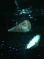
| 09/21/2005 07:49:32 PM | To the bottom of the oceanby GertComment: The image definitely fits the challenge as there are bubbles to be seen, however the technical merits are a bit soft. The lighting is pretty good, I like the different levels of lighting and how it seems to bounce off of the one shell onto the other, I love seeing how light plays in and on water so this is a good tool to help highlight other areas of the image. That said, the light on the open shell is a bit harsh and you lose some detail there. The composition is alright, it looks as though you dropped the shells in the water? This gives a feeling of floating and movement which adds interest to an image. The focus is the biggest issue I think. The soft focus makes us lose quite a bit of detail with the bubbles, which should be a fairly important piece of this image due to the challenge. It also would increase the interest and impact of the photo if the shells had more definition. The color is a bit bland, however I do think were other aspects improved the cool color it has would work to the advantage. I think crisp focus and a slightly different use of light - taking advantage of how it works through water would have given this photograph a much better impact. I gave a 3 as it isn't horrible, there are some good portions to it and there is much to work with, but the overall presentation didn't move me at all. |
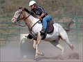
| 09/12/2005 11:29:26 PM | Barrel Raceby alfrescoComment: Fantastic action, use of natural light is great and the focus is amazing. I can never get action images that look this good. You can really feel the intensity of the rider and the movement of the horse. One thing that I love, is the horse's eye.. its like he's looking at me saying, "Yeah, no sweat." I'm just waiting for him to wink at me! | | Photographer found comment helpful. |
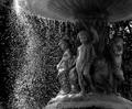
| 09/10/2005 06:59:20 PM | Underneath our Fountainby APComment: I think this has an excellent idea behind it. There are multiple points of interest to be seen and the composition, in general, is very nice. I love the perspective, and I like your choice of black & white. There are a few areas that I think take away from the image a bit. First, it seems as though there's too MUCH sharpening, especially where the water droplets are, I'm not sure if this is the case or just the way the light hits them that makes it seem that way or not. Secondly is light. There isn't enough balance, in my opinion, of light in this photograph. The left side seems to nearly have too much - but if this was done by using natural sunlight, there might not have been much you could do about it. That said, I think the image would've been boosted if you had used some fill light on the left side to help bring out more of the details of the figures under the fountain. This might also help the softer focus on that area and tighten the image up. I also think this type of image would be enhanced with a nice simple border to give it a good finished look. Overall I gave a 6 not for technical aspects but because of the vision behind it and the potential. | | Photographer found comment helpful. |
|
Showing 411 - 420 of ~1207 |
Home -
Challenges -
Community -
League -
Photos -
Cameras -
Lenses -
Learn -
Help -
Terms of Use -
Privacy -
Top ^
DPChallenge, and website content and design, Copyright © 2001-2026 Challenging Technologies, LLC.
All digital photo copyrights belong to the photographers and may not be used without permission.
Current Server Time: 07/18/2026 11:37:36 AM EDT.
|