| Image |
Comment |
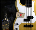
| 02/24/2006 12:03:06 AM |
Been there done that..........Lost the T-shirtby PhotoRynoComment: Great image. I like the lighting and the focus is excellent. The subject matter of each item in themselves is interesting but I think there is too much going on in the image. The interest of the guitar and stones ticket seems to be competing for attention with the alcohol and the smoke curls (which I'm not sure if its just me but it seems to have a bit of a skull look in it). Still a great interpretation of the challenge. I gave a 6 |
 Photographer found comment helpful. Photographer found comment helpful. |
| 02/24/2006 12:00:24 AM |
Friendship Braceletsby philupComment: I adore the simplistic beauty of this image. It has quite a few layers that connect with the viewer far beyond the application to the challenge subject. I think the use of black & white as the main color scheme and bringing the bracelets into higher focus with the selective coloring was the perfect move. Lighting is excellent, focus is dead on, very emotive, very nostalgic, yet still can represent any time. Well done. I gave a 10 and a favorite. |
| Photographer found comment helpful. |
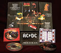
| 02/23/2006 11:57:47 PM |
Music to MY ears, anywayby jorrComment: I think it is a nice photo in that most of the items are well lit and those with the greatest impact have the best focus. Seems a bit more eBay ad-ish though, as the presentation is very straightforward and there isn't much drama to the image, rather a small catalogue of musical groups. Perhaps if the composition had been altered in some way to give the image a bit more depth. I gave it a 4 |
| Photographer found comment helpful. |
| 02/23/2006 11:53:00 PM |
"Mr. Gorbachev, tear down this wall" Ronald Reaganby vtruanComment: Great subject. I like the composition and the lighting. The focus is good as the main subject (pin) is what is being focused on but I am finding the bit in the upper left hand of the image a bit distracting because of the shallow DOF, still that's just me. I'm not sure if the way the photo is set up really speaks to the quote (as in I probably wouldn't make the connection based on what I'm looking at) but I think its IS a great image. The title definitely gives a bit more strength and history to the photo. Nicely done. I gave a 5. |
| Photographer found comment helpful. |
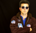
| 02/23/2006 11:49:48 PM |
Top Gunby manic35Comment: Nice portrait, though there seems to be a bit of softness in the lower part of the arms and on the face. I'm not sure if this is due to compression during uploading or a post-processing technique or just my computer. Its a bit distracting but nothing horrible. The subject choice is great, loved that movie. The lighting is a little too harsh on the right side for my tastes, I'd prefer it if it were smoother and more even and if there were a bit more room at the top so the image didn't look like it was looking to give the subject a buzz cut. All in all a good photo. I gave a 5. |
| Photographer found comment helpful. |
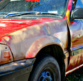
| 02/23/2006 11:47:01 PM |
1985 Honda Civic - *** RIP ***by SteveinnzComment: Nice focus, good use of lighting, the colors (where it isn't rusted out!) is quite vibrant. The subject isn't interesting to me but it is rendered fairly well. Might be better if the make of the car were visible in the image, rather than having to rely on the title to make the connection (I don't know cars by sight) that its an 80's car. Still, nicely done. I gave a 5. |
| Photographer found comment helpful. |
| 02/23/2006 11:43:59 PM |
|
| Photographer found comment helpful. |
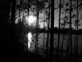
| 10/26/2005 07:50:08 PM |
Sceneby Phoenix9244Comment: A very nice silhouette but it doesn't quite meet the challenge to me. The lighting is nice and the composition is decent though the horizon seems a bit off-kilter. Focus looks okay. I gave a 3, had it been in another challenge I would have scored it higher. |
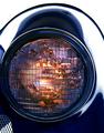
| 10/26/2005 07:48:28 PM |
2D1by tenderfootComment: Doesn't quite meet the challenge in my estimation as the light isn't very err.. light. The focus and lighting (there's that word again!) look good and I like the composition. The right side running up and over the top of the light is fairly blown out but you do get points for humor! I gave a 4. |
| Photographer found comment helpful. |
| 10/26/2005 07:24:01 PM |
Stalkingby lunixComment: I'm not sure if this is really light on white, as the yellow is very very vibrant rather than light. But.. it is lighter than the orange that giraffes normally are. I like the composition with the giraffe peeking from the side but the image is unappealing to me in general. Probably because of how bizarrely colored the giraffe is with no context to give it a reason why it is that color. I gave a 4. |
Home -
Challenges -
Community -
League -
Photos -
Cameras -
Lenses -
Learn -
Help -
Terms of Use -
Privacy -
Top ^
DPChallenge, and website content and design, Copyright © 2001-2026 Challenging Technologies, LLC.
All digital photo copyrights belong to the photographers and may not be used without permission.
Current Server Time: 07/18/2026 04:58:49 AM EDT.