| Image |
Comment |
| 04/07/2006 06:47:36 PM |
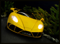
Yellow Goes Fasterby seebrownComment: Great image. I like the feeling of movement, the understated tones that really let the headlights and yellow of the car stand out. Background is great. Looks like a model rather than a real-size car but even that suspicion doesn't take away from the image. It has a real 3D-ish effect, like the car is ready to leap out of the photo at you and go barrelling away. Very nice. 7 |
 Photographer found comment helpful. Photographer found comment helpful. |
| 04/07/2006 06:45:38 PM |
Playtime in the Daffodilsby dwterryComment: A very well framed image. I love the contrasts between the brilliant yellow daffodils and the dark statuary - they look almost silhouetted. The building in the background brings more interest and a nice tonality as well. The focus is excellent on the yellow flowers, which I think is key due to the subject of the challenge. Nice use of the light available. Only thing I can think of that might be a detriment is the fact that there is so much going on in the image. In many cases that would be a downfall but I think for the most part the number of different elements is well balanced. 8 |
| Photographer found comment helpful. |
| 04/07/2006 06:43:03 PM |
Golden flowers at the golden hourby twm122Comment: Very nice capture. I like the freshness of the image, the slightly yellow/warm tone to it over all. The composition is good though I'd have preferred more interaction between the two kids, the child with their back to the viewer isn't nearly as impactful as the girl studying the flower. The light is a bit harsh which is understandable with sunlight, not sure if there would've been a way to combat that without affecting other areas of the photo. I think that harshness is also making the image a bit soft in focus. Nothing terrible but there is a crispness lacking. 5 |
| 04/06/2006 09:02:47 PM |
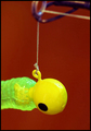
Properous Alianceby NstiG8trComment: Very yellow, has a nice contrast with the background behind it. I'm not sure I understand the title.. is this a lure and the thing at the time a fishing pole? I don't know fishing.. heh. The subject isn't too intriguing to me so I am not finding myself drawn to the image, it is rendered in a fine way, but the impact isn't there for me. Lighting looks good and focus is good. Maybe a difference in the composition would help bring the fishing pole more into play and thus add more elements and drama that would connect with the viewers (or at least with me). 4 |
| Photographer found comment helpful. |
| 04/06/2006 08:58:24 PM |
These Are For My Momby PhotoRynoComment: What an adorable little guy. I think the focus is excellent on your model and the flowers he's carrying. The color is bright and sunny, the composition is good for the most part. Lighting is excellent in my opinion. I like the selective desaturation where the held flowers and your model are concerned. I do not however like the meadow in the background. I think it really draws the emphasis off of the flowers the child is holding and that is to the detriment of the image IMO. If the background were greyed out as well and the punch of color came only from the held flowers I think this image would be MUCH more impactful. Maybe the same image but with a different background? Somewhere without so much yellow. :D Even though I do not like the yellow meadow at all I can see the potential without that distraction. I gave an 8 |
| Photographer found comment helpful. |
| 04/06/2006 08:54:00 PM |
Freshly Pressed Grapefruit Juiceby kiwinessComment: A fun image. I like the choice of background since it makes the yellows that much richer and brighter. The focus is great, lighting is good too though I think the hand could use just a little more oomph. I like the composition but I don't like that the hand is cut off at the top. Everything looks good for the most part. 6. |
| Photographer found comment helpful. |
| 04/06/2006 08:27:15 PM |
Smiling through yellow liquidby birkinComment: How very abstract. I love the tones and the vividness of the colors. There's something harsh in the yellows that I normally don't like but I think is interesting here. The circles give a great feel to the photo, very mirror-like or maybe kaliedoscope-y. Nicely different and refreshing, fun too! 7 and favorited. |
| Photographer found comment helpful. |
| 04/06/2006 08:24:29 PM |
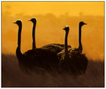
moonlight serenadeby whiteroomComment: I love the title. Hard to imagine such richness in yellows being available by moonlight though! I like the composition, the subject matter is very interesting (ostriches are great!). I like the lighting in how it is highlighting the ostriches. It almost has a silhouette feel, but there is some detailing still visible. I'm not sure if I'd like it more if it were a true silhouette or not. Very nice. 6 |
| Photographer found comment helpful. |
| 04/06/2006 08:21:52 PM |
Unfoldingby beggsComment: I can't get very excited about this image. The concept is nice, the lighting brings out the vibrancy of the color, the composition is good. I like the contrast in the vertical nature of the inner stamen/petally things versus the other petals in their horizontal placements. The focus seems a bit soft on much of the image, and overall the photo doesn't inspire me to look deeper into the floral element. 4. |
| Photographer found comment helpful. |
| 04/06/2006 08:19:25 PM |
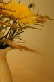
Yellow and Goldby ltaylorComment: Very nice composition. I like the subject choice. There is a lot of interest with the different floral elements as well as the nice curves on the vase/pitcher. Lighting seems a little too low, though it is nice. It has a very soothing, calm factor going for it. That said, I think it is helping the subject blend a bit too much into the background. This may be a case where there is too much yellow in too similar of shades. The focus is great on many of the floral elements and that helps draw the image from the background, but I find it still melds into the background more than I think is beneficial for the image as a whole. I do however like the gradient effect the background is showing with the darker gold at the bottom and lightening up towards the top a bit. 5. |
| Photographer found comment helpful. |
Home -
Challenges -
Community -
League -
Photos -
Cameras -
Lenses -
Learn -
Help -
Terms of Use -
Privacy -
Top ^
DPChallenge, and website content and design, Copyright © 2001-2026 Challenging Technologies, LLC.
All digital photo copyrights belong to the photographers and may not be used without permission.
Current Server Time: 07/17/2026 02:46:29 PM EDT.