| Image |
Comment |
| 10/17/2003 02:02:30 AM |
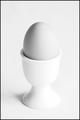
Boil for three minutes.by tomlewis1980Comment: Simple, great impact. I do have to be honest and say that I don't really like white on white presentations - I like a little color contrast to shake things up. That said I do like the composition of this photo. The egg gives just enough difference in color to keep it interesting. lighting does seem a little harsh on the right side - to the point of losing definition on the egg cup. Good image. 7 |
 Photographer found comment helpful. Photographer found comment helpful. |
| 10/17/2003 02:00:05 AM |
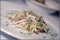
Tunafish pastaby heidaComment: Interesting set up. I like the off-kilter perspective and the light tones. Lighting is great. I even like the small focus area - it really works for this photo. The food looks appetizing, the bits of parsley? give it extra texture. Nice! 7 |
| Photographer found comment helpful. |
| 10/17/2003 01:57:31 AM |
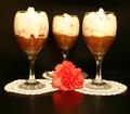
Two's Company, Three's A Crowd!by browntComment: Hmm.. I like the set up. Black background works nicely with the white doilies and carnation. The food looks good, but it has a lack of dynamic to keep me in the picture - I find the props hold my interest more. Maybe if there were more layers in the dessert, then the view we have of it would attract my attention better. Lighting is great and the arrangement of items works well. 7 |
| Photographer found comment helpful. |
| 10/17/2003 01:54:22 AM |
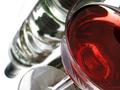
Cosmopolitanby WILDBLUEComment: Great shot! I love the differing perspectives all in one go. With the cocktail/wine glass and the glass liquor bottle, it has a clear crisp feel that is shaken up a bit with the vivid read coloring. Everything looks splendid to me. 9 |
| Photographer found comment helpful. |
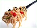
| 10/17/2003 01:48:34 AM |
Bite Meby BitzComment: Heh, great title. Works perfectly with the shot. The food looks great, love the lighting. Crisp lines and good focus. Would've liked all the tendrils of spaghetti to be fully in the shot. Nice solid photo. 7 |
| Photographer found comment helpful. |
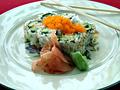
| 10/17/2003 01:40:16 AM |
California Rollby TooCoolComment: Nice presentation! Good color contrasts. The food looks well put together, and more importantly it looks like it would be good to eat. Only complaint on that end I have is the orange stuff on top (carrots?), it brings a great color contrast but has focus issues for me. The lighting makes the rolls look nice and crisp, but I find the plate due to the light reflection has too cool of a hue to it, competing with the food's coloring. Perhaps a solid colored plate in light blue or purple might have offset the food better. Very sound photo. 7 |
| Photographer found comment helpful. |
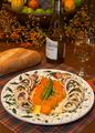
| 10/17/2003 01:36:18 AM |
Pollo Involtini al'la Nonnaby EddyGComment: Wow! No, double wow! This composition is nearly perfect. Just the right amount of background ambience. The colors work wonderfully together and the lighting is great. The food looks excellent - even the set up on the plate is fabulous. Focus is very nice, though seems a bit soft on the.. carrot curls? that could just be a strange anomoly however. Maybe a teensy wider crop on the right side, just to get a bit more of the fork in. That's mostly being picky though. Fantastic. 10 |
| Photographer found comment helpful. |
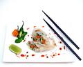
| 10/17/2003 01:33:25 AM |
Lemon Grass infused Spring Rolls by JC_HomolaComment: Wow very vivid! The colors are marvelous. The setup is crisp and clean. I like the fact that spring rolls for the most part have the lion's share of the focus. Artfully arranged, which increases the interest. The only thing I find off is the white on white look. I think keeping the white plate - so the decor stands out would be good, but a different background. Maybe a red to tie in with the peppers and would still show off the white plate/rolls and the black chopsticks. Otherwise the plate blends too much for my tastes and gets lost. Outstanding all the same. 9 |
| Photographer found comment helpful. |
| 10/17/2003 01:30:07 AM |
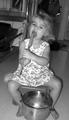
dada that' some good cookie'sby jbruno1397Comment: Nice capture, evokes memories. I like the black & white tone, it helps calm the shot down. I find it a bit busy with all the items in the background - but the coloring helps diffuse that. Your model is adorable and the lighting looks good. A little more focus on the face, rather than the dress would've appealed to me more but overall its a good shot! 7 |
| 10/17/2003 01:26:59 AM |
The Best Cook I Knowby Darter02Comment: Great set up, everything is placed well. I would've liked more of the items on the left side to be visible (not so tight a crop). The energy is great, looks realistic not over-done or fake (whether she's actually posing or not). My main complaints are the focus of the whole scene feels soft to me, and that slight blurredness is distracting. Also, I'm not sure if it is the lighting or what, but there seems to be an oversaturation of hue, there's a yellowy/red tone that is looking overloaded to my eye. 6 |
| Photographer found comment helpful. |
Home -
Challenges -
Community -
League -
Photos -
Cameras -
Lenses -
Learn -
Help -
Terms of Use -
Privacy -
Top ^
DPChallenge, and website content and design, Copyright © 2001-2026 Challenging Technologies, LLC.
All digital photo copyrights belong to the photographers and may not be used without permission.
Current Server Time: 07/18/2026 07:56:56 AM EDT.