| Image |
Comment |
| 10/18/2003 02:59:11 AM |
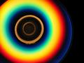
Physics course on CDby darixComment: I think the vivid colors are gorgeous, focus and lighting are good. The only thing I don't like about the image is that it doesn't say science to me - without the title it just looks like a (pretty) cd. 7 |
| 10/18/2003 02:57:01 AM |
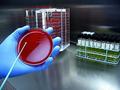
E. coli, it's what's on your plate by fas-ligandComment: One of the nicer 'science lab' photos. I definitely like the range of colors, brings additional interest. The lighting looks good - sterile and cold, fits the general idea of labs. Good title - anything with E.coli gets my attention! The action with the hand and the pointer thingie adds movement and additional story. Well done. 8 |
 Photographer found comment helpful. Photographer found comment helpful. |
| 10/18/2003 02:53:48 AM |
This is how the green appels are make!by PeZkaLLComment: I got a chuckle out of this one. Would've liked more of the apple showing, so it was more apparent that was what was being made green. Also seems to have a soft focus throughout the photo, since the hypodermic and the apple are the main subject, I think they should both be in sharper focus. Funny idea, a bit of a poke fun at science in my estimation. I like the originality. 6 |
| 10/18/2003 02:50:36 AM |
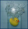
Arquimedesby anirenoComment: Great fun example of displacement. At first I didn't get the connection, but luckily I'd recently seen something on PBS about Archimedes. Everything looks good, my only wish would be that the duck have a bit more light on it. 8 |
| Photographer found comment helpful. |
| 10/17/2003 02:20:18 AM |
Beef Goulashby cvt_Comment: Great color usage. The noodles look fairly well defined. The food does look good. I like the use of the black background, but I find the ingredients spilled in the back a bit distracting. Would've rathered the shot be filled by the goulash instead - not cut off in the right hand corner, I think it is strong enough to stand on its own - no props needed. Lighting looks good. 6 |
| Photographer found comment helpful. |
| 10/17/2003 02:17:30 AM |
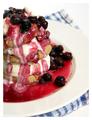
Maple syrup cookie stackby jonpinkComment: Great colors, I do like the off-centered presentation in this instance.. I do think the white border coupled with the white plate and background are a little too much. Maybe if the white beneath the blue cloth were a different color it would give an added depth. Since not all of the stack is in the photo, I would've liked all that is showing to be in focus. Otherwise, its a nice photo. Good job. 5 |
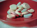
| 10/17/2003 02:15:07 AM |
Antacid Aftermathby GeneralEComment: I like the idea behind the photo, but I think it needs a few more elements to add interest. I don't have any off the cuff suggestions though. A different colored plate, may be a solution - I don't think that particular color offsets the pale coloring of the tablets very well. Great idea - rather unique, but needs a little better presentation. 4 |
| Photographer found comment helpful. |
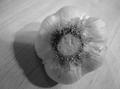
| 10/17/2003 02:11:09 AM |
Garlicby gakoutComment: To be truthful, I find little of interest in the photo. Perhaps the black & white aspect of it took out what could've been a nice contrast - whitish garlic against a wooden background (looks like wood could be wrong). The size of the photo does take away for me as well. May have added a bit of drama if the garlic was in one corner, with an expanse of background - giving it a depth of space and interest. That said, I do like the lighting, it creates some interesting shadows and the focus looks crisp on the end of the garlic. 4 |
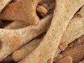
| 10/17/2003 02:07:25 AM |
Homemade For Fidoby GraciousComment: I'll be looking this recipe up when the challenge is over, my dog loves treats, and honestly - these look kind of appetizing to me too. I love the detail showing on the 'bones', the colors are a nice array of neutral tones, excellent texture. Great lighting. Focus is perfect. I don't see anything I would change. 10 |
| Photographer found comment helpful. |
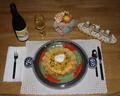
| 10/17/2003 02:05:16 AM |
Fast and Easy Tex Mex Dipby RefocusedComment: Great set up, I like how it gets all aspects in the photo without it feeling busy or crammed. Nice space. I do wish though the food had more presence than it does, I think it was lost due to the perspective the photo was taken from. I would've also liked the whole presentation to be brighter - with the nice feeling of space, comes a need imo for greater light depth. Other than those points I think its a very good photo. 7 |
| Photographer found comment helpful. |
Home -
Challenges -
Community -
League -
Photos -
Cameras -
Lenses -
Learn -
Help -
Terms of Use -
Privacy -
Top ^
DPChallenge, and website content and design, Copyright © 2001-2026 Challenging Technologies, LLC.
All digital photo copyrights belong to the photographers and may not be used without permission.
Current Server Time: 07/17/2026 06:57:18 PM EDT.