| Image |
Comment |
| 10/22/2003 01:57:06 AM |
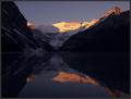
First Kiss of Lightby ToddhComment: Lovely! The use of light is tantamount here - it really makes the piece. The image feels crisp to me, I wish I could be there and see it in person. This may be strange, but I think this would be perfect for one of those motivational posters, they always use awe-inspiring images. There seems to be a bit of discoloration in the sky but I think its either due to resizing or my computer, so I didn't hold it against you. A wonderful capture. 9 |
 Photographer found comment helpful. Photographer found comment helpful. |
| 10/22/2003 01:53:09 AM |
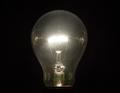
A Brilliant Idea...by StevePaxComment: The light bulb stands out well against the background - good focus - how did you get it so the background wasn't lit up by the bulb? Compositionally I don't find the image very interesting, but I do think it is well-executed and fits both its title and the challenge. 7 |
| Photographer found comment helpful. |
| 10/22/2003 01:48:16 AM |
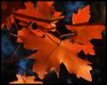
Fall Realityby dsidwellComment: Beautiful color, great detail. I'll be honest and say I wish the prominent leaf was completely in sharp focus, but I don't think it detracts, more of a personal preference. Your light usage is very upfront, set off nicely by the shadows in the background, and so fits the challenge wonderfully. A very good image. 8 |
| Photographer found comment helpful. |
| 10/22/2003 01:45:32 AM |
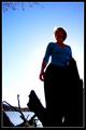
Blueby pitsamanComment: I love the perspective and the color. Those two made the biggest impact on me. The use of light is good, I do like the backlighting, but as with many 'people' images, I wish I could see the face better. Also, I think removing the branches at the top would enhance the image bring out the blue aspect all the more. The focus looks good as does the overall composition. 6 |
| Photographer found comment helpful. |
| 10/21/2003 02:36:54 PM |
I Just Want Your Soul...by HomunculusComment: Yikes, scary! Great mood to this piece, I like the flesh on black tones. Very dark subject and photo, I like how the head and hands seem to float in space so to speak. I'm not sure if she's wearing conacts, though the blurring around the eyes (particularly the right eye) makes me think something was manipulated. I could be wrong. Would try for a little bit more focus on the face since her eyes are the arresting part of the image her face, to me, should be sharper. This image really has a story and a mood behind it. 7 |
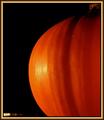
| 10/21/2003 02:30:11 PM |
Its the Great Pumpkin, Charlie Brown!by Faye PekasComment: Gorgeous color, vivid just how I like it. I like the offcenter positioning. The very round aspect of the pumpkin draws my eyes in and keeps it there for the most part. Black background really makes the color shine, excellent use of light. My only distraction is that line of..glare? reflection? in the bottom left. Very solid image. 8 |
| Photographer found comment helpful. |
| 10/21/2003 02:28:13 PM |
Coppin' a Rayby TooCoolComment: I bet this one is a cutie. I like the concept behind the image, but I think the close crop erases much of what is being described by the title and that lowers the interest factor for me. I'd like to see more of the cat's body and thus more of the rays its copping. Focus is marvelous. I'm flipflopping on whether the light in the eyes is good or bad, it gives a bit of spark but it also looks a little odd to me. I think the subject works for the challenge and light usage is good. 6 |
| Photographer found comment helpful. |
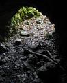
| 10/21/2003 02:18:50 PM |
Inside Looking Out/A Bears Eye Viewby boyte1Comment: What a keen perspective! The lighting is great for this image, the feeling of a cave is kept as is the deliniation of where outside begins. The focus looks like it could be sharper, and though the lighting is good, the glare on the wet ground is a little harsh. I like the almost pseudo b&w feel of this with inside the cave and low to no color vs outside with the vivid green. Well done. 7 |
| 10/21/2003 02:14:29 PM |
leaves "catching some rays"by wetlandComment: Nice image, I love the ray through the tree look, always adds a bit of magic to a scene. This one is great because it gives a bit of a lonely road being transformed just a bit by beauty. The cool blue & greens in the horizon are wonderful, particularly with the lit up reds of the fallen leaves. I would suggest a different title though - I think a title caps a piece and should enhance the image shown. I wouldn't take off points for that though so don't worry! Would like a smidge sharper image of the trees on the left. Sound photo, great job! 7 |
| Photographer found comment helpful. |
| 10/21/2003 02:11:11 PM |
Karate Girlby rll07Comment: Great image! I like the simplicity of the lines and the two color usage. Lighting is great, though I think trying it backlit directly behind (from this view) the girl might be worth a shot. The reason I say that is she starts to slightly blend into the shadows on the left, and I think her silhouette should be as sharp as possible. Definately brings back memories of that great 80's movie, Karate Kid. :) 7 |
Home -
Challenges -
Community -
League -
Photos -
Cameras -
Lenses -
Learn -
Help -
Terms of Use -
Privacy -
Top ^
DPChallenge, and website content and design, Copyright © 2001-2026 Challenging Technologies, LLC.
All digital photo copyrights belong to the photographers and may not be used without permission.
Current Server Time: 07/18/2026 01:09:11 AM EDT.