DPChallenge: A Digital Photography Contest You are not logged in. (log in or register
 
Browse Settings
Currently viewing:
MemberNiallOTuama

Show comments:

Per page:

Order:

Comments:


Comments Made by NiallOTuama
Pages:   ... [213] [214] [215] [216] [217] [218] [219] ... [231]
Showing 2151 - 2160 of ~2310
Image Comment
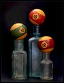
Antique Bottles and Shapes
07/14/2010 03:06:03 PM
Antique Bottles and Shapes
by Lydia

Comment:
Love the tones, colours, age, and feel.
One thing I can't quite make out (and I think I'll be giving you the benefit of my doubt) is whether the glar-like looking thing on the top right is from flash/lighting. I don't think it is cause it's there at the bottom too. If it isn't due to the lighting I think it'd look better with a consistent one. I like that none of the balls are nice and flat.
Photographer found comment helpful.
Orbs
07/14/2010 02:56:38 PM
Orbs
by photomill31

Comment:
DNMC!
Just kiddin'! Lots of spheres here. Nice deep colours in the blue. I'm not a big fan of the green ones, but I like how they look through the big one in the centre.
Actually. It's not very central, is it? It's a little leftish. Was that intentional?
Photographer found comment helpful.
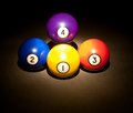
My Spheres of Influence
07/14/2010 02:52:10 PM
My Spheres of Influence
by asamite

Comment:
I like the setup and the simple idea. I think the lighting you used on top was just a little too bright -- especially on the yellow ball there's a big white part.
Photographer found comment helpful.
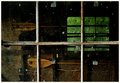
The Old Boat House
07/14/2010 10:32:47 AM
The Old Boat House
by CJinCA

Comment:
This picture screams of age - the window, the power cable, the glass, the stickers, the broken glass, the back wall, the framing.
I like how the picture frame kind of blends in with the wooden one.

Not sure how well it'll be received, but I think you did a great job!

I just became a member so I can vote on this now :)
Photographer found comment helpful.
Chaos1
07/14/2010 09:39:45 AM
Chaos1
by louinsd

Comment:
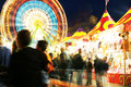
I like the ghostly figure of the kid who was on someone's shoulders. I think you were right to choose the other one for the competition, though. This one is nice, but the other one looks more chaotic, I think.
Photographer found comment helpful.
Order Setup
07/14/2010 08:21:41 AM
Order Setup
by menele

Comment:
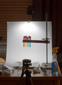
I don't know how long I stared at it trying to figure out how you did it, and it was nice and simple
Nice work, and congrats on the ribbon!
Photographer found comment helpful.
The Old Timer
07/14/2010 05:32:58 AM
The Old Timer3rd Place
by Yo_Spiff

Comment:
Did you tell him you won a prize with his picture? I'd imagine it'd make him chuckle to know he was a good model.
Congrats on the ribbon. You forgot to say you were inspired by my first challenge entry! :)

Message edited by author 2010-07-14 05:33:35.
Photographer found comment helpful.
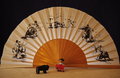
viva espana, olé!!!
07/13/2010 06:20:37 PM
viva espana, olé!!!
by cyparis

Comment:
Greetings from the critique club!

The first thing that strikes me about this image is that when you look at it first it doesn't look horozontal, even though it is. It looks slightly skewed to the left. This isn't to do with the cropping and tilt, it's to do with the differences in thickness of the folds of the fan -- on the left they're closer together giving the illusion of the misalignment. It might be down to the shadows that are cast by the lighting of the shot -- they look longer on the left, giving the illusion of depth on that side too.
The second thing that strikes me about it is that the objects look very small. Moving them closer might introduce some more difficulties, however. You'd probably want both sets of objects (fan and figures) to be in focus, so to achieve this you'd want to narrow your aperture (you shot at F/4, to close change to F/22 or narrower, perhaps). In terms of how the composition of the objects might change in light of moving the objects closer... it might add some more depth to the shot if the bull was positioned close to the camera pointed to run towards the bull fighter who was maybe deeper in the shot. Or the other way around with the bull running towards the viewer.

Another thing that struck me was that the picture doesn't really appear to be nice and crisp in focus throughout. If it's not down to the focus on the camera it could be down to the quality of the image that you exported for the challenge. Make sure to check your ppi and to shoot at the highest quality you can.

I like the colours a lot in this. You did a nice job with the lighting from the left to right in the table with the colour gradient. I think the table matches the fan, and the black background matches the black bulls in the fan. Good set up in that regard.

In terms of post processing I think you could do a little bit to this. Something I noticed was that the black at the top doesn't appear to be as dark as it could. Enhancing the blacks and the lights could also bring out the bulls on the fan more, fully blacken the background, and also give more of a suggestion of a sunrise at the table.

One last general suggestion is that it might be worth seeing what people on the forum think of the images before submitting them. On the forums there's a thread where users may ask the advice of a more experienced member on their submissions before entering them. That way you get some critique before the competition and you might learn to look out for things before submitting. If you're interested, reply to the thread and ask for a mentor for upcoming challenges. Alternatively you could request one-on-one mentoring on submissions to previous competitions. It'll probably require reshooting the scene, but that mightn't be a bad thing either.

I actually liked this image. I think with a little bit more work it could have done a little better than it did!

Hope this helped.

Photographer found comment helpful.
Hump Day Reward
07/13/2010 02:38:33 PM
Hump Day Reward
by hawkeyefilms

Comment:
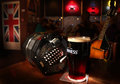
And by the way. Good shot composure. With that shot I think it would have been very easy to make it feel very... cluttered or busy, but the eye is directed to where it's supposed to be. It goes over the rest of it as an afterthought, and there's a good atmosphere in the background too.

Now that you said you pounded it with the flash I notice the bright areas near the bottom of the shot.

I don't drink guinness much to be honest. I'm more of a beamish man. I'm surprised the light penetrated the drink! Failing that I'd go for Murphy's. Then Guinness.

Message edited by author 2010-07-13 14:40:18.
Hump Day Reward
07/13/2010 02:11:16 PM
Hump Day Reward
by hawkeyefilms

Comment:
Hmmm. Speaking as an Irish man... that guinness looks far too see through. It should be jet black! Or is that some glare from lights/flash?
Photographer found comment helpful.
Pages:   ... [213] [214] [215] [216] [217] [218] [219] ... [231]
Showing 2151 - 2160 of ~2310


Home - Challenges - Community - League - Photos - Cameras - Lenses - Learn - Help - Terms of Use - Privacy - Top ^
DPChallenge, and website content and design, Copyright © 2001-2026 Challenging Technologies, LLC.
All digital photo copyrights belong to the photographers and may not be used without permission.
Current Server Time: 08/09/2026 05:37:39 AM EDT.